Achieving High-Performance Scores: Lighthouse and Static Asset Caching Techniques

How do you improve your Lighthouse performance score?

You improve your Lighthouse performance score by fixing what the report flags, most often by caching static assets, deferring and reducing JavaScript, and serving files efficiently. Lighthouse measures how fast your page loads and becomes interactive, then scores it and lists the specific issues holding you back. The score isn’t the goal in itself; it’s a proxy for real user experience, and the two biggest levers for most sites are caching and JavaScript optimisation.
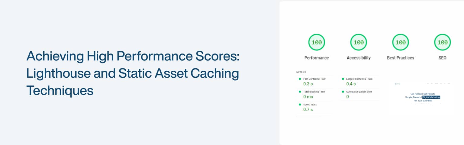
Key Takeaways

  • Lighthouse scores performance from metrics including LCP, Total Blocking Time, and CLS, the same signals behind Core Web Vitals.
  • “Good” Core Web Vitals are LCP 2.5s or less, INP 200ms or less, and CLS 0.1 or less, at the 75th percentile (web.dev).
  • Caching static assets with Cache-Control headers makes repeat visits dramatically faster.
  • Deferring, lazy-loading, and minifying JavaScript cuts the blocking time that drags scores down.

A good Lighthouse score reflects a fast, stable page, which keeps visitors and helps SEO. This guide explains the metrics Lighthouse measures, then walks through the highest-impact fixes: caching, JavaScript optimisation, and serving assets well. It builds on our wider guide to improving Core Web Vitals.

What does Google Lighthouse measure?

Google Lighthouse measures your page across performance, accessibility, best practices, and SEO, giving each a score out of 100 and listing specific fixes. It’s free, built into Chrome DevTools (and available as a standalone tool), and it simulates a visit to your page to produce a detailed, actionable report.

The performance score is built from lab measurements of several metrics. The ones that matter most are Largest Contentful Paint (LCP), how long until the main content appears; Total Blocking Time (TBT), how long the main thread is blocked and unable to respond; and Cumulative Layout Shift (CLS), how much the page jumps around as it loads. First Contentful Paint and Speed Index round out the picture. These map closely to Core Web Vitals, Google’s real-user performance signals, where good means LCP of 2.5 seconds or less, INP of 200 milliseconds or less, and CLS of 0.1 or less at the 75th percentile (web.dev). One caveat worth knowing: Lighthouse runs a lab test on a single simulated load, so use it to diagnose and verify fixes, then confirm improvements in real-user field data over the following weeks.

How does caching improve performance?

Caching improves performance by storing copies of your static files, images, CSS, and JavaScript, so they don’t have to be downloaded again on every visit. For returning visitors, cached assets load almost instantly from their device instead of travelling across the network, which is one of the biggest speed wins available.

There are three layers worth using together. Browser caching stores assets on the visitor’s device, controlled by the headers you send. Server-side caching stores rendered pages or data so the server doesn’t rebuild them every request (WordPress caching plugins and Nginx/Apache caches do this). And a Content Delivery Network (CDN) stores your files on servers around the world, serving each visitor from the nearest one to cut latency. The control that matters most for browser caching is the Cache-Control header, which tells the browser how long to keep a file before checking for a new version (MDN). Long-lived assets that rarely change (images, fonts) can be cached for a year; files that change more often (CSS, JS) for a shorter period, ideally with versioned filenames so updates still reach users.

How do you set Cache-Control headers?

You set Cache-Control headers in your server configuration, telling browsers how long to cache each file type, with long durations for assets that rarely change and shorter ones for those that do. The setup differs slightly between Apache and Nginx, but the principle is the same.

On Apache, you add rules to your .htaccess file:

<IfModule mod_expires.c>
  ExpiresActive On
  ExpiresByType image/png "access plus 1 year"
  ExpiresByType text/css "access plus 1 month"
  ExpiresByType application/javascript "access plus 1 month"
  ExpiresByType text/html "access plus 1 hour"
</IfModule>

On Nginx, you add location blocks to your server config:

location ~* \.(jpg|jpeg|png|gif|ico|woff2)$ { expires 1y; add_header Cache-Control "public"; }
location ~* \.(css|js)$ { expires 1M; add_header Cache-Control "public"; }

After editing, save and reload the server. The result is that repeat visitors download far less, since their browser already holds your stable assets, which directly improves perceived speed and your Lighthouse score. If you use a CDN or a caching plugin, it often manages these headers for you, so check its settings before hand-editing config.

How do you optimise JavaScript for a better score?

You optimise JavaScript by loading only what’s needed, when it’s needed, and keeping files small, which cuts the Total Blocking Time that drags Lighthouse scores down. JavaScript is the most common cause of a poor performance score, because the browser has to download, parse, and run it before the page can respond.

Work through these in order:

  • Defer and async non-critical scripts. The default <script> tag blocks rendering; defer runs the script after the HTML is parsed (in order), and async runs it as soon as it loads (MDN).
<script src="/js/app.js" defer></script>
<script src="/js/analytics.js" async></script>
  • Load scripts conditionally. Don’t load everything up front; load a feature’s script only when it’s actually needed, for example when the user scrolls to it or opens a component. This keeps the initial load light.
  • Minify and bundle. Minification strips whitespace and comments to shrink files; bundling combines them to reduce requests. Build tools like Webpack or Vite handle both automatically.
  • Remove unused JavaScript. Code the page never runs is pure cost; our guide to reducing unused JavaScript covers how to find and cut it, and eliminating render-blocking resources covers the deferral side in depth.

Together these reduce how much the main thread has to do during load, which is exactly what lowers Total Blocking Time and lifts the score.

How do you optimise images for a better score?

After JavaScript, images are the most common thing dragging a Lighthouse score down, because they’re often the largest, heaviest resources on the page, and the LCP element itself is usually an image. Three techniques cover most of the win: modern formats, lazy loading, and responsive sizing.

  • Serve modern formats. WebP and AVIF compress far smaller than JPEG or PNG at the same quality, so converting images is one of the biggest, easiest savings, and Lighthouse flags it directly with its “Serve images in next-gen formats” audit (web.dev).
  • Lazy-load offscreen images. Add loading="lazy" so below-the-fold images load only as the user scrolls rather than all at once, but never lazy-load your LCP or above-the-fold image, which would delay the very thing Lighthouse measures.
  • Serve responsive images. Use srcset so each device downloads an appropriately sized image instead of one huge file that wastes bandwidth on small screens.

A typical responsive, lazy-loaded image looks like this:

<img src="hero-800.webp" srcset="hero-400.webp 400w, hero-800.webp 800w, hero-1200.webp 1200w" sizes="(max-width: 600px) 400px, 800px" width="800" height="500" alt="..." loading="lazy">

Note the explicit width and height: setting them lets the browser reserve space and avoid layout shift (helping CLS) while the image loads. Compress everything before upload, and if you’re on WordPress, an image plugin or your CDN can generate WebP or AVIF and the right sizes automatically. For more on choosing formats, see our guide to image file types.

How do you eliminate render-blocking CSS and fonts?

Render-blocking resources are CSS and fonts the browser must fetch and process before it can paint anything, so they directly delay how fast your page appears and are a frequent Lighthouse flag (Chrome). Clearing them is mostly about loading the critical bits first and deferring the rest.

For CSS, inline the small amount of “critical” CSS needed to render the top of the page directly in the HTML, then load the full stylesheet without blocking, and minify what you ship. For fonts, the two highest-impact steps are preloading the fonts used above the fold so the browser fetches them early, and setting font-display: swap so text shows immediately in a fallback rather than staying invisible while the custom font loads:

<link rel="preload" href="/fonts/brand.woff2" as="font" type="font/woff2" crossorigin>

Preloading tells the browser to start fetching the font right away instead of discovering it late in the CSS, and font-display: swap (set in your @font-face rule) prevents the invisible-text delay that hurts perceived speed. Together with deferring non-critical JavaScript, this clears the path to first paint, which is exactly what lifts LCP and your score. Our guide to eliminating render-blocking resources goes deeper on the technique.

How do you keep performance high over time?

You keep performance high by monitoring it regularly, because new plugins, scripts, and content quietly erode speed if no one watches. A good score is a moment-in-time result; staying fast is a habit, not a one-off fix.

Build a simple routine: run Lighthouse after any significant change (a redesign, a new plugin, added third-party tags) and watch your Core Web Vitals in PageSpeed Insights and Search Console, which show real-user field data rather than a single lab test. Set a performance budget, a cap on page weight and script size, and treat anything that breaches it as a regression to fix. Keep removing unused code, re-checking that caching is working, and confirming fixes in the field over the weeks after you ship them. Third-party scripts are a frequent culprit for creeping slowdowns, which our guide to minimising third-party impact addresses directly. The discipline of measure, fix, re-measure is what keeps a fast site fast.

Frequently asked questions

Lighthouse scores performance from 0 to 100, with 90 and above considered good (green), 50 to 89 needing improvement (orange), and below 50 poor (red). That said, the score is a guide, not the goal, what matters is real user experience, measured by Core Web Vitals field data. A page can score well in Lighthouse’s lab test yet still be slow for real visitors on weaker devices, so treat a strong Lighthouse score as a healthy sign but always confirm with field data from PageSpeed Insights or Search Console.

Final thoughts

Improving your Lighthouse performance score comes down to understanding what it measures, the same loading and responsiveness signals as Core Web Vitals, then fixing the issues it flags. For most sites the two biggest wins are caching static assets with proper Cache-Control headers and optimising JavaScript by deferring, lazy-loading, minifying, and removing what isn’t used.

Treat the score as a diagnostic, not a trophy: fix the largest opportunities first, confirm improvements in real-user field data, and set a performance budget so the gains don’t erode over time. Do that and a fast, stable page follows, which is what the score was really standing in for. For the metric-by-metric detail, pair this with our guide to improving Core Web Vitals.

How to minimize third-party impact. 

What is third-party impact, and why does it matter?

Third-party impact is the performance and security cost that external scripts, analytics, ads, social widgets, chat tools, and fonts, add to your website. Each one is code loaded from someone else’s server, so it adds network requests, main-thread work, and a dependency you don’t control. These services add real value, but left unmanaged they’re one of the biggest drags on site speed, and the fix is to load only what you need, as efficiently as possible.

Key Takeaways

  • 92% of pages load at least one third party, and the median page makes 79 third-party requests on mobile (HTTP Archive Web Almanac, 2025).
  • Third-party scripts are a leading cause of poor responsiveness: pages with heavy user-tracking scripts keep good INP only 37% of the time on mobile (Web Almanac, 2024).
  • You manage them by auditing, prioritising, deferring, self-hosting where sensible, and setting a performance budget.
  • Security tools (CSP and SRI) limit the damage a compromised third party can do.

Almost every site depends on third parties, and most depend on dozens. The problem isn’t using them, it’s using more than you need and loading them in ways that block your own content. This guide shows how to find your third-party scripts and reduce their impact on speed and security, building on our wider guide to improving Core Web Vitals.

How do you identify third-party scripts on your site?

You identify third-party scripts using your browser’s developer tools and free auditing tools, which list every external resource your page loads. You can’t reduce what you can’t see, so this is always the first step.

Three practical methods:

  • Browser DevTools. Open Chrome DevTools (Cmd+Option+I on Mac, Ctrl+Shift+I on Windows), go to the Network tab, and reload. Sort by domain and anything not on your own domain is a third party. The Performance panel shows which of them occupy the main thread.
  • Lighthouse and PageSpeed Insights. Both run a “Reduce the impact of third-party code” audit that lists each third party with its transfer size and main-thread blocking time, so you can see which ones cost the most.
  • Your CMS plugins. On WordPress and similar, many plugins inject third-party scripts site-wide. Review each plugin’s settings, because plugins are where unexpected third parties usually creep in.

This matters because third parties compound: the median inclusion-chain depth is 3, meaning the scripts you add often pull in further scripts of their own (HTTP Archive Web Almanac, 2025). One tag can quietly become several.

How do you prioritise and remove non-essential services?

You prioritise third-party services by ranking each one against its performance cost, then removing or replacing the ones that aren’t worth what they slow down. Not every service earns its place, and the audit usually surfaces a few you can drop outright.

Work through a simple process. List every third party you found. For each, ask what it genuinely does for the business: is it core (payments, essential analytics) or merely nice-to-have (a second analytics tool, a rarely used widget)? Then check its cost in Lighthouse, which shows the main-thread time each one adds. Where a heavy service isn’t essential, remove it; where a lighter alternative exists (a privacy-friendly analytics tool in place of a heavy one), switch. Anything that survives but isn’t needed immediately should be deferred or lazy-loaded rather than loaded up front.

The payoff is concentrated in responsiveness. Tracking and consent scripts are among the worst offenders for Interaction to Next Paint: only 37% of mobile pages with user-behaviour scripts keep good INP, and consent-management scripts drop good-INP rates to 53% on mobile (Web Almanac, 2024). Cutting or deferring these often improves the metric Google now grades most directly.

How do you audit your tag manager?

A tag manager (like Google Tag Manager) is often where third-party scripts quietly accumulate, because marketing and analytics tags get added through it over months and the old ones never get removed. Auditing it is one of the highest-leverage clean-ups available, since a single container can be loading a dozen scripts you’ve forgotten about.

Work through the container methodically. List every tag, then for each ask whether it’s still used, who owns it, and whether it still fires on the right pages, paused campaigns, expired pixels, and abandoned A/B tests are common dead weight. Remove anything that no longer earns its place, and consolidate duplicates (two analytics tools doing the same job, say). Check firing triggers too: a tag set to fire on “all pages” that’s only needed at checkout is loading everywhere for no reason, so scope each trigger tightly. Finally, treat the tag manager itself as a third party with a budget, every new tag request should justify its cost before it goes in, because the container is only as fast as the sum of what it loads. A quarterly tag audit stops the slow accumulation that turns a fast site sluggish.

How do you load third-party scripts efficiently?

You load third-party scripts efficiently by using async and defer so they don’t block the page from rendering, and by lazy-loading anything that isn’t needed at first paint. The default <script> tag is render-blocking; these attributes change that.

The two attributes behave differently (MDN). With async, the script downloads in parallel and runs as soon as it’s ready, in no guaranteed order, which suits independent scripts like analytics. With defer, the script downloads in parallel but runs only after the HTML is parsed, in document order, which suits scripts that depend on page elements being present.

<script src="https://example.com/analytics.js" async></script>
<script src="https://example.com/widget.js" defer></script>

Beyond those attributes, lazy-load non-critical embeds (a social feed or map) so they load only when the user scrolls to them, and combine or remove duplicate tags to cut request count. This matters because blocking work is already high: median mobile Total Blocking Time is around 1,209 ms, roughly six times the recommended threshold (Web Almanac, 2024), and third-party scripts are a major contributor. Deferring them is one of the most direct ways to bring it down. For the related problem of your own blocking files, see our guide to eliminating render-blocking resources.

Should you self-host third-party scripts or use a CDN?

You should self-host third-party scripts when you safely can, and use a CDN to serve your own and static assets quickly, because both reduce the cost of fetching from many external servers. Each extra domain your page contacts adds a DNS lookup and a new connection, so consolidating where you can speeds things up.

Self-hosting means downloading a stable third-party file and serving it from your own server. The benefits are faster, more predictable delivery, full control over the version, and resilience if the third party’s server goes down. The caveat is maintenance: you become responsible for updates, so self-host scripts that change rarely, not ones the vendor updates constantly (like a live tag manager). A CDN, by contrast, serves your files from a server geographically near each visitor, which cuts latency and absorbs traffic spikes, and most CDNs add security features like DDoS protection. Reducing the number of distinct domains your page calls, and prefetching DNS for the ones that remain with <link rel="dns-prefetch">, trims the connection overhead further.

How do you protect security with CSP and SRI?

You protect against malicious or compromised third parties with a Content Security Policy (CSP) and Subresource Integrity (SRI), two browser mechanisms that limit what external code can do. Every third-party script is code you didn’t write running on your page, so these controls matter as much as speed.

A Content Security Policy tells the browser which sources are allowed to load resources, which helps prevent cross-site scripting and limits the blast radius if a third party turns malicious (MDN). You set it as an HTTP header listing trusted sources:

Content-Security-Policy: script-src 'self' https://trusted-cdn.com;

Subresource Integrity verifies that a file fetched from a third party hasn’t been altered, by checking it against a cryptographic hash (sha256, sha384, or sha512) you specify; if the file changes, the browser refuses to run it (MDN). You add the hash with the integrity attribute, plus crossorigin for cross-origin files:

<script src="https://trusted-cdn.com/lib.js" integrity="sha384-abc123" crossorigin="anonymous"></script>

Together they mean that even if a third party is compromised, it can’t easily inject new code or silently swap a file you trusted.

How do you monitor third-party performance over time?

You monitor third-party impact by testing regularly with performance tools and setting a performance budget so new scripts can’t quietly degrade your site. Third parties accumulate over time, so a one-off cleanup isn’t enough; you need a habit.

Use Lighthouse, PageSpeed Insights, or GTmetrix to track your Core Web Vitals and the third-party breakdown after any significant change. Watch the three current thresholds: LCP of 2.5 seconds or less, INP of 200 milliseconds or less, and CLS of 0.1 or less, all measured at the 75th percentile of real users (web.dev). Note that INP replaced the older First Input Delay metric as a Core Web Vital on 12 March 2024 (web.dev), so if your tooling still references FID, it’s out of date. Then set a performance budget, a cap on third-party size and count, and treat any new tag as a request that has to fit within it. That single discipline stops the slow creep that turns a fast site into a slow one.

What is a performance budget, and how do you set one?

A performance budget is a set of limits you agree for your pages, on size, requests, or timing, that any change has to stay within, so performance can’t quietly degrade as you add features and scripts (web.dev). It turns “keep the site fast” from a vague aim into a concrete rule you can check against.

Budgets come in three flavours, and most teams use a mix. Quantity-based budgets cap things you can count: total page weight (for example, “under 1.5MB”), the number of requests, or the size of third-party JavaScript specifically. Milestone-based budgets cap timings, such as “LCP under 2.5 seconds” or a minimum Lighthouse score. Rule-based budgets are pass/fail checks (no render-blocking resources, images served as WebP or AVIF). To set one, measure your current numbers as a baseline, agree a realistic limit slightly tighter than today (or matched to your Core Web Vitals targets), and write it down where the team can see it. Then enforce it: many teams wire a budget check into their build or use Lighthouse CI, so a change that blows the budget fails automatically. For third parties specifically, a budget is the discipline that stops the next “just one more tag” from being the one that tips your INP into the red.

Frequently asked questions

There’s no fixed limit, but the median page already loads 79 third-party requests on mobile (HTTP Archive Web Almanac, 2025), and most sites carry more than they need. Rather than chasing a number, judge each one by its cost in Lighthouse: if a script adds significant main-thread time and isn’t essential, it’s one too many. The practical test is whether removing it would hurt the business; if not, remove it. Aim to minimise count and defer whatever remains.

Final thoughts

Third-party scripts are unavoidable and genuinely useful, but they’re also one of the heaviest, least-noticed costs on the modern web: the median page loads dozens of them, and the worst offenders quietly wreck responsiveness. The goal isn’t to remove them all, it’s to keep only what earns its place and load it without blocking your own content.

Audit what you have, drop the non-essential, defer and lazy-load the rest, self-host stable files, and protect yourself with CSP and SRI. Then set a performance budget so the problem doesn’t return. Do that and your third parties add value without dragging your site down. For the full performance picture, pair this with our guides to improving Core Web Vitals and reducing unused JavaScript.

Website Maintenance Services: Keeping Your Website in Peak Condition

Website maintenance is the ongoing work of keeping a live site secure, fast, accurate, and available: applying software and plugin updates, patching security holes, taking backups, monitoring uptime, fixing broken links, and keeping content current. It’s the difference between a site that quietly does its job for years and one that breaks, slows, or gets hacked the moment you stop looking at it. If your site runs on WordPress, this matters more than most owners realise: WordPress powers 41.9% of all websites and 59.4% of those built on a known content management system (W3Techs, June 2026), which makes it the single largest target for automated attacks.

Key Takeaways: Most website breaches trace back to maintenance you skipped, not attacks you couldn’t have stopped. Sucuri found 39.1% of content management systems were outdated at the point of infection (Sucuri 2023 Hacked Website Report), and Patchstack logged 7,966 new WordPress vulnerabilities in 2024, up 34% year on year (Patchstack). A simple update-backup-monitor cadence prevents most of it.

Why does website maintenance matter so much?

Website maintenance matters because the most common way a site gets hacked is also the most preventable: running software that has a known, already-patched flaw. Sucuri’s 2023 Hacked Website Report found that 39.1% of content management systems were outdated at the point of infection, and that WordPress accounted for 95.5% of the infections it cleaned (Sucuri 2023 Hacked Website Report). That second number isn’t a knock on WordPress security; it reflects its 60% share of the CMS market. The takeaway is the same either way: attackers scan for sites running old versions, and an unmaintained site eventually shows up in those scans.

The threat surface keeps growing. Patchstack recorded 7,966 new vulnerabilities across the WordPress ecosystem in 2024, a 34% increase on the previous year (Patchstack, State of WordPress Security 2024). Almost none of those came from WordPress core. In Patchstack’s 2023 breakdown, 97% of reported vulnerabilities lived in plugins and 3% in themes, with core responsible for roughly 0.2%. So the risk isn’t really “WordPress”; it’s the dozen or so plugins most sites accumulate and then forget to update.

Beyond security, maintenance protects the things you spent money to build: search rankings, page speed, and the trust of anyone who lands on the site. A site that throws errors, loads slowly, or shows a broken padlock loses visitors before they read a word.

What does website maintenance actually include?

Website maintenance covers six recurring jobs: updates, security, backups, uptime monitoring, performance, and content and link hygiene. Each runs on a different clock. Security patches can’t wait; a content review can. Treating them all as one vague “we’ll get to it” task is how sites fall behind.

Here’s a practical cadence you can run against any small or mid-sized site. Frequencies are a sensible default, not a rule; a high-traffic ecommerce store will tighten several of these, while a five-page brochure site can relax a few.

TaskFrequencyWhy it matters
Apply security and plugin updatesWeekly (security patches: same day)97% of WordPress vulnerabilities are in plugins (Patchstack); known holes get scanned for within days
Take and verify a full backupWeekly, plus before every updateA tested backup is the only reliable recovery from a hack, a bad update, or human error
Check uptime and SSL statusContinuous (automated alerts)An expired certificate or silent outage costs traffic and trust until someone notices
Review Core Web Vitals and speedMonthlyLCP, INP, and CLS are confirmed ranking and experience signals (web.dev)
Scan for broken links and errorsMonthlyGoogle only crawls valid href links (Google Search Central); dead links waste crawl budget and frustrate users
Update content and check accessibilityQuarterlyStale pages drift out of date; WCAG 2.2 conformance widens your audience
Full security and access auditQuarterlyRemoves unused plugins, stale user accounts, and weak credentials before they’re exploited

The single most valuable habit on this list isn’t any individual task. It’s pairing two of them: take a verified backup immediately before you apply updates. Most “an update broke my site” disasters are only disasters because there was no clean restore point. With one, a broken update is a five-minute rollback instead of a weekend rebuild.

How often should you update software and plugins?

Apply security patches the day they ship, and run general updates on a weekly schedule. The reason for the split is that not all updates carry the same urgency. A security release closes a hole that attackers may already be scanning for; a feature update can safely wait until your weekly maintenance window when you have a backup in place.

The danger lives in the plugins. Because 97% of WordPress vulnerabilities sit in plugins and themes rather than core (Patchstack), every plugin you install is a small ongoing liability. Two rules keep that under control: update them promptly, and delete the ones you don’t use. A deactivated plugin still sitting on the server can still be exploited, so removal beats deactivation.

If you manage WordPress and want to apply pending updates quickly from the command line, WP-CLI handles core and plugins in two commands:

wp core update
wp plugin update --all

Run that after a backup, on a staging copy if you have one, and check the front end before pushing live. For anything mission-critical, test updates on staging first; a payment or booking plugin update that breaks checkout is worse than the vulnerability you were patching.

Why do backups and uptime monitoring belong together?

Backups and uptime monitoring belong together because one tells you something went wrong and the other lets you undo it. Monitoring without backups means you find out fast that your site is down but can’t fix it; backups without monitoring means you have a recovery option but may not learn you need it until customers complain.

For backups, the workable standard is a recent, off-site, and tested copy. Off-site matters because a backup stored on the same server dies with the server. Tested matters because an untested backup is just a hopeful file; restore it to a staging site occasionally to confirm it actually works. Keep enough history that you can roll back past a problem you didn’t notice immediately, such as a malware injection that sat quietly for a week.

For uptime, automated monitoring that checks your site every few minutes and alerts you on failure is enough for most sites. Watch two things people forget: SSL certificate expiry and domain renewal. Both fail silently and both take a site offline or flag it as insecure, and both are entirely avoidable with a calendar reminder or auto-renewal.

How does maintenance affect speed and SEO?

Maintenance keeps your site fast and crawlable, and both feed directly into search performance. Google measures real-world experience through Core Web Vitals, and the targets are specific: Largest Contentful Paint within 2.5 seconds, Interaction to Next Paint at 200 milliseconds or less, and Cumulative Layout Shift of 0.1 or below, measured at the 75th percentile of loads (web.dev). Those numbers drift the wrong way over time as you add images, plugins, and tracking scripts, which is why speed is a monthly check, not a one-time launch task.

Link hygiene is the other half. Google can only follow a link if it’s a proper <a> element with an href attribute that resolves to a real address (Google Search Central). Internal links that 404 waste crawl budget and dead-end your visitors. A monthly broken-link scan catches the rot before it spreads. If you’ve already got speed problems, our guide on how to fix slow website speeds walks through the usual culprits, and improving your Core Web Vitals covers the specific metrics in depth. For the bigger picture on why diagnostics scores matter, see why your Google Lighthouse score is so important.

What about security beyond plugin updates?

Security beyond updates means controlling access, enforcing HTTPS, and reducing the number of things that can go wrong. Updates close known holes, but a maintained site also limits its own attack surface. The high-value, low-effort moves: enforce strong passwords and two-factor authentication on admin accounts, remove user accounts that are no longer needed, and keep the plugin and theme count as lean as the site can run on.

HTTPS is non-negotiable. A valid SSL certificate encrypts traffic, and an expired one turns into a browser warning that scares visitors away. Fold certificate status into your uptime monitoring so it never lapses unnoticed.

The principle underneath all of it is least privilege: every active plugin, every admin account, and every integration is a door. Maintenance is partly about keeping those doors locked and partly about removing the doors you don’t use. Sites that handle payments or sensitive data warrant a tighter regime; our write-up on website security for Magento covers the ecommerce-specific hardening that goes beyond a general checklist.

Does maintenance include accessibility and mobile?

Yes. Keeping a site healthy in 2026 means keeping it usable for everyone and on every device, not just patched and online. Accessibility has a clear benchmark: WCAG 2.2 became a W3C Recommendation on 12 December 2024 and defines three conformance levels, A, AA, and AAA, with AA the practical target for most sites (W3C). Maintenance keeps you there as content changes, by checking that new images have alt text, new colour choices keep enough contrast, and new pages stay keyboard-navigable.

Mobile is the other ongoing check. Layouts that worked at launch can break as you add content or as browsers change, so a periodic pass on real devices is worth the time. A site that’s responsive at launch can quietly degrade, which is why responsive website design is a thing you maintain, not a box you tick once.

Across the maintenance tasks in the table above, the ones owners skip most are the quiet ones: backup verification and SSL expiry tracking. They produce no visible benefit when they’re working, which is exactly why they get dropped, and exactly why their failure is so expensive. A useful rule of thumb: if a task only proves its worth on the day something breaks, automate it so it never depends on you remembering.

Frequently asked questions

It varies widely by site complexity, traffic, and whether you handle it in-house or outsource. A small brochure site might need only a few hours a month, while a busy ecommerce store needs continuous monitoring and faster response times. The honest framing is to compare the cost of maintenance against the cost of downtime, a hack cleanup, or lost rankings, which is almost always higher.

What this means in practice

Website maintenance isn’t a project with an end date; it’s a habit with a schedule. The good news is that the work that prevents most disasters is also the cheapest and most routine: update on a weekly clock, patch security holes the day they ship, take a verified backup before you touch anything, and let automated monitoring watch uptime and SSL while you sleep. Layer on a monthly speed and broken-link check and a quarterly content and access review, and you’ve covered the failure modes that take down the vast majority of sites. Start by auditing your own site against the cadence table above and find the one row you’ve been ignoring longest, usually backups or plugin updates, and fix that first. Each task you bring up to date is one fewer way your site can quietly break while you’re focused on running the business it supports.

Responsive Website Design: Boosting Your Online Efficiency

Responsive website design is an approach to building sites so that one codebase adapts its layout, images, and typography to fit any screen, from a phone held in one hand to a widescreen monitor. Instead of shipping a separate mobile site, you write fluid grids and CSS rules that reflow the same content to whatever viewport loads it. As of May 2026, mobile devices generated 50.29% of global web traffic against 48.24% for desktop (StatCounter Global Stats), so the screen most of your visitors use is one you can’t see when you design.

Key Takeaways: Responsive design serves one HTML codebase that reflows to any screen using fluid grids, flexible media, and CSS breakpoints. It matters because mobile is now the majority of web traffic at 50.29% (StatCounter, May 2026) and Google indexes the mobile version of your pages. Get fluid layout, responsive images, and Core Web Vitals right, and one site works everywhere.

What is responsive website design?

Responsive website design is a method where a single set of HTML and CSS responds to the device viewing it, rather than detecting the device and serving a different page. The term comes from Ethan Marcotte’s 2010 article and rests on three pillars: fluid grids, flexible images, and media queries. The mobile share of traffic is what makes this non-optional now. StatCounter put mobile at 50.29% of global page views in May 2026, ahead of desktop for the first time on a sustained basis.

Here’s the simplest version of the mechanism. A media query asks the browser how wide the screen is, then applies different rules below a chosen width:

.container {
  display: grid;
  grid-template-columns: repeat(3, 1fr);
  gap: 1.5rem;
}
@media (max-width: 768px) {
  .container {
    grid-template-columns: 1fr;
  }
}

Above 768 pixels you get three columns. Below it, the grid collapses to one. No second site, no app, no redirect. The same markup just rearranges itself.

Why does responsive design matter for your business?

Responsive design matters because the device you can’t control is now the one most people use, and Google ranks what that device sees. StatCounter recorded mobile at 50.29% of global traffic in May 2026, so more than half your visitors arrive on a screen narrower than a paperback. A layout built only for desktop forces those visitors to pinch, zoom, and scroll sideways, and most won’t bother.

There’s a search consequence too. Google states plainly that it “uses the mobile version of a site’s content, crawled with the smartphone agent, for indexing and ranking” (Google Search Central). Mobile-first indexing means the mobile rendering of your page is the version that competes in results. If your desktop site is rich but your mobile experience is broken, you rank on the broken one.

The framing that helped our own thinking: responsive design isn’t a mobile feature bolted onto a desktop site. It’s the reverse. The mobile layout is the canonical version Google reads, and the desktop layout is the enhancement. Designing in that order tends to produce cleaner, faster pages than retrofitting a fixed-width design.

How does responsive design differ from adaptive design?

Responsive and adaptive design both serve different layouts to different screens, but they do it through opposite mechanisms. Responsive design uses fluid, percentage-based grids that flex continuously across every width. Adaptive design ships a fixed set of layouts, snapping to whichever predefined size is closest to the device. Responsive flows like water; adaptive jumps between fixed states.

TraitResponsive designAdaptive design
Layout modelFluid grids, continuous reflowFixed layouts at set breakpoints
Number of layoutsOne that flexesSeveral discrete versions
Behaviour between breakpointsStretches and shrinks smoothlyHolds the nearest fixed layout
Build effortLower long-term maintenanceHigher, more layouts to maintain
Best fitMost marketing and content sitesHeavily templated apps with known device targets

For most business websites, responsive is the default choice in 2026 because it handles screen sizes you haven’t anticipated, including foldables and unusual aspect ratios. Adaptive still has a place where you control the device range tightly and want pixel-exact control at each size.

What are the core building blocks of a responsive site?

The core building blocks are fluid grids, flexible media, and media queries, plus modern additions like CSS Grid, Flexbox, and container queries. Fluid grids size columns in relative units (percentages, fr, rem) rather than fixed pixels, so the layout scales with the viewport. Flexbox handles one-dimensional rows and columns; CSS Grid handles two-dimensional layouts.

The newest building block worth adopting is the container query. Instead of asking how wide the screen is, it asks how wide a component’s container is, so a card can restyle itself based on the space it actually sits in. MDN documents the syntax, which establishes a containment context and then queries it:

.card-grid {
  container-type: inline-size;
}
@container (min-width: 480px) {
  .card {
    display: grid;
    grid-template-columns: 8rem 1fr;
  }
}

Container queries change a habit, not just a syntax. With media queries, a sidebar card and a full-width card need separate rules because the viewport is the same for both. With container queries, one card component restyles itself wherever you drop it. That makes responsive components genuinely reusable across templates, which is the part media queries never solved cleanly.

How do you handle responsive images?

You handle responsive images with the srcset and sizes attributes, which hand the browser a list of image widths and let it pick the smallest file that still looks sharp on the device. According to MDN, this solves the resolution-switching problem: a phone downloads a small file and saves bandwidth, while a high-density laptop gets a crisp larger one. The <picture> element goes further, allowing art direction (different crops per layout) and modern formats like WebP and AVIF with fallbacks.

A typical responsive image looks like this:

<img
  src="hero-800.jpg"
  srcset="hero-480.jpg 480w, hero-800.jpg 800w, hero-1200.jpg 1200w"
  sizes="(max-width: 600px) 480px, 800px"
  alt="Team reviewing a responsive layout on a tablet">

Images are usually the heaviest thing on a page, so this is also a performance lever. Serving a 1200-pixel hero to a 360-pixel phone wastes data and slows the render. Pairing srcset with modern formats (WebP or AVIF) typically cuts image weight substantially against old JPEGs, which feeds directly into the loading metric Google measures.

Which breakpoints should you actually use?

The breakpoints you use should follow your content, not a fixed list of device sizes. Add a breakpoint where the design starts to look cramped or stretched, then test. That said, a small set of common ranges covers most real-world screens and gives you a sensible starting grid.

RangeTypical devicesCommon layout
Up to 480pxSmall phonesSingle column, stacked
481px to 768pxLarge phones, small tablets portraitOne or two columns
769px to 1024pxTablets, small laptopsTwo to three columns
1025px to 1440pxLaptops, desktopsFull multi-column layout
1441px and upLarge monitorsCapped max-width, centred

Start mobile-first, meaning your base CSS targets the smallest screen and you use min-width media queries to add complexity as space grows. This order keeps the lightest styles as the default, which suits the mobile-first index Google crawls with. Avoid chasing exact phone model dimensions; new sizes ship every year and content-driven breakpoints age better.

How does responsive design affect Core Web Vitals?

Responsive design directly shapes Core Web Vitals because the mobile layout you serve is what Google measures at the 75th percentile of real loads. web.dev sets the “good” thresholds at LCP within 2.5 seconds, INP of 200 milliseconds or less, and CLS of 0.1 or less, measured separately for mobile and desktop.

MetricWhat it measures“Good” threshold
LCP (Largest Contentful Paint)Loading speed2.5 seconds or less
INP (Interaction to Next Paint)Responsiveness200 milliseconds or less
CLS (Cumulative Layout Shift)Visual stability0.1 or less

Responsive choices map onto each one. Oversized images hurt LCP, which srcset and modern formats fix. Layout shift (CLS) often comes from images and ads without reserved dimensions, so set width and height attributes so the browser holds the space before the file arrives. INP suffers when heavy scripts block the main thread on lower-powered phones, so keep mobile JavaScript lean. For a deeper walkthrough, see our guide on Core Web Vitals and how to improve them.

What about accessibility and touch targets?

Responsive design and accessibility overlap most at touch targets and reflow. WCAG 2.2, which became a W3C Recommendation on 12 December 2024, added nine success criteria over 2.1, including Target Size (Minimum). That criterion (2.5.8) calls for interactive targets of at least 24 by 24 CSS pixels so people with limited motor control can tap them reliably.

Responsive layouts also have to reflow without forcing two-dimensional scrolling, support text resizing up to 200%, and keep contrast intact at every breakpoint. The mobile view is where these tend to break: buttons get crowded, tap targets shrink, and forms become fiddly. Designing the small screen first, with generous spacing around interactive elements, solves the accessibility problem and the usability problem at once. Our notes on the dos and don’ts of mobile UX design go further on touch ergonomics.

Frequently asked questions

Not quite. Mobile-friendly means a site works acceptably on phones, which a separate mobile site or an adaptive build can also achieve. Responsive design is a specific technique: one codebase using fluid grids and media queries that reflows to any width. Responsive sites are mobile-friendly, but not every mobile-friendly site is responsive.

What this means in practice

Responsive design has moved from a competitive edge to a baseline expectation. With mobile traffic past the halfway mark and Google indexing the mobile version of your pages, the small screen is no longer the afterthought; it’s the version that defines how you rank and how most people experience your brand. Build mobile-first, use fluid grids and srcset images, reserve space to avoid layout shift, and meet the Core Web Vitals thresholds, and one codebase will serve every visitor well. Start by auditing your own site on a real phone and against PageSpeed Insights, then fix the loudest problems first. For broader context, see our piece on how important web design is to your digital marketing strategy and, for ecommerce specifics, Magento web design.

Magento Module Development: Unleash the Power of Customization and Control

A Magento module is a self-contained package of code that adds new functionality to a store or changes how existing functionality works, without touching Magento’s core files. It’s the fundamental unit of customisation on the platform: a custom payment method, a loyalty system, an ERP integration, each ships as a module. If you want Magento to do something it doesn’t do out of the box, you build a module.

Modules matter because they’re how you customise Magento safely. Magento powers roughly 8% of online stores and skews toward larger, more complex merchants (mgt-commerce, 2026), and those stores almost always need behaviour the default install doesn’t provide. The module system lets you add that behaviour in a self-contained, upgrade-safe way instead of hacking core, which is exactly what keeps the store maintainable.

Key Takeaways

  • A Magento module is a self-contained code package that extends or modifies store functionality without editing core files.
  • Modules follow a strict directory structure and must be registered (registration.php + module.xml) before Magento recognises them.
  • The safe customisation tools live inside modules: dependency injection, plugins (interceptors), and event observers, in that order of preference over overriding core.
  • A module is the container; a plugin is one technique used inside it. The two terms are related, not interchangeable.

What is a Magento module?

A Magento module is a discrete package of code, configuration, and assets that implements a specific piece of functionality and plugs into the Magento framework. It’s the building block of the entire platform: even Magento’s own features (catalog, checkout, customer accounts) ship as modules. Your custom work follows the same pattern, which is what makes it sit cleanly alongside core rather than fighting it.

Think of a module as a self-contained toolkit you drop into the store. It can register new database tables, add admin configuration, expose API endpoints, render frontend blocks, or hook into existing behaviour, all bundled in one place you can enable, disable, or move between environments. This modularity is the whole point: where Magento web development builds the store as a whole, module development is how specific, bespoke functionality gets added to it one self-contained piece at a time.

How is a Magento module different from a plugin or extension?

These three terms get used loosely, but they’re not the same thing, and confusing them causes real problems. A module is the container. A plugin is a specific technique used inside a module. An extension is usually just a module (or set of modules) packaged for distribution. Here’s the distinction:

TermWhat it actually is
ModuleThe self-contained package of code that adds or changes functionality
Plugin (interceptor)A technique used inside a module to modify a public method’s behaviour, before, after, or around it
ExtensionA module (or bundle of modules) packaged and distributed, often via the Adobe Commerce Marketplace or Composer
ThemeA separate frontend package controlling appearance, not functionality (see Magento theme development)

The practical takeaway: you always build a module. Inside that module you might write a plugin to alter an existing method, or an observer to react to an event. Plugins are deep enough to warrant their own treatment, which our Magento plugin development guide covers in detail. Here, the focus is the module itself.

What can you actually build with a custom module?

Almost any behaviour the default store lacks, from a single admin setting to a full third-party integration. The module system has no narrow remit; if Magento exposes the hook, a module can use it. In practice, the work that lands on most stores falls into a handful of recurring categories:

  • Payment and shipping integrations. A custom payment method for a regional gateway, or a carrier integration that pulls live rates, both common when the marketplace options don’t cover your provider.
  • ERP, CRM, and inventory sync. Modules that push orders to an accounting or ERP system and pull stock levels back, often the single biggest custom-development job on a serious store.
  • B2B and custom pricing logic. Customer-group pricing, quote workflows, tiered discounts, and tax rules that the standard catalog can’t express on its own.
  • Checkout and cart changes. Extra checkout steps, custom validation, or fields captured at purchase, an area to tread carefully, since checkout changes touch revenue directly.
  • Admin tools and reporting. Custom admin grids, configuration panels, and export jobs that give your team data Magento doesn’t surface by default.

The pattern is consistent: whenever a requirement is specific to how your business runs rather than to ecommerce in general, it tends to become a custom module. That’s the line between buying an extension and building one.

What does a Magento module’s structure look like?

A module follows a strict, predictable directory layout under app/code/{Vendor}/{Module}, and Magento won’t load it unless that structure and its registration files are correct. The folders map to responsibilities: configuration, business logic, controllers, frontend, and setup. A typical custom module looks like this:

app/code/{Vendor}/{Module}/
├── etc/
│   ├── module.xml          # declares the module + version
│   ├── di.xml              # dependency injection / plugin config
│   └── adminhtml/
│       └── system.xml      # admin store-config fields
├── Block/                  # view logic (frontend + adminhtml)
├── Controller/             # request handlers / routes
├── Model/                  # business logic + data
├── Observer/               # event observers
├── Plugin/                 # interceptors (before/after/around)
├── view/
│   ├── frontend/           # layouts, templates, web assets
│   └── adminhtml/
├── registration.php        # registers the module with Magento
└── composer.json           # package metadata + dependencies

Two files are mandatory before anything else works. registration.php tells Magento the module exists, and etc/module.xml declares its name, version, and dependencies on other modules. Get these wrong and the module simply won’t appear when you run bin/magento module:status. Everything else is added only as the functionality needs it, a small module might have just those two files plus a single observer.

How do you create a custom Magento module?

You create a module by setting up the directory, writing the two registration files, enabling it through the CLI, and then adding functionality incrementally. The mechanics are straightforward once the structure makes sense; the discipline is in adding only what you need. The core workflow looks like this:

  1. Create the directory at app/code/{Vendor}/{Module}.
  2. Add registration.php to register the module with the framework.
  3. Add etc/module.xml declaring the name, setup version, and any module dependencies (a <sequence> block controls load order).
  4. Enable and register it by running bin/magento module:enable {Vendor}_{Module}, then bin/magento setup:upgrade.
  5. Build functionality by adding controllers, models, blocks, plugins, or observers as required.
  6. Compile and deploy with bin/magento setup:di:compile and bin/magento setup:static-content:deploy for production.

That last step trips people up: in production mode, Magento needs dependency injection compiled and static content deployed, or your changes won’t show. During development you can skip some of this by running in developer mode, but the production sequence is non-negotiable before go-live. This build-and-deploy rhythm is part of the ongoing discipline that good Magento support services handle as a matter of routine.

Why should you never edit Magento core files?

Because the moment you edit a core file, the next Magento upgrade or security patch either overwrites your change or breaks on top of it, and you lose the change, the patch, or both. Editing core is the single most damaging habit in Magento development. It turns every future update into a manual reconciliation and quietly leaves the store unpatched against known vulnerabilities.

The module system exists precisely so you never have to. Magento gives you safer tools to change behaviour, and they have a clear order of preference: configuration first, then dependency injection (swapping a class via di.xml), then plugins (intercepting a public method), then event observers (reacting to a dispatched event), and only overriding a class wholesale as a last resort. Each of these lives inside your module, separate from core, so patches apply cleanly and your customisation survives. This is the same upgrade-safe principle behind theme inheritance in Magento theme development, the platform is built to keep your code and Adobe’s code apart.

How do dependency injection and plugins work in a module?

Dependency injection (DI) is how Magento 2 wires classes together, and it’s the mechanism that makes plugins and class replacement possible without touching core. Instead of a class creating its own dependencies, Magento’s object manager injects them based on the configuration in di.xml. That indirection is what lets you swap one implementation for another, or wrap a method, purely through configuration in your own module.

Plugins (formally, interceptors) build on DI to modify a public method’s behaviour in one of three ways: a before plugin changes the arguments going in, an after plugin changes the result coming out, and an around plugin wraps the whole call (use around sparingly, since it carries the most performance and compatibility risk). You declare plugins in di.xml and implement them in your module’s Plugin/ directory. Because this is the most common and most misused customisation technique on the platform, it gets its own deep dive in our Magento plugin development guide.

When should you use event observers instead?

Use an observer when you want to react to something that happened, rather than change how a method works. Magento dispatches events at key moments, an order is placed, a customer registers, a product is saved, and an observer is a class in your module that runs custom logic when its event fires. It’s the right tool when your code’s job is to respond, not to intercept.

The distinction between plugins and observers matters for maintainability. A plugin modifies the input or output of a specific method, so it’s tightly coupled to that method’s signature. An observer listens for a named event, so it’s decoupled from any particular method and less likely to break on upgrade. As a rule of thumb: if you’re reacting to a business event (send a notification when an order ships), reach for an observer; if you’re altering a specific method’s behaviour (change how a price is calculated), reach for a plugin. Choosing the right one keeps the module clean and upgrade-safe.

How do you test and debug a Magento module?

Test modules with Magento’s built-in testing framework and debug them with logging, developer mode, and Xdebug, before they ever reach production. A module that works on your machine can still break under real data or alongside other extensions, so testing isn’t optional on a revenue-generating store. Magento supports several test types layered by scope:

  • Unit tests (PHPUnit) verify individual classes and methods in isolation, fast, and the first line of defence.
  • Integration tests check how your module behaves against a real Magento instance and database.
  • Functional tests (via the MFTF framework) drive the storefront or admin to confirm end-to-end behaviour.

For debugging, enable developer mode (bin/magento deploy:mode:set developer) to surface full error messages and stack traces, write to Magento’s logs with the PSR-3 logger rather than var_dump, and use Xdebug with breakpoints for anything non-trivial. Magento’s built-in profiler helps when a module is slowing pages down. Catching issues here, not in production, is what separates a stable store from a fragile one, and it’s a core part of Magento website speed optimization too, since a badly written module is a common cause of slow pages.

How are Magento modules packaged, distributed, and versioned?

Modules are distributed as Composer packages and versioned with semantic versioning, which is what makes them installable, updatable, and shareable across environments. In Magento 2, Composer is the standard delivery mechanism: each module carries a composer.json declaring its name, version, and dependencies, and Magento itself is assembled from Composer packages. That’s a deliberate shift from Magento 1’s manual file copying, and it’s why moving a module between staging and production is a single command rather than a zip upload.

There are three common distribution routes. A private module lives in your own repository and installs via a Composer path or VCS reference, the norm for bespoke client work. A commercial or free extension ships through the Adobe Commerce Marketplace, which vets submissions for quality and compatibility. And an open-source module is published on Packagist for anyone to composer require. Whichever route, semantic versioning matters: bumping the version correctly (patch for fixes, minor for additions, major for breaking changes) tells everyone downstream whether an update is safe to take. Skipping that discipline is how a routine composer update quietly breaks a store.

What are the best practices for Magento module development?

Follow Magento’s coding standards, prefer the safe customisation tools over overriding core, keep modules small and single-purpose, and make everything upgrade-safe. The difference between a module that ages well and one that becomes technical debt is almost entirely about discipline, not cleverness. The practices that matter most:

  • Never edit core. Use DI, plugins, and observers in that order of preference.
  • One module, one job. Small, focused modules are easier to test, debug, and disable when something goes wrong.
  • Declare dependencies properly in module.xml and composer.json so load order and compatibility are explicit.
  • Follow Magento coding standards (PSR-12, plus Magento’s own rules) so other developers can read and maintain your code.
  • Write tests and document the module so its purpose and behaviour survive staff changes.
  • Keep it compatible with the Magento version you target, and re-test after every upgrade.

These aren’t bureaucracy, they’re what let the store survive patches, version upgrades, and the next developer. If you’re hiring out the work, a developer who treats these as optional is a warning sign, the same vetting logic applies as in choosing any Magento development company.

Frequently asked questions

A Magento module is a self-contained package of code, configuration, and assets that adds new functionality to a store or changes existing behaviour, without editing Magento’s core files. It’s the basic unit of customisation on the platform, even Magento’s own features ship as modules. Custom modules live under app/code and must be registered before Magento will load them.

Final thoughts

Magento module development is the disciplined way to make the platform do exactly what your business needs. A module is a self-contained package that adds or changes functionality without touching core, and the tools inside it, dependency injection, plugins, and observers, exist so your customisations survive every patch and upgrade. Get the structure and registration right, add only what you need, and test before you ship.

The recurring theme is upgrade-safety: never edit core, keep modules small and single-purpose, and follow Magento’s patterns. Do that and your customisations become an asset rather than a liability the next upgrade exposes. To go deeper on the most common technique used inside modules, see our Magento plugin development guide, and for the bigger picture, Magento web development.

SEO Tag Optimization: Title, Meta, Schema, Canonical & Hreflang in 2026

SEO tag optimization is the practice of writing the HTML signals Google reads first, the title tag, meta description, headings, image alt text, schema, canonical and hreflang, so that the right page wins the right query and the snippet that lands in the SERP is the one you wrote. Most sites lose visibility not because the content is weak, but because the tags are missing, wrong, or contradicting each other.

Key Takeaways

  • Google rewrites the title tag on 33.4% of pages and the meta description on 62.78% of pages, and shows the meta description in results only 37.22% of the time (Ahrefs SEO Statistics, 2024).
  • 98% of pages now use a title tag and 70% use an H1, but only 66.7% of desktop pages have a meta description (Web Almanac 2024, SEO chapter).
  • 80.4% of sites have missing image alt attributes and over 67% of domains using hreflang have implementation issues (Ahrefs SEO Statistics, 2024).

!SEO tag optimization for a webpage, including title, meta description, headings and schema

What counts as an SEO tag?

An SEO tag is any HTML element in the <head> or page body that search engines use to interpret or display the page. Google’s own documentation lists the elements it acts on: the <title>, meta description, headings, image alt attributes, structured data (schema.org), canonical link, hreflang, robots directives and Open Graph or Twitter card meta for social previews (Google Search Central, Title link best practices).

Not every meta tag matters. Google confirmed years ago that the meta keywords element is ignored, and the meta viewport is a rendering signal rather than a ranking one. The eight tags below are the ones that change what Google indexes, what it shows, and what gets clicked.

Why does the title tag still do the heaviest lifting?

The title tag is the single highest-impact tag on the page, and it’s also the one Google is most likely to override. Ahrefs’ 2024 statistics study found Google rewrites the title shown in the SERP on 33.4% of pages, and when it does, it pulls from the H1 50.76% of the time (Ahrefs SEO Statistics, 2024). The fix isn’t to give up on writing titles, it’s to write titles Google has no reason to replace.

Google’s own documentation tells you what triggers a rewrite: titles that are too long, stuffed with repeated keywords, or boilerplate across multiple pages (Google Search Central, Title link best practices). A title that’s specific, descriptive, and under the typical SERP width survives untouched.

“`html

SEO Services | SEO Company | SEO Agency | Best SEO 2026 SEO Tag Optimization: Title, Meta, Schema, Canonical & Hreflang in 2026 “`

What length should a title tag be?

Google does not enforce a character limit. The 50 to 60 character figure most guides repeat is a rendering rule, not an algorithmic one. Google truncates titles to fit the device width, so a desktop SERP will show roughly 600 pixels of title and a mobile SERP slightly less. The table below shows typical SERP rendering widths based on Web Almanac and SEO platform data.

SurfaceTypical visible charactersWeb Almanac 2024 medianPractical target
Desktop SERP55 to 6077 chars (12 words)50 to 60 chars
Mobile SERP50 to 5579 chars (12 words)50 to 55 chars
Browser tab30 to 40not measuredfront-load the keyword
Social share (OG fallback)60 to 70not measureduse og:title if longer

Source: Web Almanac 2024, SEO chapter. The median title is significantly longer than the visible SERP width, which is why Google rewrites a third of them. Aim for the practical target and you stop relying on Google to guess.

When does Google actually show your meta description?

Google shows the meta description you wrote on only 37.22% of pages, and rewrites the rest from page content (Ahrefs SEO Statistics, 2024). Google’s official line is that the meta description is used “when it might give users a more accurate description of the page than content taken directly from the page” (Google Search Central, Snippet documentation). In practice that means: write it for the query, not for the page.

The Web Almanac 2024 SEO chapter reports the median meta description has doubled in two years, from 19 words in 2022 to 40 words in 2024, with median character count now at 272 (Web Almanac 2024). That’s longer than what Google typically renders in the SERP, but the extra room helps Google match your description against more queries.

“`html

“`

Three rules that lift the chance Google keeps your description:

  • Include the query. If your target query doesn’t appear in the description, Google is more likely to substitute body copy that does.
  • Front-load the answer. The first 120 characters carry the SERP. Put the value there.
  • One per page. Web Almanac data shows duplicate descriptions across templates is the most common error.

How important is the H1 and heading hierarchy?

H1 placement is now more about disambiguation than ranking. When Google ignores your title tag, it uses your H1 to generate the SERP title in 50.76% of cases (Ahrefs SEO Statistics, 2024). That makes the H1 a backup title, not just a heading. 59.5% of sites have missing H1 tags and 51.3% have multiple H1s, which is two of the most common SEO audit findings in the same Ahrefs dataset.

The fix is one H1 per page, written like a short version of the title:

“`html

SEO Tag Optimization: Title, Meta, Schema, Canonical & Hreflang

What counts as an SEO tag?

…sub-points belong here, not as a second H1

“`

Multiple H1s won’t break ranking on their own, John Mueller said as much in 2019, but they confuse assistive technology and they invite Google to pick the wrong one for the SERP. Keep one.

What does schema markup actually do for visibility?

Schema markup tells Google what a page is, in machine-readable JSON-LD, so it can build rich results around it. Google’s own case studies put the click-through lift at 25% for Rotten Tomatoes across 100,000 enhanced pages and 82% for Nestlé on pages that earn rich results (Google Search Central, Intro to structured data). The format Google recommends is JSON-LD, embedded in a <script> tag in the head or body.

html

The schema types worth implementing depend on what you publish. Use the table below to match common page types to the schema Google currently builds rich results for.

Page typePrimary schema typeRich result it powers
Article or blog postArticle / BlogPostingArticle carousel, date and author
Product pageProduct + Offer + AggregateRatingMerchant listings, prices, reviews
FAQ on a pageFAQPageFAQ rich result (now limited to gov and health)
Service pageService + LocalBusinessLocal pack and knowledge panel signals
RecipeRecipeImage, time, calories in SERP
Job listingJobPostingGoogle Jobs box
VideoVideoObjectVideo thumbnail and key moments

Source: Google Search Central, Search gallery. FAQ rich results were narrowed in Google’s August 2023 update, so don’t expect the FAQ snippet on a generic commercial page anymore. The schema still helps Google understand the content.

Why is image alt text the most-skipped on-page win?

Because most CMS templates make it optional, and 80.4% of sites end up with missing alt attributes (Ahrefs SEO Statistics, 2024). The Web Almanac 2024 study found that the median mobile site only has alt text on 58% of its images, and 14% of pages now ship explicitly empty alt="" values, often auto-generated by the CMS (Web Almanac 2024).

Alt text serves two distinct purposes: it’s read aloud by screen readers, and it’s what Google uses to understand image content for Google Images and AI Overviews. The rule is description, not keyword:

“`html

seo seo services seo agency seo company best seo SEO tag optimization diagram showing title, meta, schema and canonical relationships “`

Decorative images, dividers, background graphics, take alt="" so screen readers skip them. Functional images, icons that act as buttons, take a description of the action. Content images take a description of the content.

How do canonical tags and hreflang fail in practice?

Canonical and hreflang are the two head-level tags most likely to be broken silently. The 2024 Web Almanac reports 65% of mobile and 69% of desktop pages now use a canonical tag, up from 61 and 59% in 2022, but 0.8% have conflicting canonical values inside the same page and 2.1% of mobile pages see the canonical change after JavaScript rendering (Web Almanac 2024). Hreflang is worse: Ahrefs found over 67% of domains using hreflang have implementation issues (Ahrefs SEO Statistics, 2024).

“`html

“`

Three rules from Google’s documentation that cover most failure modes:

  • Canonical is a strong signal, not a directive. Google may still pick a different URL if your internal linking, sitemap, or hreflang point elsewhere. Don’t combine noindex with a canonical; they cancel each other out (Google Search Central, Consolidate duplicate URLs).
  • Hreflang must be bidirectional. If page A points to page B with hreflang, page B must point back to page A. Missing return tags are why most hreflang setups are ignored (Google Search Central, Localized versions).
  • Use full URLs, not paths. Both canonical and hreflang require absolute URLs including the protocol.

Where do robots, Open Graph and Twitter card tags fit?

These are the three tags that don’t rank you, but they decide whether you get indexed and how you look when shared. The robots meta is the most consequential of the three because it’s the one that can quietly de-index your entire blog.

“`html

“`

The most common destructive accident is shipping a staging-environment noindex, nofollow to production. Check your robots meta and your robots.txt after every redeploy. The most common Open Graph mistake is the missing or wrong og:image, since social platforms cache aggressively and a fix can take 24 hours to propagate.

Has mobile-first indexing changed which tags matter?

Yes, in one specific way: Google now crawls almost exclusively with the smartphone Googlebot, which means the tags in your mobile rendering are the ones that count (Google Search Central, Mobile-first indexing). Mobile-first is the default for Search.

The practical implications for tag work:

  • If your mobile template strips structured data, the schema doesn’t exist as far as Google is concerned.
  • If your mobile template shortens the title or hides the H1, Googlebot sees the shorter version.
  • If your mobile template injects a different canonical than your desktop template, Google may pick either, and the mobile version wins more often.

Render the page in a mobile user agent (Chrome DevTools, Lighthouse, or Google’s URL Inspection Tool in Search Console) and view the rendered HTML. The tags you see there are the tags Google sees.

A 12-point tag audit you can run in 20 minutes

Open the page in Chrome, view source, then check each item in order. This catches the failures that account for most lost visibility in the studies above.

  1. Is there exactly one <title> tag, under 60 characters, with the primary keyword in the first 50?
  2. Is there exactly one <meta name="description">, between 120 and 270 characters, including the target query?
  3. Is there exactly one <h1>, not duplicated as a second H1 lower in the page?
  4. Do all heading levels descend (H1 then H2 then H3) without skipping levels?
  5. Do all content images have a descriptive alt attribute? Decorative images, alt=""?
  6. Is there exactly one <link rel="canonical"> with a full URL pointing to the current page (or its master version)?
  7. Are all hreflang tags bidirectional and using absolute URLs with valid language codes?
  8. Is the robots meta index, follow on pages that should rank? Is the staging noindex removed?
  9. Is there valid JSON-LD schema for the page type (Article, Product, LocalBusiness)?
  10. Are Open Graph og:title, og:description, og:image and og:url present?
  11. Does twitter:card exist, ideally as summary_large_image?
  12. Does the mobile rendering preserve all of the above? (View Source on mobile, or use Google’s URL Inspection Tool.)

Frequently asked questions

No. Google has confirmed for over a decade that the meta keywords tag is not used for ranking in Google Search. Bing also stopped using it as a positive ranking signal years ago. Leaving the tag in won’t hurt you, but it adds page weight and gives competitors a free look at the keywords you target. Most modern SEO plugins for WordPress no longer expose the field. Remove it and move the effort to the title tag and meta description, which Google does read.

What this means in practice

If you only have time for three changes this week, do these in order. Write the title and meta description for the target query, not the page name, and check that both survive Google’s rewrite by searching the URL site:operator and reading the SERP. Add or fix one schema type per page template, starting with BlogPosting for articles and Product for product pages. Run a 12-point audit on your top 20 pages and fix the canonical, hreflang and robots meta failures first, since those control whether the page ranks at all. The tags above are what Google reads before anything else on your site; getting them right is the cheapest visibility work in SEO.

Internal Linking for SEO: A 2026 Playbook for Site Owners

Internal linking is the practice of pointing one page on your site to another using hyperlinks, so Google can crawl your content efficiently, distribute authority (PageRank) across pages, and so readers can move between related topics without bouncing back to search. According to Ahrefs’ study of 1 billion pages, 66.31% of pages on the web have zero backlinks pointing to them, which means internal links are often the only authority signal Google has to work with on a typical page.

Key Takeaways: Internal links are still one of the strongest on-page signals you control, per Google Search Central’s link best practices. The top-ranking page for a query has on average 3 to 10x more internal links pointing at it than competing pages further down (Backlinko analysis of 11.8M results). Orphan pages, pages with zero internal links pointing in, are effectively invisible to crawlers, and industry crawls find 5 to 15% of pages on a typical site are orphaned (Sitebulb orphan pages guide).

What is internal linking, and why does Google care?

Google’s Search Central documentation states that “Google can follow your links only if they use an <a> tag with an href attribute,” and that internal linking helps Google understand site structure, page relationships, and which pages you consider most important. The mechanism is not subtle. Google’s crawler discovers new URLs primarily through links, and the link graph inside your own site is the part you fully control.

Three things happen when you link from page A to page B on the same domain:

  • Discovery. Googlebot finds page B faster, sometimes within hours of the link going live, rather than waiting for the next sitemap crawl.
  • Equity transfer. A fraction of page A’s PageRank passes to page B. The original Stanford PageRank paper by Page and Brin describes this as a “random surfer” probability that the link is followed.
  • Context. The anchor text and surrounding sentence tell Google what page B is about, which influences which queries it ranks for.

External backlinks get more attention in SEO discourse, but on most sites the internal link graph carries more weight in practice, simply because there are far more internal links to work with than external ones.

How many internal links should each page actually have?

Backlinko’s analysis of 11.8 million Google search results found a clear correlation between the number of internal links pointing to a page and that page’s average ranking position. Top-ranking pages had significantly more incoming internal links than pages on subsequent SERPs, with the median top-three page receiving roughly 3 to 10 times the inbound internal links of pages outside the top 20.

A working benchmark for a content-led site:

  • Pillar pages and money pages: 20 to 100+ relevant inbound internal links from supporting content.
  • Supporting blog posts: 5 to 20 inbound internal links from related articles and category pages.
  • New articles: at minimum 3 internal links inbound within 30 days of publishing, otherwise the page will struggle to get crawled and indexed at any speed.

Google’s John Mueller has repeatedly confirmed on Search Off the Record that “internal links are one of the strongest signals you can give Google about which pages on your site you find important.” Pages with no inbound internal links from your important sections are telling Google those pages do not matter to you, and Google will treat them accordingly.

How does PageRank flow through internal links?

PageRank, the algorithm described in the original 1998 Stanford paper by Larry Page and Sergey Brin, treats every link as a vote of importance and distributes a fraction of the linking page’s score to the linked page. Google has confirmed many times that PageRank, in updated form, remains part of the modern ranking system. The mechanic that matters for internal linking:

  • A page’s total outgoing PageRank is divided across all the links on the page. If you have 100 outbound links, each one passes 1% of the available equity. If you have 10, each one passes 10%.
  • Cutting “noise” links in headers, footers, and sidebars concentrates more equity on the in-content links that actually map to your topic.
  • A page can have its inbound PageRank diluted if its outbound links point to low-value destinations.

In practical terms: a homepage with 200+ navigation, footer, and “related posts” links passes less equity per link than a homepage with 40 links, all of them deliberate. That is why minimal navigation and contextual in-content linking outperform sprawling mega-menus for SEO purposes, even though the user experience tradeoffs are different.

What anchor text should you use for internal links?

Ahrefs’ study of 4 billion pages found that exact-match and partial-match anchor text correlates with higher rankings for the target keyword, but only when the anchor sits in a natural sentence. The same study noted that fully exact-match anchors stop helping (and may hurt) once the same phrase repeats across many internal links pointing to the same destination.

Rules that hold up across most sites:

  • Use descriptive phrases that include the target keyword or a close variant. “How to set up Google Search Console” beats “click here” or “read more.”
  • Vary the anchor across pages. If 50 inbound internal links all use the identical anchor “SEO services,” Google may interpret that as manipulation. Mix exact match, partial match, branded, and related phrases.
  • Avoid generic anchors as the only signal. “This article” or “this guide” tell Google nothing about the destination.
  • Match the anchor to the sentence. The anchor should read naturally in the surrounding prose, not feel bolted on.

A simple rule of thumb: if a reader skimmed the anchor text without context, would they have a reasonable idea what the linked page is about? If not, rewrite the anchor.

How deep can pages be from your homepage before they suffer?

Crawl studies consistently find that pages four or more clicks from the homepage receive significantly less Googlebot attention and, on average, rank for fewer keywords. The recommended ceiling for content you want to rank is three clicks deep from the homepage. Pages five or more clicks deep frequently end up as orphans in the crawl graph.

To audit click depth:

  • Run a crawl in Screaming Frog or Sitebulb and sort pages by “Crawl Depth.”
  • Identify any priority page (a service page, money page, or high-intent blog post) sitting four or more clicks deep.
  • Add internal links from higher-level pages, often the homepage, a hub page, or a category index, to pull those pages closer.

Click depth is the single most actionable lever for indexation speed. Fixing a 5-click money page to 2 clicks usually moves it from “barely crawled” to “crawled weekly” within a month.

What tools should you use to find internal linking opportunities?

Most internal-linking work is impossible to do by hand at scale. You need a crawler and a search-data tool. The six worth knowing:

ToolWhat it showsCost (2026)Best use case
Screaming Frog SEO SpiderFull site crawl, internal link counts per URL, anchor text, broken links, click depthFree up to 500 URLs, £239/year for unlimitedComprehensive technical audit on any site size
Ahrefs Site AuditInternal linking opportunities report with keyword context, orphan pages, redirect chainsFrom $129/month (Lite plan)Combining link audit with backlink and keyword data
Semrush Site AuditInternal linking issues, page authority score (Internal LinkRank), site architectureFrom $139.95/month (Pro)Teams already on Semrush for keyword tracking
Google Search Console“Internal links” report under Links, free, shows top-linked pages on your siteFreeSanity check on which pages Google sees as most-linked
SitebulbCrawl with visual site architecture diagrams, internal link distribution, hint-driven prioritiesFrom $13.50/month (Lite)Visual learners and agency reporting
Link Whisper (WordPress)Suggests internal links inside the WordPress editor as you write, auto-link by keywordFrom $77/yearWordPress site owners writing content frequently

For a small site, Google Search Console plus the free Screaming Frog tier covers most of what you need. For a site over 500 URLs, one of the paid crawlers becomes essential because manual link mapping does not scale.

How do you find pages to link FROM using a Google site: search?

The site: operator narrows Google’s index to a single domain, which is the fastest way to find every page on your own site that already mentions a target keyword. Those are the pages where adding an internal link makes the most editorial sense, because the topic is already on screen.

The exact query format:

site:yourdomain.com "target keyword phrase"

A real example, finding every page on your site that mentions “schema markup” so you can link them to your schema markup pillar:

site:chetaru.com "schema markup" -inurl:/schema-markup/

The -inurl:/schema-markup/ part excludes the destination page itself from the results, so you do not get the pillar page in its own opportunity list. Run the query, open each result in a new tab, and for each one decide whether a contextual link to the pillar fits inside an existing sentence. Most editorial teams find 5 to 20 opportunities per pillar this way in under an hour.

How do you use Search Console to plan internal links?

Google Search Console’s Performance report tells you which pages on your site already get impressions for a target query, which means they already have topical authority Google has recognised. Linking from those pages to a page you want to rank passes that recognised authority to the new page.

The workflow:

  1. Open Search Console, choose your property, and go to Performance > Search results.
  2. Filter by Query containing your target keyword (for example, “schema markup”).
  3. Switch to the Pages tab. The list now shows every page on your site that has received impressions for queries containing that keyword.
  4. Sort by impressions descending. The top 5 to 10 pages are your highest-leverage source pages.
  5. For each source page, open it and find a natural sentence where you can insert a contextual link to the destination page using descriptive anchor text.

You can pull this data programmatically through the Search Console API. A minimal API query body that returns the top pages for a query looks like this:

json { "startDate": "2026-02-01", "endDate": "2026-05-01", "dimensions": ["page"], "dimensionFilterGroups": [ { "filters": [ { "dimension": "query", "operator": "contains", "expression": "schema markup" } ] } ], "rowLimit": 25 }

That returns up to 25 URLs ranked by impressions, ready to feed into a spreadsheet for outreach to your own content team.

How do you fix orphan pages on a typical site?

Orphan pages are pages with zero inbound internal links from anywhere else on the site. Sitebulb’s guidance on orphan pages suggests 5 to 15% of pages on a typical content site are orphaned, often because they were created for a campaign, a redirected old URL, or a template that lost its internal link path during a redesign.

The fastest fix:

  1. Crawl your site with Screaming Frog or Sitebulb. Both surface orphan pages directly. In Screaming Frog you also need to feed in a sitemap and GSC export to identify URLs that exist but are not linked.
  2. Decide per page: keep, redirect, or noindex. An orphan with no traffic and no commercial value should be redirected to its parent topic or noindexed. An orphan that should rank needs links.
  3. For the keep list, add at least 2 inbound internal links from contextually related pages within 7 days. Use the site: operator method above to find candidates.
  4. Recrawl in 14 days and verify the orphans are now reachable from the homepage in three clicks or fewer.

Most sites cut their orphan count in half within one editing cycle, which usually shows up in Search Console as a measurable lift in indexation rate within four to six weeks.

What internal linking mistakes hurt the most?

Three failure patterns appear in most audits:

  • Sitewide footer or sidebar links to every page. This dilutes equity. Footers should link to 10 to 20 pillar pages, not 100 individual blog posts.
  • Exact-match anchor text overuse. Linking to the same page from 50 places using the identical anchor “best SEO services” looks manipulative. Vary the anchors.
  • Broken internal links left for months. Every 404 inside your own site is a wasted crawl budget hit. Crawl monthly and fix them in the same week.

A fourth, subtler issue: linking from low-authority pages to your highest-value pages and assuming that helps. It rarely does. The flow that moves the needle is the reverse, linking from your highest-authority pages (homepage, top blog posts, hub pages) into the pages you want to rank.

Frequently asked questions

There is no fixed limit since Google dropped the old “100 links per page” guidance over a decade ago, but practical experience suggests in-content link density of one link per 100 to 150 words reads naturally. Pages with 200+ links almost always include navigation, footer, and related-post bloat that should be trimmed regardless of SEO concerns.

What this means in practice

Internal linking is the single highest-leverage on-page SEO lever for most sites because it is fully under your control, costs nothing to implement, and compounds every time you publish new content that links to old content. Get the basics right, descriptive anchor text, sensible click depth, no orphan pages, contextual links from your strongest pages, and the rest of your SEO work pays off faster.

For deeper coverage of related territory, see our guides on technical SEO and content strategy.

On-Page SEO Optimization in 2026: Practical Checklist That Actually Moves Rankings

On-page SEO is the set of changes you make on the page itself, title tags, headings, content, internal links, images, schema, page speed, to help Google rank it for the queries its readers actually type. According to Google’s Search Essentials documentation, three things determine ranking: content relevance, page experience, and authority signals. On-page optimization is the layer that controls relevance and page experience; off-page work (backlinks, brand mentions) controls authority. Without strong on-page foundations, off-page investment is largely wasted.

Key Takeaways: The on-page changes that consistently move rankings in 2026 are: a clear answer in the first 60 words, a title tag that matches the searcher’s exact intent, heading hierarchy that reflects the page’s structure, internal links with descriptive anchor text, properly compressed images with alt text, and fast Core Web Vitals (Google CrUX data). Schema markup helps for specific result types (FAQ, Product, How-To) but is not the headline lever most sites think it is. The single highest-impact change for most pages: rewrite the title tag and the first paragraph to match the search intent precisely.

What is on-page optimization in plain language?

On-page optimization is everything you control directly on the page: the HTML, the content, the images, the structure, and the technical signals the page sends to search engines. It excludes off-page factors (backlinks, brand mentions, social signals), which are controlled outside the page.

The seven on-page elements that move ranking the most:

  • Title tag. The single most important on-page signal. The <title> text that appears in browser tabs and search results.
  • H1 and heading hierarchy. A single H1 reflecting the page’s main topic; H2s for sections; H3s for sub-sections. No skipped levels.
  • First 60-word answer. Google’s helpful content guidelines reward pages that answer the user’s question quickly.
  • Internal linking. Pages link to other relevant pages on the site with descriptive anchor text. Helps Google understand site structure.
  • Image optimisation. Compressed file sizes, descriptive filenames, accurate alt text. Improves load speed and accessibility.
  • Page speed and Core Web Vitals. LCP, INP, CLS directly affect ranking and bounce rate.
  • Schema markup. JSON-LD on the page tells Google what type of content it is (Article, FAQ, Product, How-To).

Everything else (keyword density, meta keywords tag, exact-match URLs) is either marginal or deprecated. The seven above are where the work lives.

How do you write a title tag that actually ranks?

The title tag is the single highest-impact on-page change because it controls both ranking and click-through rate. A good title tag does three things:

The three jobs of a working title tag:

  1. Matches the exact phrasing the searcher used. “How to optimise WordPress page speed” outperforms “WordPress Performance Tips” for the same query because it mirrors the search.
  2. Includes the primary keyword near the start. Google reads the first 50-60 characters most heavily; the keyword should appear in that window.
  3. Earns the click on the SERP. The title is the ad copy for the organic listing. Specific, useful titles beat generic ones.

The format that consistently performs:

<Primary keyword>: <specific value or year> | <brand>

Examples that work:

  • “On-Page SEO Optimization in 2026: Checklist That Moves Rankings”
  • “WordPress Page Speed: 7 Fixes Under 30 Minutes Each”
  • “B2B SaaS Pricing Strategy: 3 Models That Actually Convert”

What does not work:

  • “Welcome to Our Blog” (no keyword, no value)
  • “Marketing” (too broad, no intent match)
  • “Best Marketing Tips, Tricks, Strategies and More for Businesses in the Modern Era” (keyword-stuffed, low CTR)

The right length is 50 to 60 characters. Google truncates beyond that. Yoast’s SEO documentation is a useful default for setting title tags in WordPress without touching theme files.

What does the first 60 words of a page need to do?

The opening paragraph carries disproportionate ranking weight in 2026. The pattern that works: state the direct answer in the first sentence, then expand.

The structure that ranks:

  • Sentence 1. The direct answer to the page’s main question, in 25 to 40 words.
  • Sentence 2-3. Supporting context, including a cited statistic from a Tier 1 source.
  • Sentence 4 (optional). A bridge into the main body.

Pages that lead with “Welcome to our blog” or “In today’s digital landscape” fail the first-60-word test. They tell Google nothing useful about what the page answers.

Backlinko’s research on top-ranking content found pages ranking in positions 1-3 typically answer the user’s primary question within the first three sentences. The pages further down the SERP usually bury the answer below “introduction” sections.

The rewrite test: ask “if I deleted everything below the first 60 words, would the reader have an answer?” If the answer is no, rewrite the opening.

How does heading hierarchy actually affect ranking?

Heading structure tells Google how to read the page. Clean structure helps the page rank for its topic; messy structure dilutes the signal.

The rules that hold up in 2026:

  • One H1 per page. Matches the page’s primary topic. Usually similar to the title tag but not identical.
  • H2 for each major section. Each H2 a question or topic statement that addresses one ranking-worthy subtopic.
  • H3 inside H2 for sub-sections. Use sparingly; deep nesting confuses both readers and Google.
  • No skipping levels. H1 → H2 → H3. Not H1 → H3 (skipped H2) or H1 → H4.
  • Headings reflect intent. “How does X work?” outperforms “X overview” for query-driven pages.

A common anti-pattern: theme styles applying H2 visually to non-section text (sidebars, callouts), which tells Google the sidebar is a major section. The fix is using styled <p> or <div> for visual emphasis, reserving H2 for actual section breaks.

Google’s John Mueller has confirmed that proper heading hierarchy is a ranking signal, not just an accessibility one. Sites that get this right rank measurably better on competitive queries than sites with chaotic heading structures.

How do you optimise internal linking without overthinking it?

Internal links serve three purposes: they help Google understand site structure, they distribute ranking authority across pages, and they help readers navigate. The four practices that work:

The four internal-linking practices:

  • Link from new pages back to relevant existing pages. Every new piece of content should link to 3-5 existing pages on related topics.
  • Use descriptive anchor text. “See our guide to white-label SEO” beats “click here” by an order of magnitude for ranking signal.
  • Build topic clusters. A hub page on the broad topic, with spoke pages on sub-topics, all linking back to the hub.
  • Audit and update internal links quarterly. When pages change, broken or outdated internal links should be fixed.

What does not work:

  • Exact-match anchor text on every link. Looks unnatural to Google; risks being treated as manipulative.
  • Footer link stuffing. Long lists of links in the footer dilute signal rather than distribute it.
  • Linking every keyword in the body. Three to five contextual internal links per 1,000 words is the right density.

A useful tool: WordPress’s Link Whisper or Yoast SEO’s internal-linking suggestions flag opportunities to link related pages. Manual review beats automated insertion, but the suggestions are worth checking.

What is the right approach to image optimisation in 2026?

Images affect ranking through three mechanisms: page speed (large images slow LCP), accessibility (alt text helps screen readers and Google), and image search (Google Images is a real traffic source for visual content).

The five things to do with every image:

  1. Compress before uploading. Squoosh, TinyPNG, or WordPress plugins like ShortPixel. Target file sizes under 200KB for most hero images.
  2. Use modern formats. WebP for most use cases; AVIF for newer browsers. Google’s image SEO guide recommends both.
  3. Descriptive filename before upload. blue-suede-shoes-mens-size-9.jpg beats IMG_4523.jpg. Filenames are a ranking signal.
  4. Accurate alt text. A literal description of what the image shows. Helps screen readers and tells Google what the image is about. Not a keyword-stuffing opportunity.
  5. Lazy loading below the fold. Use the loading="lazy" attribute or a plugin. Improves LCP by deferring off-screen image loads.

What does not work in 2026:

  • Keyword-stuffed alt text. “blue shoes blue suede shoes mens shoes shoes for men” looks manipulative to Google.
  • Missing alt text on functional images. Decorative images can have empty alt (alt=""); content images need real descriptions.
  • Stock photos without compression. A 4MB hero image kills Core Web Vitals scores regardless of what it shows.

The pages that win on image SEO are the ones whose authors treat images as content, not decoration.

How important are Core Web Vitals to on-page ranking?

Core Web Vitals (LCP, INP, CLS) are a real ranking signal. Google’s documentation confirms page experience is part of the ranking algorithm, and CrUX data shows sites with green Core Web Vitals scores rank higher than sites with red on equivalent content.

The three metrics that matter:

MetricWhat it measuresTargetWhat typically fails it
LCP (Largest Contentful Paint)Load speed of the main visible contentUnder 2.5 secondsUnoptimised hero images, slow server, render-blocking JS
INP (Interaction to Next Paint)Responsiveness to user interactionUnder 200msHeavy JS bundles, third-party scripts, unoptimised event handlers
CLS (Cumulative Layout Shift)Visual stability during loadUnder 0.1Images without dimensions, late-loading ads, web fonts swapping

How to actually fix them:

  • LCP. Compress the hero image to under 200KB. Preload it. Eliminate render-blocking CSS/JS in the critical path.
  • INP. Reduce JavaScript execution. Defer third-party scripts. Use Google’s PageSpeed Insights to identify the worst offenders.
  • CLS. Set width and height on every image. Reserve space for ads and embeds. Use font-display: swap carefully.

The marginal benefit of Core Web Vitals decreases above the threshold. Going from LCP of 3.5s to 2.0s helps significantly; going from 2.0s to 1.5s helps marginally. The honest priority is hitting “green” across all three, not chasing perfection.

When does schema markup actually matter?

Schema markup (structured data in JSON-LD format) helps Google understand the page’s content type. It does not directly boost ranking, but it unlocks specific rich-result placements that increase CTR.

The schema types worth adding in 2026:

  • Article / BlogPosting. Every blog post. Tells Google it is an article and surfaces author/date info.
  • FAQ. Q&A blocks at the bottom of posts. Unlocks the expandable FAQ rich result in some queries.
  • Product / Offer. Ecommerce product pages. Drives the price and availability badges in search.
  • How-To. Step-by-step guides. Used to be heavily surfaced; Google now limits its rich-result placement, but the markup still helps Google parse the content.
  • Breadcrumb. Site navigation hierarchy. Improves the SERP listing display.

Google’s schema documentation lists the supported types and required properties. The Schema.org reference covers all types but most are not used by Google for SERP features.

What does not work:

  • Schema for things Google does not surface. Adding markup for types Google does not use as rich results does not help ranking.
  • Schema that contradicts the visible page content. Google penalises misleading markup.
  • Auto-generated schema with errors. Use Google’s Rich Results Test to validate.

The honest framing: schema is a polish item, not a foundational lever. Get title tags, content, and internal linking right first; add schema once those are working.

Frequently asked questions

Rewriting the title tag and the first paragraph to match the search intent precisely. A title that mirrors the searcher’s query and a first paragraph that answers it directly produces visible ranking lift within 30 to 90 days on most pages.

What this means in practice

On-page optimization in 2026 is mostly about clarity: a clear title, a clear answer in the first paragraph, clean heading structure, descriptive internal links, optimised images, fast Core Web Vitals. The fancy tactics (schema, keyword density tools, exact-match URLs) are marginal compared with getting those foundations right. The pages that rank are the ones that answer the user’s question quickly, load fast, and link clearly to related content.

For related reading, see our guides on why SEO is important, how SEO helps your business, and our SEO services overview.

How Much Does a WordPress Website Cost in 2026?

A WordPress website costs nothing in software and anywhere from about $100 to $50,000+ (£75 to £50,000+) to actually build and run, depending on who builds it and how complex it is. WordPress itself is free and open-source; the cost is in hosting, design, development and maintenance. That huge range is why “how much does a WordPress website cost” has no single answer, only a set of tiers and trade-offs.

This guide breaks the real numbers down in both USD and GBP: cost by build tier, an itemised component breakdown, developer rates by region, the often-ignored three-year total, and the hidden costs that turn a “cheap” build expensive. It is a companion to our web design and development guide, focused purely on the WordPress budget question.

Key Takeaways

  • WordPress is free software, but a built site costs ~$100–$500 (DIY), ~$500–$5,000 (freelancer), ~$3,000–$15,000 (agency), or $20,000+ (enterprise/eCommerce).
  • Ongoing costs are bigger than people think: average maintenance runs ~$246/mo (£185), about $2,950/yr (Codeable, 2026).
  • Over three years, the build is only ~48% of total cost; hosting and maintenance become the larger share.
  • Developer rates drive most of the price: US $70–$200/hr vs offshore $15–$50/hr (Codeable; Aalpha, 2025–26).

Is WordPress actually free?

The software is free; the website is not. WordPress.org is open-source and costs nothing to download, which is part of why it powers 41.5% of all websites and 59.3% of all sites running a known CMS (W3Techs, June 2026). But to put a WordPress site online you still pay for a domain, hosting, and usually a theme, plugins and someone to build it.

So the honest framing is this: WordPress removes the platform licence fee that hosted builders like Wix or Shopify charge, and shifts that money into hosting and build instead. You trade a fixed monthly platform fee for more control and a cost you assemble from parts. The rest of this guide is those parts, priced.

How much does a WordPress website cost by build tier?

Cost is driven mainly by who builds it. The same brochure site can cost $300 or $12,000 depending on whether you do it yourself or hire an agency. There are four broad tiers, and the gap between them is large (all figures illustrative 2026 market ranges):

  • DIY: ~$100–$500 / £75–£375 first year — domain, shared hosting and a premium theme you set up yourself.
  • Freelancer: ~$500–$5,000 / £375–£3,750 (UK freelancers typically £1,500–£3,000) for a custom-built small-business site.
  • Agency: ~$3,000–$15,000 / £2,000–£10,000+ for design, build, content and support from a team.
  • Enterprise / complex / eCommerce: ~$20,000–$50,000+ / £10,000–£50,000+, rising past $100,000 for large custom builds.
WordPress build cost by tier (typical upper end)DIYFreelancerAgencyEnterprise$0$20k$35k$50k+$100–$500 / £75–£375$500–$5k / £375–£3.75k$3k–$15k / £2k–£10k$20k–$50k+ / £10k–£50k+
Source: aggregated 2026 market cost guides; illustrative ranges. Developer-rate and maintenance figures are separately sourced below.

Most small businesses land in the freelancer or agency tier. The DIY tier saves money up front but costs time and usually looks it; the enterprise tier is for stores and complex functionality. For the eCommerce-specific version of these numbers, see our guide to eCommerce website development costs.

What does each component cost?

The build price is the sum of recurring infrastructure plus one-off work. Knowing the line items lets you read a quote and spot what is missing. Here is the itemised breakdown in both currencies, with whether each is one-off or recurring:

Line item USD range GBP range Type
Domain name (.com) $10–$20/yr (renews $15–$40) £8–£15/yr (renews £11–£30) Recurring
Shared hosting $3–$10/mo £2–£8/mo Recurring
Managed WP hosting (WP Engine/Kinsta) $30–$110/mo entry £23–£83/mo Recurring
SSL certificate $0 (free) to $50–$200/yr £0 to £38–£150/yr Recurring
Premium theme $40–$100 one-off £30–£75 One-off
Page builder (e.g. Elementor Pro) $59–$399/yr £44–£300/yr Recurring
Premium plugins (forms, SEO, security) $0–$500+/yr £0–£375+/yr Recurring
Custom design / development $500–$15,000+ £375–£10,000+ One-off
Content / copywriting $500–$3,000 £375–£2,250 One-off
WooCommerce / eCommerce setup $1,500–$25,000 £1,125–£18,750 One-off
Annual maintenance / care plan $360–$6,000/yr (avg ~$2,950) £270–£4,500/yr (avg ~£2,214) Recurring

Two line items deserve attention. Managed WordPress hosting is worth its premium for business sites: WP Engine starts at $30/mo (£23) and Kinsta at $35/mo (£26), both handling security, backups and performance (WP Engine; Kinsta, 2026). And maintenance is the cost people forget, which we will come back to.

How much do WordPress developers cost by region?

Developer rate is the single biggest swing in any build, and it varies enormously by location. A US WordPress developer charges $70–$200/hr (£53–£150), with senior specialists at the top of that band (Codeable; Flexiple, 2025). UK rates sit around £40–£90/hr. Eastern Europe runs roughly $25–$50/hr, and offshore developers in India typically charge $15–$50/hr (£11–£38) (Aalpha, 2026).

WordPress developer hourly rate by region ($)India / offshoreEastern EuropeUKUS$0$100$200$15–$50$25–$50$53–$120$70–$200

Source: Codeable, Flexiple (US/UK); Aalpha (India), 2025–26.

This is why offshore delivery changes the maths. The same WordPress build that costs £10,000 from a London agency can be delivered for a fraction of that by an established India-based team, with the quality difference coming down to process and communication, not the rate itself. The deciding factor is operational discipline, not geography, but the rate gap is real and it is the main reason agency quotes vary so widely.

What is the true 3-year cost of a WordPress website?

Most cost guides quote year one and stop, which understates the real number. The build is a one-off, but hosting, maintenance and licences repeat every year, and over three years they add up to more than the build itself. For a typical agency small-business site, the build might be ~$8,000 while ongoing costs run ~$2,950/yr, so the three-year total is closer to $16,800 — and on our own modelling the build makes up only about 48% of that (illustrative).

3-year total cost of a typical agency WordPress siteBuild $8k (48%)Hosting + maintenance ×3yr ≈ $8.8k (52%)3-year total ≈ $16,800 (£12,600)Illustrative: build $8k + ~$2,950/yr ongoing. Sources: Codeable, WP Engine/Kinsta, 2026.

Illustrative 3-year TCO; ongoing cost overtakes the build by year three.

The practical takeaway: budget for the running cost, not just the launch. A site you can afford to build but not maintain falls behind on security and performance, which costs more to fix later. When you compare quotes, compare three-year totals, not headline build prices. Performance maintenance matters here too, see our guide to Core Web Vitals and how to improve them.

What are the hidden costs of a WordPress website?

The costs that surprise people are the recurring ones that scale or renew. Four catch businesses out most often:

  • Hosting renewal jumps. Managed and shared hosts advertise low first-year rates, then renew 50–100% higher. Budget for the renewal price, not the promo.
  • Traffic overage fees. Managed hosts cap monthly visits and charge for overages (WP Engine, for example, bills extra per 1,000 visits beyond your plan). Growth raises your hosting bill.
  • Annual plugin and page-builder renewals. Premium plugins and builders like Elementor Pro ($59–$399/yr) are subscriptions; a stack of them quietly adds hundreds per year.
  • Maintenance you deferred. Skipping updates is free until something breaks, then it is an emergency fix at a premium.

None of these are reasons to avoid WordPress; they are reasons to budget honestly. A clear quote should separate one-off build cost from recurring annual cost so you can see the real picture. On every quote we issue, we split the one-off build from the recurring annual cost line by line, because it is the fastest way for a client to spot a number that has been left out.

Is WordPress cheaper than Shopify, Wix or Squarespace?

WordPress is usually cheaper to run but not always cheaper to start. It charges no platform fee, where Wix runs from $29/mo (£22), Squarespace $25–$72/mo (£19–£54), and Shopify $39/mo (£25) plus apps. WordPress shifts that money into hosting ($30–$110/mo managed) and a one-off build, so a DIY WordPress site can be the cheapest option of all, while a custom agency build is not.

The right comparison is not sticker price but fit. WordPress wins on flexibility, ownership and content/SEO control; hosted builders win on speed and zero maintenance. For the store-specific version of this decision, see our WooCommerce vs Shopify comparison, and if you want a partner to scope the build, our guide to choosing an eCommerce development company applies to WordPress too.

Platform Monthly platform / hosting Transaction fees Typical build / setup Best for
WordPress (self-hosted) $0 platform + $30–$110/mo hosting (£22–£83) None (payment-processor fees only) $100–$50,000+ (£75–£50,000+) Flexibility, ownership, content/SEO
Wix From $29/mo (£22) None on paid plans (processor fees only) DIY / low Fast DIY brochure sites
Squarespace $25–$72/mo (£19–£54) None on higher plans (processor fees only) DIY / low Design-led DIY sites
Shopify From $39/mo (£25) + apps Extra unless you use Shopify Payments DIY to custom Dedicated eCommerce
Platform pricing as published by each provider, 2026; build ranges illustrative. Hosted builders bundle hosting; WordPress separates it into hosting plus a one-off build.

Read the table by total cost of ownership, not the monthly figure. A hosted builder’s tidy monthly fee can work out dearer over three years once you add apps and accept you can never move the site elsewhere, whereas WordPress front-loads a build cost but leaves you owning the asset with the cheapest ongoing run rate.

How can you reduce the cost of a WordPress website?

You can cut a WordPress budget substantially without cutting corners, as long as you save on the right things. The goal is to spend where it affects results, design, performance, security, and economise where it doesn’t.

  • Start with a quality theme, not full custom. A well-coded premium theme ($50–$100 / £40–£75) covers most small-business needs and saves thousands in bespoke design.
  • Limit premium plugins. Every paid plugin is an annual renewal. Use only what earns its keep, and prefer one multi-purpose plugin over five single-use ones.
  • Provide your own content. Writing your copy and supplying images yourself removes one of the larger line items from an agency quote.
  • Phase the build. Launch a solid core site, then add features as revenue allows, rather than paying for everything up front.
  • Consider offshore or hybrid delivery. The regional rate gap is real: an established India-based team can deliver the same build for a fraction of a US or UK agency price, with quality coming down to process, not location.
  • Budget maintenance in, don’t defer it. A modest care plan is far cheaper than the emergency fix that deferred updates eventually trigger.

The false economy to avoid is skimping on hosting, security, or maintenance; those save a little now and cost a lot later. Cut the build cost intelligently, keep the running foundation solid, and you get a site that’s affordable to own as well as to launch.

How is AI changing WordPress build costs?

AI is starting to push the lower end of WordPress build costs down by automating work that used to take billable hours. AI site builders, content generators, and assistants built into tools like Elementor now draft layouts, copy, and even basic code from a prompt, compressing the time a simple site takes to stand up. For DIY and small builds, that can mean a faster, cheaper launch.

What AI changes, and what it doesn’t:

  • Lower cost for simple sites. AI-assisted drafting of copy, images, and layouts trims hours from straightforward brochure builds.
  • Faster groundwork on bigger builds. Developers use AI to scaffold code and content, then spend their time on the custom work that actually differentiates the site.
  • Quality and oversight still cost. AI output is a first draft. Strategy, custom design, accessibility, performance, and security still need human judgement, and that’s where the value (and the cost) concentrates.

The practical effect is a widening gap: the floor for a basic WordPress site is dropping, while complex, custom builds still command professional rates because AI speeds the routine parts but can’t replace the expertise. Treat AI as a way to get more from your budget, not as a reason to expect a custom build for nothing.

Planning a WordPress build?

The honest way to budget a WordPress site is to price the build and the three-year running cost together, in your own currency. Talk to Chetaru for an itemised quote that separates one-off from recurring cost, with no surprises. We build and maintain WordPress sites for clients across the UK, US, Australia and Europe.

Frequently asked questions

The WordPress software is free and open-source, but a live website is not. You pay for a domain ($10–$20/yr), hosting ($3–$110/mo), and usually a theme, plugins and build work. WordPress removes the platform fee that Wix or Shopify charge and shifts the cost into hosting and development instead.

The bottom line

WordPress software is free, but a real WordPress website costs from about $100 to $50,000+ depending on who builds it, plus roughly $2,950 a year to run. The smart way to budget is to price the build and three years of running costs together, compare itemised quotes rather than headlines, and account for the hidden recurring costs that competitors leave out. Do that, and WordPress is one of the best-value platforms available. When you are ready to put real numbers to your project, talk to our team.

Top benefits of google analytics for Business

What are the benefits of Google Analytics for business?

The main benefit of Google Analytics is that it shows you, for free, who visits your website, where they come from, and what they do once they arrive, so you can make decisions based on data rather than guesswork. The current version, Google Analytics 4 (GA4), replaced the older Universal Analytics, which stopped processing data on 1 July 2023 (Google). For most businesses it’s the foundation of understanding their digital presence, and it costs nothing to use.

Key Takeaways

  • Google Analytics 4 is free and shows who visits your site, how they got there, and what they do (Google).
  • GA4 replaced Universal Analytics, which stopped processing data on 1 July 2023 (Google).
  • It helps you understand your audience, measure marketing, track conversions, and integrate with Google Ads and other tools.
  • GA4 uses an event-based data model, so every interaction is tracked as an event (Google).
  • The value is turning raw traffic data into decisions: what to fix, what to invest in, and what’s working.

This guide covers the top benefits and how to act on them. It’s part of our Google Analytics cluster, alongside guides to users versus new users in GA4 and deleting a property.

What is Google Analytics and how does it work?

Google Analytics is a free web analytics service from Google that measures traffic and behaviour on your website and app, and the current version is GA4 (Google). You add a small tracking snippet to your site, and from then on Analytics records how people find and use it.

The way it works changed with GA4. Where the old Universal Analytics was built around sessions and pageviews, GA4 uses an event-based model in which every interaction, a page view, a click, a scroll, a purchase, is recorded as an event (Google). This makes it more flexible and lets it measure activity across both websites and apps in one place. GA4 also leans toward privacy-conscious measurement, using modelling to fill gaps left by cookie consent choices. The practical result is a tool that tracks the full journey from how someone arrives to what they do, across devices, and reports it back to you in dashboards and custom explorations.

What are the top benefits of Google Analytics?

The top benefits span understanding your audience, measuring marketing, tracking conversions, and integrating with other Google tools, all without cost (Google). Rather than a single feature, the value is the range of questions it answers about your site. The table below summarises the main ones.

Benefit What it tells you
Audience insight Who your visitors are, where they’re located, what devices they use
Traffic sources How people find you: search, social, ads, referrals, direct
Behaviour tracking Which pages they visit, how long they stay, where they leave
Conversion tracking Which actions (sales, signups, leads) happen and what drives them
Real-time data What’s happening on your site right now
Campaign measurement Which marketing efforts actually bring results
Free to use Enterprise-grade analytics at no cost
Integrations Connects to Google Ads, Search Console, and BigQuery

Each of these turns into a practical decision: which content to create more of, which marketing channels to invest in, which pages to fix, and which campaigns to stop. The sections below go deeper on the benefits that matter most for everyday business decisions.

How does Google Analytics help you understand your audience?

Google Analytics shows you who your visitors are, where they come from, and what devices and browsers they use, so you can tailor your site and content to the people actually visiting (Google). Instead of assuming who your audience is, you can see it.

The audience reports reveal demographics and location, the technology people use (mobile versus desktop matters a lot for design choices), and how engaged different groups are. If most of your visitors are on mobile, that’s a clear signal to prioritise mobile experience. If a particular region or audience converts well, that’s where to focus. GA4 also lets you build audiences, segments of users defined by behaviour, which you can analyse or use for remarketing through Google Ads. Understanding your audience this precisely is the foundation for almost every other improvement, because it tells you who you’re actually designing and writing for.

How does it improve your marketing decisions?

Google Analytics shows which traffic sources and campaigns bring visitors and which of those convert, so you can put your budget where it works (Google). It connects the dots between your marketing activity and real outcomes on your site.

The traffic-source reports break down where visitors come from: organic search, paid ads, social media, email, referrals, and direct visits. Seeing which channels drive engaged, converting traffic, not just clicks, tells you where your marketing is paying off and where it’s wasted. Because GA4 integrates with Google Ads, you can tie ad spend directly to on-site results, and its connection to Search Console links your search performance to behaviour once visitors arrive. This is the data that turns marketing from guesswork into investment: you stop funding channels that don’t convert and double down on the ones that do. Our guide to building a digital marketing strategy shows how to act on these signals.

How does it help you track conversions?

Google Analytics lets you define and measure conversions, the actions that matter to your business, such as purchases, signups, or contact-form submissions, so you can see what’s actually working (Google). In GA4, you mark the events that represent these goals as key events (conversions) and track them over time.

This is where analytics connects to revenue. Conversion tracking shows not just how many people convert, but which pages, sources, and campaigns drive those conversions, so you can see the full path that leads to a sale or a lead. If a particular landing page or channel converts far better than others, that’s a clear instruction on where to invest. It also surfaces where people drop off before converting, pointing you to the bottlenecks worth fixing. Without conversion tracking, you’re measuring traffic; with it, you’re measuring results, which is what actually matters to a business.

How do you get the most from Google Analytics?

You get the most from Google Analytics by setting it up properly, defining the conversions that matter, and checking it regularly to act on what it shows (Google). The tool only creates value when its data feeds decisions, so a few habits make the difference.

Start by setting up GA4 correctly and marking your key events as conversions, so you’re measuring outcomes from day one. Connect it to Google Ads and Search Console to see the full picture across marketing and search. Then build a habit of reviewing it: a regular look at your top traffic sources, best-converting pages, and audience trends turns data into action.

Learn the core metrics so you read them correctly; our guide to users versus new users in GA4 clears up one of the most commonly confused pairs. And keep your account tidy: if you have old or duplicate properties, our guide to deleting a property explains how. The goal is a clean, well-configured account you actually use, not one you set up once and forget.

Frequently asked questions

Yes. Google Analytics 4 is free for the vast majority of businesses, offering detailed analytics at no cost (Google). There’s a paid enterprise tier (Google Analytics 360) for very large organisations with advanced needs, but the standard free version covers what most small and medium businesses require. The main investment is the time to set it up and use it well.

Final thoughts

Google Analytics 4 gives any business a free, detailed view of who visits their site, how they got there, and what they do, which is the raw material for almost every improvement you can make online. Its benefits, audience insight, marketing measurement, conversion tracking, and integration with Google’s other tools, all come back to one thing: replacing guesswork with evidence. The value isn’t in collecting the data but in acting on it, so set GA4 up properly, define the conversions that matter, and build a habit of checking it. To use it well, learn the core metrics in our guide to users versus new users, and keep your account clean with our guide to deleting a property.

Which Web Hosting Type is Right for Your Website?

How do you choose the right web hosting?

You choose the right web hosting by matching the hosting type to your site’s traffic, budget, and how much control and technical skill you have. The choice matters because your host determines how fast your server responds, and a slow server response, measured as Time to First Byte, drags down every page; a good TTFB is 0.8 seconds or less (web.dev). The main types, shared, VPS, dedicated, cloud, and managed WordPress, suit very different needs, and this guide explains each so you can pick well.

Key Takeaways

  • The main hosting types are shared, VPS, dedicated, cloud, and managed WordPress, each balancing cost, control, and performance differently.
  • Your host affects server response time (TTFB), where good is 0.8 seconds or less, so it directly shapes page speed (web.dev).
  • Shared hosting is cheapest and best for small sites; dedicated and cloud suit high traffic and demanding sites.
  • Match the type to your traffic, budget, technical skill, and growth plans, not to the lowest price alone.
  • You can start small and upgrade as your site grows; hosting isn’t a permanent decision.

Because hosting underpins site speed, this pairs with our guides to fixing slow website speeds and improving Core Web Vitals.

What is web hosting and why does the type matter?

Web hosting is the service that stores your website’s files on a server and makes them available to visitors over the internet (MDN). Every website needs hosting, but the type you choose determines how much server power, control, and reliability you get.

The type matters for three reasons. Performance: how quickly the server responds to requests affects your page speed and Core Web Vitals, and an overloaded shared server responds more slowly than a dedicated or well-provisioned one. Reliability: better hosting types offer more uptime and handle traffic spikes without crashing, which matters when a campaign or a busy season sends visitors your way. And control: some types let you configure the server fully, while others manage it for you in exchange for less flexibility. Choosing the wrong type means either paying for power you don’t need or throttling a growing site on resources it has outgrown.

What are the main types of web hosting?

The main types are shared, VPS, dedicated, cloud, and managed WordPress hosting, ranging from cheap and hands-off to high-capacity and fully configurable (MDN). Each represents a different trade-off between cost, control, and performance. The table below compares them at a glance.

Type Best for Trade-off
Shared Small sites, blogs, beginners Cheapest, but shares resources with other sites
VPS Growing sites needing more control More power and isolation, some technical skill needed
Dedicated High-traffic, demanding sites Full control and power, highest cost
Cloud Variable or scaling traffic Scalable and resilient, pay for what you use
Managed WordPress WordPress sites wanting it handled Optimised and maintained, less flexibility

What is shared hosting?

Shared hosting puts many websites on a single server, splitting its resources between them, which makes it the cheapest option and the usual starting point for small sites and blogs. The trade-off is the “noisy neighbour” effect: if another site on the server has a traffic surge, your site can slow down too. It’s ideal for low-traffic sites where budget matters most, but sites that grow tend to outgrow it.

What is VPS hosting?

A virtual private server (VPS) divides a physical server into isolated virtual ones, giving you a guaranteed slice of resources and more control than shared hosting. Your performance no longer depends on other sites, and you can configure the environment more freely. It suits growing sites that need more power and consistency, though it usually expects a little more technical knowledge to manage.

What is dedicated hosting?

Dedicated hosting gives you an entire physical server to yourself, with full control over its resources and configuration. It delivers the most power and the most flexibility, which suits high-traffic sites and demanding applications, but it’s the most expensive option and typically requires real server-administration skill. Most sites don’t need dedicated hosting until they’re large.

What is cloud hosting?

Cloud hosting runs your site across a network of connected servers rather than one machine, so it can scale resources up or down on demand and stay online if one server fails. You generally pay for what you use, which makes it cost-effective for variable traffic and resilient against spikes. It’s a strong fit for sites with unpredictable or growing traffic that value reliability and flexibility.

What is managed WordPress hosting?

Managed WordPress hosting is optimised specifically for WordPress, with the host handling updates, security, backups, and performance tuning for you. You trade some flexibility for convenience and a server environment tuned for WordPress, which often means better speed and fewer maintenance headaches. It suits WordPress site owners who’d rather focus on their content and business than on server management.

How do you match hosting to your website’s needs?

You match hosting to your needs by weighing four things: your expected traffic, your budget, your technical skill, and your growth plans (web.dev). Starting from these rather than from price alone leads to a host that fits rather than one you quickly outgrow or overpay for.

Work through them in order. Traffic is first: a small blog runs fine on shared hosting, while a busy store or app needs VPS, cloud, or dedicated resources to stay fast under load. Budget is real, but treat it alongside performance, since a host that’s too weak costs you visitors and conversions through slow pages. Technical skill matters because dedicated and unmanaged VPS hosting expect you to administer the server, whereas shared and managed options handle that for you. And growth plans matter because choosing a type that can scale, or a host that makes upgrading easy, saves a painful migration later. If you run WordPress and don’t want to manage servers, managed WordPress hosting often gives the best balance of speed and simplicity.

When should you upgrade your hosting?

You should upgrade when your site consistently outgrows its current resources, which usually shows up as slow pages, downtime during traffic spikes, or hitting your plan’s limits (web.dev). Hosting isn’t a one-time decision; the right type early on is often the wrong one once a site grows.

Watch for a few clear signals. Pages loading slowly despite optimisation, especially a poor Time to First Byte, can mean an overloaded shared server. Your site going down or crawling when traffic peaks suggests you’ve outgrown your resources. Repeatedly hitting storage, bandwidth, or resource caps on your plan is another sign. And a growing, revenue-generating site simply justifies investing in faster, more reliable hosting. The good news is that upgrading is normal and expected: many sites start on shared hosting and move to VPS, cloud, or managed hosting as they grow. If slow speed is your main symptom, our guide to fixing slow website speeds helps you confirm whether hosting is the cause before you switch.

Frequently asked questions

Shared hosting is the cheapest, because many sites share one server and split its cost (MDN). It’s a sensible starting point for small sites, blogs, and beginners where budget is the priority. The trade-off is shared resources, so performance can dip if other sites on the server get busy, and growing sites usually need to upgrade.

Final thoughts

The right web hosting type is the one that fits your site’s traffic, budget, technical skill, and growth plans, not simply the cheapest or the highest-spec. Shared hosting is a fine, low-cost start for small sites; VPS and cloud suit growing and variable traffic; dedicated hosting serves large, demanding sites; and managed WordPress hosting trades flexibility for a fast, hands-off experience.

Because your host shapes server response time and uptime, it directly affects your page speed and SEO, so it’s worth choosing deliberately. Start with what fits today, watch for the signs of outgrowing it, and upgrade when your site needs it. To dig into the speed side, see our guides to fixing slow website speeds, improving Core Web Vitals, and broader website speed optimization.

Harnessing the Power of Effective Facebook Advertising

What makes Facebook advertising effective?

Effective Facebook advertising comes from matching the right ad to the right audience and measuring the result, not from spend alone. The platform’s value is its targeting: you can put a relevant message in front of precisely the people most likely to act, then track what they do. As organic reach has declined, paid ads have become the reliable way to get results on Facebook, and the businesses that win are the ones who treat advertising as a measure-and-refine loop.

Key Takeaways

  • Facebook is reachable with ads by about 2.28 billion users, and 70% of marketing leaders report positive ROI from it (DataReportal, 2025; Sprout Social, 2026).
  • The metrics that matter are cost per result, ROAS, conversion rate, and engagement, not vanity likes.
  • Facebook retired the single 1-10 relevance score; ads are now graded on three relevance diagnostics.
  • Good ads combine clear copy, a strong visual, precise targeting, and constant testing.

Facebook advertising rewards clarity and discipline more than budget. A small, well-targeted, well-measured campaign routinely beats a larger, vaguer one. This guide covers the strategy side, ad types, metrics, copy and design, and B2B versus B2C, and works alongside our practical guide to the Facebook Ad Manager tool and our overview of Facebook for business.

What types of Facebook ads can you run?

The main Facebook ad types are in-feed ads, image, video, carousel, and collection, that appear naturally as people scroll, supported by formats for Stories and Reels. In-feed ads are the workhorses because they sit among the content people already engage with, making them visible without being intrusive.

In-feed ads can be a boosted organic post or an ad built specifically in Ads Manager, and they come in several formats: a single image for simplicity, video for engagement and storytelling, carousel for showing multiple products or steps, and collection for a shoppable, catalog-style experience. Stories and Reels add full-screen, short-form placements suited to vertical video. (The older right-hand-column ad, which sat beside the feed on desktop, still exists but is now a limited, desktop-only placement, not a primary one.) Choosing the format is really about matching the medium to the message: video to tell a story, carousel to show a range, a single strong image when the message is simple. For the full format and placement detail, see our Facebook Ad Manager guide.

Which metrics actually matter?

The metrics that matter are the ones tied to business outcomes: cost per result, return on ad spend (ROAS), conversion rate, and meaningful engagement, not raw likes. Likes feel good but rarely pay; these numbers tell you whether your spend is working.

Group them into three:

  • Results and conversions: the actions you actually want, purchases, leads, sign-ups, and the conversion rate (the share of clicks that complete the action). This is the headline of whether an ad works.
  • Cost: cost per result (total spend divided by results) and ROAS (revenue divided by ad spend). ROAS above your break-even point is the signal to scale; below it is the signal to fix or stop.
  • Engagement: likes, comments, shares, and video views. These matter mainly as a leading indicator, strong engagement often improves delivery efficiency and signals that your creative resonates, but engagement without conversions isn’t success.

Watch cost per result and ROAS most closely, because they tell you directly whether the campaign makes money. Engagement and conversion rate then tell you why, and what to adjust.

How do you create a high-performing Facebook ad?

You create a high-performing ad by combining clear, benefit-led copy, a strong visual, precise targeting, and a single obvious call to action, then testing variations. Each element supports the others; a great image with weak targeting, or sharp targeting with muddled copy, underperforms.

On copy, be concise and lead with the benefit to the customer, not a list of features. Name the problem you solve, state the value plainly, and include one clear call to action (“Shop now,” “Get a quote,” “Learn more”). On design, use a high-quality image or video, keep it on-brand, design for mobile first since that’s where most people see it, and let the visual carry attention while the copy explains. On targeting, reach the right people using demographics, interests, behaviours, and especially Custom and Lookalike Audiences built from your own data. Then test: run A/B variations of copy, creative, and audience, and let results decide. The single highest-impact habit in Facebook advertising is to keep testing and double down on what converts.

How does Facebook grade your ad relevance now?

Facebook no longer uses a single 1-10 relevance score; it grades ads with three separate relevance diagnostics, and understanding them tells you what to fix. The old score was retired in 2019 and replaced by a more useful breakdown (Meta).

The three diagnostics each isolate a different problem. Quality ranking compares your ad’s perceived quality against others competing for the same audience. Engagement rate ranking compares its expected engagement. Conversion rate ranking compares its expected conversion against ads with the same optimisation goal. The value is diagnostic: a low quality ranking points to weak creative; a low engagement ranking points to a message that doesn’t resonate; a low conversion ranking points to a landing-page or offer problem. Higher relevance generally means lower costs and better delivery, so improving whichever ranking is weak is one of the most cost-effective optimisations available, and far more actionable than chasing a single mystery number.

How does strategy differ for B2B vs B2C?

Facebook advertising works for both B2B and B2C, but the strategy differs: B2C focuses on direct product appeal and impulse, while B2B focuses on lead generation and longer-term relationship building. The targeting tools are the same; how you use them and what you ask for differ.

B2C advertising tends to be product-led, attracting consumers with compelling visuals, offers, and a quick path to purchase, often optimising for the Sales objective. B2B advertising usually optimises for Leads, using thought-leadership content, gated resources, and lead forms to start a relationship that closes elsewhere, since the buying cycle is longer and involves more people. Both benefit from Facebook’s precise targeting, and both gain from the Instagram connection: because Facebook owns Instagram, one campaign can run across both platforms, extending reach to Instagram’s younger, highly engaged audience. Deciding how to split effort between them is worth thinking through with our Instagram vs Facebook comparison.

What’s the difference between retargeting warm and cold audiences?

Retargeting is advertising to people based on how they’ve already interacted with you, and the core distinction is warm versus cold: cold audiences have never heard of you, while warm audiences have engaged before, and the two need different messages. Treating them the same is a common reason ad budgets underperform.

Cold audiences are new prospects, reached through interest, behaviour, or Lookalike targeting. The job here is to introduce yourself, so the creative leads with the problem you solve and builds awareness rather than pushing for an immediate sale. Warm audiences are people who’ve already shown interest, website visitors (captured via the Meta Pixel), people who engaged with your posts or videos, your email list uploaded as a Custom Audience, or past customers. Because they already know you, retargeting them with something specific, a reminder of a product they viewed, an offer, or social proof, converts far more efficiently and at a lower cost per result.

The practical strategy is a funnel: use cold campaigns to fill the top (awareness and traffic), then retarget the warm audiences those campaigns create with conversion-focused ads. A classic high-return retargeting play is showing an offer to people who added to cart but didn’t buy. Build your warm audiences deliberately with the Meta Pixel and Custom Audiences so you always have someone to retarget, because warm retargeting is usually the most profitable spend in the account. That accuracy depends on good tracking, which is why pairing the Meta Pixel with the Conversions API matters.

Frequently asked questions

There’s no fixed price; you set the budget and pay based on competition and your targeting. Costs are usually measured as cost per click (CPC), cost per thousand impressions (CPM), or cost per result, and they vary by industry, audience, season, and ad quality, higher-relevance ads generally cost less. The practical approach is to start with a small daily budget, find an audience and creative that deliver a positive return on ad spend, then scale spend behind what works. What matters isn’t the cost per click but whether each pound returns more than it costs.

Final thoughts

Effective Facebook advertising isn’t about the biggest budget; it’s about putting a clear, relevant message in front of the right audience and measuring what comes back. As organic reach has faded, paid ads have become the dependable route to results, and Facebook’s targeting and reach make that route hard to match.

Lead with benefit-driven copy and strong visuals, target precisely using your own data, watch cost per result and ROAS, and use the three relevance diagnostics to fix what’s weak. Above all, keep testing and scale what converts. For the tool that runs it all, see our Facebook Ad Manager guide, and for the wider toolkit, our overview of Facebook for business.