How do passive event listeners improve scroll performance?
Passive event listeners improve scroll performance by promising the browser that your handler won’t call preventDefault(), so the browser can scroll immediately instead of waiting for your code to run. That wait is the whole problem: to hit a smooth 60 frames per second, the browser has roughly 16 milliseconds to produce each frame (web.dev), and a blocking scroll or touch listener can eat straight into that budget. Marking the listener { passive: true } removes the wait.
Key Takeaways
A passive listener tells the browser your handler will never call preventDefault(), so scrolling never has to wait for your JavaScript (MDN).
Since Chrome 56 (2017), touchstart and touchmove listeners on the document, window, and body are passive by default (Chrome for Developers).
The browser aims for one frame every ~16ms to keep scrolling at 60fps; a blocking listener can miss that window (web.dev).
Lighthouse has a dedicated audit, “Does not use passive listeners to improve scrolling performance,” that flags the listeners worth fixing (Chrome Lighthouse).
Scroll responsiveness is part of how Google measures real-user experience through Interaction to Next Paint, where a good score is 200 milliseconds or less at the 75th percentile (web.dev). This guide explains what passive listeners are, why blocking ones cause jank, exactly how to add them, and which events to apply them to. It pairs well with our wider guide to improving Core Web Vitals.
What are passive event listeners?
A passive event listener is one you register with the { passive: true } option, which signals to the browser that the listener will never call preventDefault() (MDN). The option was added to addEventListener through the DOM specification and shipped in Chrome 51 in 2016, and it’s now supported in every current browser (MDN browser compatibility).
The default behaviour is the opposite. When you attach an ordinary scroll, touch, or wheel listener, the browser has no way of knowing in advance whether your code will cancel the default action, so it has to play it safe. Passive listeners remove that uncertainty by stating your intent up front.
Why do regular scroll and touch listeners slow scrolling down?
A non-passive listener slows scrolling because the browser must run your JavaScript and confirm you didn’t call preventDefault() before it’s allowed to scroll the page (Chrome for Developers). preventDefault() cancels an event’s default action, and for a scroll or touch event that default action is the scroll itself, so the browser can’t assume anything until your handler finishes.
That creates a chain of delay. The user moves their finger or wheel, the browser hands the event to your listener, your code runs, and only then, once the browser sees no cancellation, does the page move. If your handler does meaningful work, the scroll stutters. The effect is worst on touch devices, which is exactly why mobile scrolling is where passive listeners pay off most.
How do you add a passive event listener?
You add a passive listener by passing an options object as the third argument to addEventListener, with passive set to true (MDN):
window.addEventListener('scroll', function () {
  // your scroll handling code
}, { passive: true });
The same pattern works for touch and wheel events, which are the other common culprits behind janky scrolling:
One gotcha is worth knowing before you flip every listener to passive. If you mark a listener passive and then call preventDefault() inside it, the browser ignores the call and logs a console warning rather than honouring it (MDN). So a listener that genuinely needs to cancel scrolling, a custom swipe-to-dismiss gesture, for example, must stay non-passive. Passive is a promise, and the browser holds you to it.
Which events should be passive, and which shouldn’t?
Most scroll-adjacent events should be passive, because the vast majority of handlers only read the scroll position or trigger an effect rather than cancelling the scroll (Chrome for Developers). The exceptions are the handful of listeners that deliberately block the default action. The table below covers the common cases.
Event
Make it passive?
Why
scroll
Yes
Scroll handlers can’t cancel scrolling anyway, so there’s no reason to block
touchstart / touchmove
Usually
Passive by default at document level since Chrome 56; keep passive unless you handle gestures
wheel / mousewheel
Usually
Passive unless you implement custom zoom or scroll hijacking
Custom swipe or pull-to-refresh
No
These call preventDefault() to control the gesture, so they must stay non-passive
If you’re unsure, default to passive and test the interaction. A listener that breaks when made passive will tell you immediately, because the gesture it controls will stop working and the console will warn you.
What does Chrome do automatically?
Chrome already makes some of these listeners passive for you. Since Chrome 56, released in early 2017, touchstart and touchmove listeners added to the document, window, or body are treated as passive by default (Chrome for Developers). Firefox and Safari adopted the same document-level default, so this behaviour is now consistent across browsers (MDN).
The important limit is scope. This automatic default only applies to those top-level targets. A touchmove listener attached to a specific <div> or any other element is still non-passive unless you say otherwise, so element-level listeners are where you still need to add { passive: true } by hand. That distinction catches a lot of developers who assume the whole page is covered.
How do you find non-passive listeners on your site?
Run Lighthouse, which includes an audit named “Does not use passive listeners to improve scrolling performance” that lists the listeners worth converting (Chrome Lighthouse). Lighthouse is built into Chrome DevTools, so you can open the Lighthouse panel, run a report, and read the flagged listeners straight from the best-practices section.
For a closer look, the DevTools Performance panel records what happens during a scroll and shows long-running event handlers on the main thread, which is where you’ll see a listener blocking a frame. Between the Lighthouse audit and a recorded scroll trace, you can pinpoint exactly which handlers are costing you smoothness before you change a line of code.
What else improves scroll performance?
Passive listeners are one lever among several, and the biggest scroll wins usually come from reducing main-thread work overall (web.dev). Once your listeners are passive, these techniques compound the benefit:
Load JavaScript with async or defer so scripts don’t block rendering while the page is still drawing. Our guide to reducing unused JavaScript goes deeper on trimming what loads.
Optimise images and media. Compress files, serve modern formats like WebP, and add loading="lazy" so off-screen images don’t load until they’re needed.
Trim and minify CSS and JavaScript. Smaller files parse faster and leave more of the frame budget for scrolling. See how to identify and reduce unused CSS.
Keep work out of scroll handlers. Avoid layout reads and heavy calculations inside a scroll callback; throttle the work or move it behind requestAnimationFrame.
Remove listeners you no longer need with removeEventListener, so old handlers don’t keep firing.
Yes. The passive option is supported in all current browsers, including Chrome, Firefox, Safari, and Edge, and has been since around 2016 (MDN). Older browsers that don’t recognise the options object simply ignore it and treat the listener as non-passive, so adding { passive: true } is safe to ship without a fallback.
The browser ignores the call and logs a warning in the console rather than cancelling the event (MDN). That’s why any listener that genuinely needs to cancel scrolling or a gesture must stay non-passive. If you see that warning, it usually means a listener was made passive by mistake.
Scroll listeners can’t cancel scrolling, so they behave like passive handlers regardless. The browser’s automatic passive default specifically covers touchstart and touchmove on the document, window, and body since Chrome 56 (Chrome for Developers). Element-level touch and wheel listeners still need { passive: true } added explicitly.
No. Passive listeners remove one specific source of scroll delay, but a slow page usually has several causes, including heavy JavaScript, large images, and render-blocking resources. Treat passive listeners as part of a broader performance pass alongside the Core Web Vitals work covered in our Core Web Vitals guide.
Final thoughts
Passive event listeners are one of the cheapest performance wins available: a single option that stops scroll and touch handlers from blocking the browser. Add { passive: true } to listeners that don’t call preventDefault(), leave the ones that do alone, and let Chrome’s document-level default cover the rest. Run a Lighthouse report to confirm the change landed, then verify the improvement in real-user field data over the following weeks. If scrolling still feels heavy, the next place to look is the main thread itself, where reducing JavaScript and image work tends to deliver the larger gains.
You add friends on Snapchat in five main ways: searching their username, using Quick Add suggestions, scanning their Snapcode, the Add Nearby feature, or syncing your phone contacts. Each suits a different situation, whether you already know someone’s username, want to connect with a person beside you, or are looking to discover people you might know. Knowing all five makes building your friend list quick, and knowing the privacy settings alongside them keeps it safe.
Key Takeaways
Five ways to add friends: username search, Quick Add, Snapcode, Add Nearby, and contact sync.
Quick Add suggests people based on mutual friends; Snapcodes are scannable QR codes unique to each user.
By default only added friends can contact you, review your privacy settings before opening that up.
Snapchat’s young, frequent audience (483 million daily users) is why its friend features feel so central (Snap Inc., 2026).
Snapchat is built around people you actually know, so adding the right friends is central to the experience. This guide covers every way to find and add them, and the privacy settings that keep the process safe, especially important for younger users. It’s part of our wider guide to the Snapchat app, and pairs with our look at Snapchat’s friendship features.
What are the ways to find and add people?
The ways to find and add people on Snapchat range from precise (you know their username) to discovery-based (Snapchat suggests people you might know). Picking the right method depends on whether you already have a way to identify the person.
Method
How it works
Best when
Username search
Search their exact Snapchat username
You already know their username
Quick Add
Tap suggestions based on mutual friends
Discovering people you may know
Snapcode
Scan their unique QR-style code
You’re together in person
Add Nearby
Find users physically near you
At an event or meeting in person
Contact sync
Match your phone contacts to accounts
Adding people you already know
Each has a clear use. Username search is the precise option when someone gives you their handle. Quick Add surfaces people connected to your existing friends, the main way to expand your circle. Snapcodes are unique scannable codes, ideal for adding someone face to face: open the camera, point it at their code, and tap. Add Nearby connects people in the same place at the same time, handy at events. Contact sync matches your phone’s address book to Snapchat accounts so you can add people you already know. For most people, Quick Add and username search do the bulk of the work.
How do you stay safe when adding friends?
You stay safe by keeping your privacy settings tight, mainly letting only friends contact you and see your content, and being cautious about adding people you don’t actually know. Snapchat’s defaults are sensible, but it’s worth checking them, especially for younger users.
By default, only people you’ve added as friends can send you snaps or view your story, which is the safe baseline. You can widen “Contact Me” to “Everyone,” but that lets strangers message you, so most people shouldn’t. Three settings matter most: “Contact Me” (keep to “My Friends”), “View My Story” (limit to friends or a custom list), and “See My Location” on Snap Map (keep restricted, or use Ghost Mode to hide it entirely). Be wary of adding people you don’t recognise from Quick Add or Add Nearby, since adding someone gives them more access to you. And remember Snapchat’s disappearing content isn’t a safety guarantee, anyone can screenshot. The simple rule, especially for teenagers, is to keep your friend list to people you actually know and your settings locked to friends only.
What are the privacy risks of Add Nearby, and how do you control it?
Add Nearby lets you add Snapchat users physically near you, which is handy at an event but means briefly making yourself discoverable to strangers in the same place, so it’s worth understanding the trade-off. It isn’t always-on: it only finds people while you and they both have the Add Nearby screen open, so it’s a deliberate, momentary action rather than constant background broadcasting.
The related setting to manage is “See Me in Quick Add” (Snapchat’s friend-suggestion system, now surfaced under Find Friends). With it on, Snapchat can suggest you to others based on mutual friends and signals; turning it off in Settings then Privacy Controls removes you from those suggestions (the change can take up to 72 hours to fully apply). For younger users especially, the safe defaults are to keep “Contact Me” and “View My Story” set to friends only, leave Snap Map on Ghost Mode, and only use Add Nearby with people you’re genuinely meeting in person, then add them and close the screen. Discoverability is useful in the right moment; the key is that you control when it’s on.
Blocking vs removing a friend: what’s the difference?
Removing and blocking both cut someone from your friends, but they do very different things. Removing a friend simply takes them off your friends list, and depending on your privacy settings they may still see public content, search for you, and even add or message you again, whereas blocking completely prevents them from interacting with you at all.
In practice: remove someone when you just want to tidy your list or stop sharing friends-only content, but you’re not worried about them. Block someone when you want them gone entirely, a blocked person can’t see your profile, Stories, Charms, or Snap Map location, can’t find you in search, and can’t message you (they can still see genuinely public content like public Spotlight) (Snapchat Support). To block or remove, open the person’s profile, tap the menu, and choose the option; blocking is reversible if you change your mind, though re-adding is a fresh start. For anyone you don’t recognise or who makes you uncomfortable, blocking is the safer choice.
Frequently asked questions
Quick Add suggests people to add based on signals like mutual friends, shared connections, and how you use the app. If you and another person have several friends in common, Snapchat is likely to suggest you to each other, which makes it the main way most people grow their friend list. You can tap to add anyone suggested, and you can remove yourself from others’ Quick Add suggestions in your settings if you’d rather not appear there. It’s useful for reconnecting with people you know, but apply the same caution before adding anyone you don’t recognise.
People can send you a friend request or add you, but by default they can’t contact you or see your content unless you’ve added them back. With the standard “My Friends” privacy setting, only friends you’ve accepted can snap you or view your story, so being added by a stranger doesn’t give them access on its own. If you change “Contact Me” to “Everyone,” that changes, and strangers can message you, which is why most people should leave it on “My Friends.” You can also block anyone you don’t want contacting or finding you.
A Snapcode is a unique, QR-style code tied to your Snapchat account that others can scan to add you instantly. To add someone by Snapcode, open the Snapchat camera, point it at their code (on their screen or printed), and press and hold the screen to scan; Snapchat recognises it and offers to add them. To share your own, find your Snapcode on your profile and show or send it. Snapcodes are the fastest way to swap accounts in person, no typing usernames, and businesses sometimes print them on packaging or signage to be added easily.
Syncing contacts helps you find people you already know who are on Snapchat, and lets you invite those who aren’t, but it does share your address book with the app, so it’s a personal trade-off. If you’re comfortable with that and want to connect with existing contacts quickly, it’s convenient. If you’d rather not upload your contacts, you can skip it and add people by username, Snapcode, or Quick Add instead. You can also turn contact syncing off later in settings. For privacy-conscious users, especially younger ones, the manual methods work perfectly well without sharing your contacts.
Final thoughts
Finding and adding friends on Snapchat is straightforward once you know the five methods: username search and Quick Add for everyday adding, Snapcodes and Add Nearby for connecting in person, and contact sync for people you already know. Together they make building your circle quick.
The part that matters most, especially for younger users, is doing it safely: keep your privacy settings to friends only, be cautious about adding people you don’t recognise, and remember that disappearing content isn’t a substitute for good judgement. For more on managing the friends you add, see our guide to Snapchat’s friendship features, and for the bigger picture, our overview of the Snapchat app.
Snapchat advertising is worth it if your customers are young: it reaches a large, highly engaged audience of teens and young adults that’s hard to match elsewhere, through immersive, vertical, often AR-based ad formats. With 483 million daily active users who open the app more than 30 times a day, and ad reach concentrated among under-35s, it’s a precise channel for brands targeting Gen Z and younger millennials, and a weaker fit for older audiences.
Key Takeaways
Snapchat reaches about 709 million people with ads, including 90% of 13-to-24-year-olds in its major markets (DataReportal, 2025; Snap for Business).
Core formats: Single Image or Video Ads, Story Ads, Collection Ads, Commercials, and AR Lenses and Filters.
The Snap Pixel tracks on-site conversions so you can optimise toward sales.
Snapchat’s ad business is large and growing: Snap’s 2025 revenue was $5.93 billion (Snap Inc., 2026).
Snapchat is a visual, interactive platform, which makes it well suited to creative advertising that doesn’t feel like advertising. The key is matching the format to your goal and audience. This guide covers who Snapchat reaches, the ad formats, how to set up and optimise campaigns, and what to measure, building on our overview of the Snapchat app.
Who does Snapchat advertising reach?
Snapchat advertising reaches a young, frequent, highly engaged audience: roughly 709 million people are reachable with ads, and the platform reaches 90% of 13-to-24-year-olds in its core markets (DataReportal, 2025; Snap for Business). That demographic concentration is the single most important thing to understand before you spend.
The audience matters more than the raw size. If you sell to teenagers and young adults, fashion, beauty, gaming, entertainment, food, apps, Snapchat puts you in front of them at a frequency few channels match, since users open the app more than 30 times a day. They also interact mostly with close friends rather than strangers, which makes the environment feel personal and can make ads more receptively received. The flip side is that if your customers are older, your money is usually better spent elsewhere; Snapchat is a specialist channel, not a general one. Knowing whether your audience is actually on Snapchat is the first decision, and it’s a genuine filter, not a formality.
What Snapchat ad formats are available?
Snapchat offers several ad formats built for its vertical, full-screen, camera-first environment: Single Image or Video Ads, Story Ads, Collection Ads, Commercials, and AR Lenses and Filters. Each suits a different goal, and all are designed to fit naturally between the content people are already watching.
Format
What it is
Best for
Single Image or Video
A full-screen vertical snap between content
Reach and direct response
Story Ads
A branded tile in the Discover feed
Telling a fuller brand story
Collection Ads
A main image or video with tappable product tiles
Ecommerce and product ranges
Commercials
Non-skippable video (3-6s) or extended play
Guaranteed brand messages
AR Lenses & Filters
Branded augmented-reality experiences
Engagement and brand awareness
The formats share a vertical 9:16, 1080×1920 spec, so creative can often be reused across them. The standout is AR: Snapchat’s Lenses let people interact with your brand by putting it on their face or in their space, which drives engagement no static ad can. Brands from Domino’s to Starling Bank have used Snap Ads and AR Lenses to reach younger audiences, the AR experiences in particular tend to deliver strong engagement and brand recall. Match the format to the job: Commercials for a guaranteed message, Collection Ads for products, Lenses for engagement.
How do you set up and optimise a Snapchat ad campaign?
You set up a Snapchat campaign in Ads Manager by choosing an objective, defining your audience, setting a budget, and building creative, then you optimise by giving the system time to learn and acting on the data. The platform’s logic mirrors other ad systems, but its creative demands are distinct: vertical, fast, and native to the app.
Start with a clear objective, awareness, traffic, app installs, or sales, because it shapes delivery. Define your audience using Snapchat’s demographic, interest, and behaviour targeting, and build Custom Audiences from your own data. Create genuinely native creative: vertical, quick to grab attention, and designed for sound-on, casual viewing rather than a repurposed landscape TV ad. Set a realistic budget and bidding strategy. Then, crucially, give it time: avoid changing an ad in its first few days so Snapchat’s system can learn who responds, much as other ad platforms have a learning phase. After that, use split testing to compare creative and audiences, and shift budget toward what performs. The discipline is the same as any paid channel: launch, learn, refine, scale what works.
What’s the step-by-step Snapchat Ads Manager setup?
Setting up a campaign in Snapchat Ads Manager follows a three-level structure, campaign, ad set, and ad, the same logic as other ad platforms. Here’s the sequence:
Create the campaign and pick an objective (awareness, traffic, app installs, engagement, or sales). The objective tells Snapchat what to optimise for.
Build the ad set: define your audience (below), choose placements, and set your budget and schedule.
Set budget and bidding: choose a daily or lifetime budget and a bid strategy, starting modestly while you learn what works.
Create the ad: upload your vertical 9:16 (1080×1920) creative, add a headline and a clear call to action, and set the destination (website, app, or a Snap-native page).
Add the Snap Pixel if you’re optimising for website actions, so conversions are tracked (covered below).
Review, publish, and let it learn: avoid editing in the first few days so Snapchat’s system can find who responds, then read results and refine.
For a first campaign, Snapchat also offers Instant Create, a simplified flow that builds a basic campaign from a few inputs, but the full Ads Manager gives the control and measurement that serious campaigns need.
What targeting options does Snapchat offer?
Snapchat’s targeting falls into three groups, predefined audiences, custom audiences, and lookalikes, which together let you reach a precise slice of its young audience rather than spending broadly (Snap for Business).
Predefined audiences: target by location (country down to postcode), demographics (age, gender, and more), and interests and behaviours (Snap Lifestyle Categories), reaching people by who they are and what they engage with.
Custom Audiences: built from your own data, a customer list (email, phone, or device ID, the current home of what used to be called Snap Audience Match), website visitors via the Snap Pixel, app users, or people who engaged with your ads or profile.
Lookalike Audiences: new people who resemble a Custom Audience, with options to favour high similarity, wider reach, or a balance of the two.
The highest-performing targeting is usually Custom and Lookalike Audiences, because they start from people who already know you or closely match those who do. Combine them with Snapchat’s demographic strength, its young, frequent users, and you can reach a relevant audience efficiently. Whatever you choose, the Snap Pixel underpins the data, so install it early.
How does the Snap Pixel improve results, and what should you measure?
The Snap Pixel improves results by tracking what people do on your website after seeing your ad, so Snapchat can optimise toward conversions and you can measure real return, not just clicks. Installed on your site, it records actions like purchases and sign-ups and reports them back to Ads Manager.
That data does two valuable things: it lets you build audiences (for example, people who visited but didn’t buy) and lets the system optimise delivery toward people likely to convert.
On what to measure, focus on outcomes over vanity metrics. Track amount spent and paid impressions for reach, click-through rate for creative effectiveness, and, most importantly, conversions and return on ad spend (ROAS) for whether the campaign makes money. Video view metrics matter for video and Commercial formats. As with any channel, cost per result and ROAS are the numbers that decide whether to scale or stop, the rest tell you why. Snapchat’s ad business is substantial and growing, with Snap’s 2025 revenue reaching $5.93 billion (Snap Inc., 2026), which means a mature, well-tooled platform to work with.
Snapchat vs TikTok ads: which is right for your brand?
Snapchat and TikTok both run full-screen vertical video to young audiences, but they suit different goals, and many brands use both. The quickest way to choose is by what you’re trying to do and who you want to reach.
Choose Snapchat when AR and Gen Z matter most: its standout advantage is augmented reality, branded Lenses are used billions of times a day and around three-quarters of its users engage with AR daily, which makes it powerful for try-on, product visualisation, and playful brand experiences with a close-friend audience. Choose TikTok when broad, sound-led viral discovery is the goal: its algorithmic feed reaches a wider age range (its largest single cohort is now 25–34) and rewards trend-driven content that can scale fast regardless of follower count. In practice, Snapchat is the AR-and-Gen-Z specialist and TikTok the broad discovery engine; a brand selling visual products to young people often runs both, leading with Lenses on Snapchat and trend content on TikTok. As with any channel, match the platform to where your customers actually are and what your creative does best.
Frequently asked questions
There’s no fixed price; you set a budget and pay based on competition and targeting, and Snapchat is accessible for smaller budgets. Costs are measured in metrics like cost per thousand impressions and cost per result, and they vary by audience, season, and creative quality. The practical approach is to start with a modest daily budget, find creative and an audience that deliver a positive return on ad spend, then scale. What matters isn’t the cost per impression but whether each pound returns more than it costs, which is why measuring conversions with the Snap Pixel is essential.
It can be, if your customers are young and your product is visual. The targeting lets a small budget reach a specific young audience rather than wasting spend broadly, and AR Lenses and vertical video can punch above their weight on engagement. The key filter is audience fit: a small business selling to teens or young adults can do well, while one selling to an older demographic usually shouldn’t start here. Begin small, create native vertical creative rather than repurposed ads, and measure return before scaling.
A good Snapchat ad is vertical, fast, and native to the app, it grabs attention in the first second and feels like it belongs between friends’ snaps, not like a TV commercial dropped in. Use full-screen 9:16 video, design for casual sound-on viewing, keep the message simple with one clear call to action, and lean into Snapchat’s strengths like AR where it fits. Test variations and let performance decide. The biggest mistake is repurposing landscape or overly polished ads that feel out of place; native, authentic-feeling creative consistently outperforms it.
The main differences are audience and creative. Snapchat skews much younger and is camera-first, so its ads are vertical, full-screen, and often AR-based, suited to reaching Gen Z. Facebook reaches a broader, older audience with deeper targeting and a wider range of placements and formats. Many brands use both: Snapchat to reach young audiences with immersive creative, Facebook for broad reach and detailed targeting. Which to prioritise depends on where your customers are, our guides to Facebook advertising and Facebook for business cover that side.
Final thoughts
Snapchat advertising is a specialist channel that does one thing exceptionally well: reaching young, engaged audiences with immersive, vertical, often AR-based creative. With 483 million daily users and 90% reach of 13-to-24-year-olds in its core markets, it’s hard to beat for brands targeting that demographic, and a poor fit for those who aren’t.
If your customers are there, match the format to your goal, build native vertical creative, use the Snap Pixel to measure real conversions, and give campaigns time to learn before judging them. Start small, measure return, and scale what works. For the wider context of how the platform works, see our overview of the Snapchat app.
A Snapchat streak, or Snapstreak, is a count of how many consecutive days two friends have exchanged snaps, shown by a fire emoji and a number next to the friend’s name. It starts once you and a friend have each sent the other a photo or video snap within 24 hours for three days running, and it keeps climbing as long as that daily exchange continues. It’s a simple feature, but it’s become one of the most engaging parts of the app, a small daily ritual that keeps friends in touch.
Key Takeaways
A streak starts after three consecutive days of both friends exchanging snaps, then shows a fire emoji and day count.
Only photo and video snaps count, not text chats, voice notes, or stories.
The hourglass emoji warns the streak is about to expire; you have roughly a few hours to act.
Streaks help explain why users open Snapchat more than 30 times a day (Snap for Business).
Streaks tap into something simple but compelling: the satisfaction of not breaking a chain. For a platform whose 483 million daily users open the app dozens of times a day, that daily habit is a big part of the appeal. This guide explains how streaks work, how to keep them going, and how to recover a lost one, and it’s part of our wider guide to the Snapchat app.
How do you start and keep a streak going?
You start a streak by exchanging snaps with a friend every day for three days, and you keep it going by making sure you both send at least one snap each within every 24-hour window. The rule that trips people up most is that only snaps count, a text chat, however chatty, does nothing for your streak.
To start one, send a photo or video snap to a friend and have them snap you back, then repeat for three consecutive days. Once the fire emoji appears with a number, the streak is live. To maintain it, both of you must send a snap to the other inside each 24-hour window, every day, without fail. A few habits make that easier:
Send simple snaps. On a busy day, a photo of the ceiling or a quick selfie keeps the streak alive just as well as anything elaborate.
Set a daily reminder. A phone alarm at a consistent time stops you forgetting.
Keep streak friends near the top. Pinning or prioritising the people you have streaks with makes the daily exchange quick.
Agree a routine. Snapping at a set time each day turns it into a shared habit rather than a chore.
The key thing to remember is reciprocity: it doesn’t count unless you both snap each other. One-way snaps won’t keep a streak alive.
What do the streak emojis mean?
The streak emojis tell you a streak’s status at a glance: the fire emoji means an active streak with its day count, and the hourglass emoji is an urgent warning that it’s about to expire. Learning to read them is the difference between keeping a long streak and losing it by accident.
The fire emoji appears once a streak is established, with a number showing how many days it’s run; longer streaks become a small point of pride between friends. The hourglass emoji is the one to watch: it appears when the 24-hour window is nearly up and neither of you has snapped, giving you a short window, often a few hours, to send a snap before the streak resets to zero. If you ever see the hourglass next to a streak friend, treat it as a prompt to snap immediately. There are other friendship emojis on Snapchat too (for best friends and mutual best friends), but the fire and hourglass are the two that govern streaks specifically.
Are there streak milestones, trophies, or badges?
Snapchat no longer has a trophy or badge system tied to streaks, the old Trophy Case was discontinued in 2019, so the milestone is really the number itself climbing next to the fire emoji. There’s no level or reward you “unlock” at a set day count the way some apps gamify streaks.
A few markers do exist, though. At 100 days a 💯 (hundred) emoji appears next to the fire to mark the milestone, and the longer the number grows, the bigger the bragging rights between friends. Snapchat also replaced trophies with Charms: small shareable graphics in a friendship’s profile that mark things like how long you’ve been friends or that you have an active Snapstreak together. So while there’s no formal badge to earn, the rising number, the 100-day 💯, and Friendship Charms are the recognition Snapchat gives a long streak. The streak itself stays separate from your Snap Score, which reflects overall snapping activity.
How do you manage streaks with several friends at once?
Keeping streaks with multiple friends comes down to making the daily round of snaps fast and hard to forget, since every streak needs its own reciprocal snap inside each 24-hour window. There’s no single button that maintains all your streaks automatically, so a little organisation helps.
The practical tactics: send one photo to several streak friends at once by selecting multiple recipients on the send screen (a quick ceiling-or-selfie snap to all of them keeps every streak alive in one action), watch the chat list for any ⏳ hourglass that signals a streak about to expire, and set a daily reminder so the whole round happens at a consistent time. Snapchat shows the fire emoji and day count next to each friend in your chat list, so a quick scan tells you which streaks are active. If juggling many streaks becomes a chore, it’s worth being honest about which ones you actually value, a streak is only fun while it’s effortless.
What happens to your streaks if you delete and reinstall Snapchat?
Deleting the app doesn’t delete your account or its data, your friends, Memories, and settings all return when you reinstall and log back into the same account, but it does not pause your streaks. The 24-hour rule keeps running: if more than a day passes with no snap exchanged (likely while the app is uninstalled), the streak breaks like any other missed day.
So a streak survives a reinstall only if you don’t miss the daily exchange: log back in quickly and snap your streak friends within the window and it’s fine; leave the app off for more than a day and the streak resets. Reinstalling doesn’t automatically restore a streak that has already broken. If one does break unfairly, Snapchat offers limited restores, a Snapchat+ subscription includes one free Streak Restore per month (non-subscribers can pay for one), and on iOS there’s a “Restore All” option to recover several recently-expired streaks at once (Snapchat Support). The safest approach is simply not to let the app sit uninstalled across a 24-hour window if you care about your streaks.
Can you get a lost Snapstreak back?
Sometimes, yes. Snapchat offers a limited ability to restore a lost streak, and if the streak disappeared because of a technical glitch rather than a missed day, Snapchat Support may reinstate it. The recovery options depend on why and how the streak was lost.
If a streak vanishes, first check the chat for a restore option, Snapchat sometimes shows a prompt or badge offering a one-time restore, which you simply follow. If there’s no restore option and you’re sure you both snapped within the window (so it was a bug, not a missed day), you can report it to Snapchat Support through the app’s help section, providing your friend’s username and the streak details; if they verify a technical fault, they may restore it, often within about a day. Be honest, though: support restores genuine glitches, not streaks lost to forgetting. If neither route works, the only option is to start the streak again from day one.
Frequently asked questions
Usually because one of you didn’t send a snap within the 24-hour window, the most common cause is simply forgetting or assuming a text chat counted (it doesn’t). Other causes include connectivity problems that stopped a snap sending in time, or, occasionally, a genuine app bug. Check whether you both actually exchanged photo or video snaps that day. If you did and it still vanished, it may be a technical fault you can report to Snapchat Support. If a snap was genuinely missed, the streak resets and has to be rebuilt.
No. Only photo and video snaps sent directly between the two of you count toward a streak. Text chats, voice notes, stickers, and posting to your story do nothing for it, which catches a lot of people out. Both friends must send an actual snap to the other within each 24-hour window. This is the single most common reason streaks break: people chat all day, assume they’re maintaining the streak, and lose it because neither sent a snap. When in doubt, send a quick photo snap, not a message.
You have 24 hours from the last snap exchange to send another, and when that window is nearly up the hourglass emoji appears as a final warning, giving you a short additional window (often a few hours) to act. So in practice you get a full day plus a brief grace period. The safest habit is not to rely on the hourglass at all: snap your streak friends at a consistent time each day, well within the window, so you’re never depending on the last-minute warning to save a long streak.
Streaks themselves don’t directly add to your Snap Score, but the activity that maintains them does. Your Snap Score rises as you send and receive snaps, and keeping streaks means doing exactly that every day, so an active streaker’s score climbs steadily as a side effect. The streak number and the Snap Score are separate things, though: the streak counts consecutive days with one friend, while the Snap Score reflects your overall snapping activity across everyone. Maintaining lots of streaks will tend to grow your score over time.
Final thoughts
Snapchat streaks are a small feature with an outsized pull: a daily fire emoji and a rising number that turn staying in touch into a habit. The rules are simple, both friends must exchange a photo or video snap every 24 hours, but the discipline is real, which is exactly why streaks keep people coming back to the app day after day.
Keep them going with simple snaps and a daily reminder, watch for the hourglass warning, and report genuine glitches to support if a streak disappears unfairly. Most of all, remember that only snaps count, not chats. For the bigger picture of how the platform works and why these habits matter, see our guide to the Snapchat app.
Snapchat is a camera-first social app built around disappearing photo and video messages called snaps, plus stories, augmented-reality lenses, and a map of friends. What sets it apart from other social networks is its temporary, in-the-moment nature: most content vanishes after it’s viewed or after 24 hours, which encourages casual, authentic sharing rather than polished, permanent posts. You open it to the camera, not a feed, which tells you everything about how it’s meant to be used.
Key Takeaways
Snapchat has 483 million daily active users and about 956 million monthly users (Snap Inc., 2026).
Its core features are disappearing snaps, 24-hour stories, AR lenses, and Snap Map.
It skews young: under-35s make up roughly three-quarters of its audience (DataReportal, 2025).
Founded in 2011, Snap Inc. went public on the NYSE in 2017.
Snapchat is one of the most widely used apps in the world, especially among younger people, yet it works differently enough from Instagram or Facebook that it’s worth understanding properly. This guide covers its core features, its history, and what makes it distinct, and it’s the hub for our deeper guides to Snapchat advertising, Snapchat streaks, and finding friends on Snapchat.
What are snaps and stories?
Snaps and stories are Snapchat’s two core ways of sharing: a snap is a photo or video sent to specific people that disappears after viewing, while a story is a collection of snaps visible to your friends for 24 hours. Both are built on the same idea, that content is temporary, which is what gives Snapchat its casual, low-pressure feel.
A snap is the basic unit. You take a photo or video, optionally add text, lenses, or filters, and send it to chosen friends; once they’ve viewed it (you can set a 1-to-10-second timer, or no limit), it’s gone. Because there’s no permanent record, people share freely, the mundane, the silly, the everyday, rather than curating a perfect grid. A story works differently: you add snaps to it through the day, and any friend can watch the whole sequence as many times as they like within 24 hours before it expires. Stories are how you broadcast your day to everyone, while snaps are how you talk to specific people. Together they cover both private messaging and casual broadcasting in one app.
What are lenses, filters, and Snap Map?
Lenses, filters, and Snap Map are the features that make Snapchat distinctive: lenses and filters add augmented-reality effects to your camera, while Snap Map shows where your friends are and what’s happening nearby. These are the parts of Snapchat that other apps later copied, and they remain central to how it feels.
Lenses use augmented reality to transform what the camera sees, reshaping your face, adding 3D animations, or changing your surroundings in real time, and they’re interactive, responding to gestures and movement. Filters are simpler overlays: a colour wash, the time, the weather, or a location-based design. Snapchat pioneered this kind of playful AR, and it’s still a defining feature. Snap Map, meanwhile, is a live map showing the location of friends who choose to share it (location sharing is off by default), plus public snaps from events and places around the world. It turns the app into a way to see what’s happening, both among your friends and globally, and it’s something most rival apps still don’t match.
What are Snapchat Memories?
Memories is Snapchat’s built-in archive: a private place to save snaps and stories so they don’t disappear, then revisit, edit, and reshare them later. It’s the counterweight to the app’s disappearing nature, a personal collection of the moments you choose to keep, organised by date and searchable.
You save a snap to Memories with the save icon, and open your collection by swiping up from the camera. Saved content is stored in Snapchat’s cloud and tied to your account, so it follows you to a new phone when you log in, rather than living only on the device. One current detail worth knowing: since late September 2025, free Memories storage is capped at 5GB, with paid Memories Storage Plans (and Snapchat+) raising the limit for heavy users (Snap Newsroom). Snapchat also resurfaces old saves automatically through “On This Day” flashbacks and year-end recaps, and for businesses, Memories doubles as a store of reusable branded snaps. We cover it in depth in our guide to Snapchat Memories.
What is Spotlight, and how does it differ from TikTok?
Spotlight is Snapchat’s algorithmic short-form video feed, its answer to TikTok, where vertical videos are surfaced based on what you engage with rather than only who you follow. Like TikTok, it tests a video with a small audience first and scales its reach if people watch and engage, so anyone can go viral regardless of follower count.
The difference is context. TikTok is discovery-first: the algorithmic feed is the whole app, built around viral, sound-led trends. Spotlight sits inside Snapchat, which is fundamentally a camera-and-friends app, so it’s the discovery layer attached to a private messaging core rather than the main event. For creators, Snapchat folded Spotlight into its unified Creator Monetization Program: since February 2025, eligible creators can earn from ads in qualifying Spotlight videos and Stories (Snap Newsroom). The practical read: TikTok is where you go to discover, while Snapchat is where you talk to friends and Spotlight is the reach engine alongside that.
What’s the history of Snapchat?
Snapchat was founded in 2011 by Evan Spiegel, Bobby Murphy, and Reggie Brown, and grew from a simple disappearing-photo app into a major platform owned by the publicly listed Snap Inc. Its history is a steady run of features that the rest of social media often followed.
The app began as “Picaboo” in 2011 before being renamed Snapchat later that year; Brown left early, but the disappearing-photo idea endured. The milestones since show how it evolved:
Year
Milestone
2011
Founded (as Picaboo, then Snapchat)
2013
Stories introduced
2015
Lenses and AR filters launched
2016
Company rebranded as Snap Inc.; Spectacles released
2017
Snap Inc. IPO on the NYSE
2020s
Spotlight, AR platform, and AI features added
That trajectory, from a single clever idea to a public company with hundreds of millions of daily users, is why Snapchat remains a platform worth understanding, whether you use it personally or for business.
Who uses Snapchat, and why does it matter for businesses?
Snapchat’s audience skews strongly young, which is exactly why it matters for businesses trying to reach teenagers and young adults. Under-35s make up roughly three-quarters of its audience (DataReportal, 2025), and Snap reports that its ads reach 90% of 13-to-24-year-olds in its major markets.
That demographic concentration is the platform’s defining commercial trait. If your customers are Gen Z or younger millennials, Snapchat reaches them at a scale and frequency few channels match, users open the app more than 30 times a day (Snap for Business). For brands targeting older audiences, the fit is weaker, and platforms like Facebook may serve better, which is worth weighing with our comparison of Instagram vs Facebook for marketing. The practical point is that Snapchat isn’t a general-purpose marketing channel; it’s a precise one, strongest for reaching the young, visually engaged audience that lives on it. For how to actually advertise there, see our guide to Snapchat advertising.
Snapchat vs Instagram vs TikTok: how do they compare?
The three platforms overlap but serve different jobs, and the quickest way to see it is side by side. The table below compares them on audience, format, and best use.
Snapchat
Instagram
TikTok
Core audience
Skews under 25; camera-and-friends
Broad Gen Z and millennial
Broad; largest single cohort 25–34
Built around
Disappearing snaps, Stories, Spotlight, AR
Photos, Reels, Stories, a polished feed
An algorithmic short-video discovery feed
Discovery
Secondary (Spotlight); friends-first
Hashtags, Explore, Reels
The whole app is discovery
Standout strength
AR Lenses and a private friend graph
Visual brand-building and shopping
Viral reach regardless of follower count
Best for
Reaching Gen Z, AR, close-friend sharing
Brand presence and visual commerce
Trend-driven viral discovery
For a business the takeaway is that they’re complementary, not interchangeable: Snapchat for Gen Z reach and AR, Instagram for a polished brand presence, TikTok for viral discovery. Short vertical video made for one often works across all three, so many brands repurpose a single clip everywhere. To weigh the two Meta platforms specifically, see our comparison of Instagram vs Facebook for marketing.
Frequently asked questions
Yes, very. Snapchat has 483 million daily active users and around 956 million monthly users (Snap Inc., 2026), both up year on year. While it competes with TikTok and Instagram for younger users’ attention, it remains one of the most-used apps among teens and young adults, who open it dozens of times a day. Its disappearing-content model and AR features keep it distinct from feed-based rivals, which is part of why it has stayed relevant rather than being absorbed by them.
Snapchat opens to the camera, not a feed, and most of its content disappears, which makes it feel more like private messaging than public broadcasting. Instagram and TikTok are feed-first and built around permanent, discoverable posts and algorithmic recommendation; Snapchat is built around talking to people you already know, with stories and Spotlight as secondary discovery. It also pioneered AR lenses and the friend-map concept. In short, Snapchat is closer to a camera and messaging app with social features, where the others are closer to content-discovery platforms.
By default, yes, snaps are designed to delete after viewing, but with caveats. Recipients can screenshot or photograph a snap with another device, and Snapchat notifies you of screenshots but can’t prevent them. Some content can be saved deliberately (to Memories, or by both people in a chat). So treat “disappearing” as the normal behaviour, not a guarantee of secrecy: don’t send anything you’d be uncomfortable existing if someone captured it. The temporary design encourages casual sharing, but it isn’t a substitute for real privacy.
Snapchat has solid privacy and safety controls, but like any social app, safety depends on using them. Location sharing on Snap Map is off by default, you control who can contact you and view your stories, and there are tools to report and block users. For younger users especially, it’s worth reviewing privacy settings, keeping the friend list to people you know, and using Ghost Mode on the map. The disappearing-content model can create a false sense of security, so the same caution about what you share applies as on any platform.
Final thoughts
Snapchat is best understood as a camera-first, in-the-moment app rather than another feed: snaps and stories for casual sharing, lenses and Snap Map for the playful, location-aware features it pioneered. With 483 million daily users concentrated among the young, it remains one of the most significant social platforms, especially if that’s the audience you care about.
For most people it’s a fun, low-pressure way to stay in touch; for businesses it’s a precise channel for reaching teens and young adults. Whichever applies to you, the features above are the foundation. To go deeper, see our guides to Snapchat advertising, keeping Snapchat streaks, and finding and adding friends.
You start a clothing brand by working through it in order: define a clear concept and niche, research the market, plan the business, design and produce your line, build an online store, launch, then measure and scale. Each stage de-risks the next, and the most common reason new fashion brands fail is skipping the early, unglamorous steps, validation and planning, and rushing to product. This guide breaks the journey into 14 manageable steps so you build in the right sequence.
Key Takeaways
The global apparel market is worth roughly $1.8 trillion, and fashion ecommerce alone is projected at about $957 billion in 2026 (Statista, 2026).
About half of new US businesses don’t survive past five years (BLS, 2024), so a clear niche and disciplined execution matter as much as design.
Most fashion ecommerce traffic and sales now come from mobile, so a fast, mobile-first store is essential.
Work the 14 steps in order: concept, research, plan, brand, design, produce, build, market, sell, price, launch, operate, measure, scale.
“You gotta have style. It helps you get down the stairs. It helps you get up in the morning. It’s a way of life.” That’s Diana Vreeland (D.V., 1984), and it’s the right starting point: a clothing brand sells a point of view, not just garments. But style alone doesn’t build a business. The apparel market is enormous and growing, yet it’s also crowded and unforgiving, which is exactly why a structured approach beats enthusiasm. Below are the 14 steps, grouped into four phases, with a summary table first.
Phase
Steps
Foundation
1. Concept & niche · 2. Market research · 3. Business plan · 4. Brand identity
You lay the foundation by defining a focused niche, researching the market, writing a business plan, and building a brand identity, before you design a single garment. These four steps decide whether there’s a real, differentiated business to build, and they’re the ones founders most often rush.
Step 1: Define your concept and niche. Choose a specific segment rather than trying to dress everyone: sustainable basics, streetwear, athleisure, modest fashion, or luxury, for example. A clear niche helps you stand out, target your marketing, and build a loyal following. With roughly half of new businesses gone within five years (BLS, 2024), differentiation isn’t optional. Write a one-line mission (why you exist) and the values behind it, because they’ll guide every later decision.
Step 2: Conduct market research. Identify your direct and indirect competitors, study their products, pricing, and reviews, and find the gaps you can fill. Then define your target customer in detail, age, income, values, and shopping habits, ideally as a written persona. Real evidence of demand beats conviction, and it’s far cheaper to learn before you produce than after.
Step 3: Create a business plan. Set short-term and long-term goals, then build honest financials: startup costs (design, sampling, manufacturing, website, marketing), ongoing costs, a revenue forecast, and a break-even point. A plan you’ll actually use is a working document, not a formality, and it’s what surfaces problems while they’re still cheap to fix.
Step 4: Develop your brand identity. Choose a memorable, available name (check the domain and social handles), design a simple, versatile logo, and settle a consistent visual identity, colours, fonts, and imagery style. Then write your brand story: why you started, what you stand for, and who you’re for. In fashion, the story and identity do much of the selling.
How do you design and produce your line (steps 5 to 6)?
You design and produce your line by sketching and sampling your garments, then finding reliable manufacturers and putting quality control in place. This is where the brand becomes a physical product, and where small decisions about fabric and fit determine whether customers come back.
Step 5: Design your clothing line. Start with sketches, by hand or in software like Adobe Illustrator, then choose fabrics deliberately, balancing quality, comfort, cost, sustainability, and reliable supply. Turn designs into samples: make patterns, cut and sew a first sample, fit-test it, gather feedback, and refine until you have a production-ready prototype. Document every detail (patterns, fabric specs, construction) so production stays consistent.
Step 6: Set up production. Find manufacturers who specialise in your type of garment using directories like Maker’s Row and Alibaba, referrals, and trade events. Request samples, check quality and communication, visit if you can, and put a clear contract in place covering price, timelines, quality standards, and minimums. Then run the production process in stages, sample approval, order placement, sourcing, cutting and sewing, finishing, with quality checks before, during, and after the run. Consistent quality is what builds reputation and repeat business.
Print-on-demand vs custom manufacturing: which should you choose?
When you set up production (Step 6), the first decision is whether to use print-on-demand or custom manufacturing, and it shapes your costs, margins, and risk more than almost any other choice. Neither is universally better; they suit different stages and goals.
Print-on-demand (POD)
Custom manufacturing
Upfront cost
Very low, no inventory
High, minimum order quantities
Per-unit cost
Higher, so thinner margins
Lower at volume, better margins
Control over product
Limited (printed designs on blanks)
Full (fabric, fit, construction)
Risk
Low, you produce only what sells
Higher, you buy stock upfront
Best for
Testing designs, low volume, starting out
Proven demand, quality, scale
Print-on-demand lets you launch with almost no capital: a supplier prints and ships each item only when it’s ordered, so you carry no stock and no risk, at the cost of higher per-unit prices and limited customisation (you’re decorating existing blanks, not making your own garments). Custom manufacturing is the opposite, real upfront investment and minimum order quantities, but full control over fabric, fit, and finish, and far better margins once you sell at volume. A common, sensible path is to start with POD to validate which designs sell, then move winners to custom manufacturing as demand proves itself, which is exactly the validate-before-you-invest discipline the earlier steps stress.
How do you build your brand and sell it (steps 7 to 10)?
You build and sell your brand by creating a strong online store, marketing it, setting up your sales channels, and pricing your products to be profitable. For a modern clothing brand the website is the shop, so this phase is where most of your sales infrastructure gets built.
Step 7: Establish your online presence. Build an ecommerce store on a platform like Shopify, WooCommerce, or BigCommerce, with a clean, mobile-first design, since most fashion ecommerce traffic and sales now come from phones. Include the essential pages (home, shop, product, about, contact, FAQ), high-quality product photography, secure payment, and SEO-optimised content. For what separates a good fashion store from an average one, see our guides to ecommerce website design and the best ecommerce store examples. Set up social profiles (Instagram, TikTok, Pinterest, Facebook) with consistent branding.
Step 8: Develop a marketing strategy. Combine content marketing (lookbooks, styling guides, behind-the-scenes), social media, email, and selective paid ads and influencer partnerships. Fashion is visual and social, so lead with strong imagery and short video. To choose between the main social channels, our comparison of Instagram vs Facebook for marketing is a useful starting point, and an affiliate program can extend reach on a performance basis.
Step 9: Set up your sales channels. Your own store gives you the most control and margin, but consider adding wholesale to boutiques, marketplace listings, and pop-up shops to widen reach and test new markets. Each channel has different economics, so weigh control against exposure.
Step 10: Price your products. Calculate the true cost per unit, materials, labour, manufacturing overhead, plus a share of design, marketing, packaging, shipping, and fixed costs, then choose a pricing strategy that fits your positioning: cost-plus, competitive, value-based, or premium. Make sure your price covers all costs and a real margin, not just the manufacturing cost. Mispricing, usually pricing too low to cover the full cost of doing business, is a common early killer.
How do you launch, run, and grow the brand (steps 11 to 14)?
You launch with a campaign, run tight operations, measure performance, and then scale what works. Launch is the start of the real feedback loop, not the finish line, so this phase is about turning a first collection into a lasting business.
Step 11: Launch your brand. Build anticipation before launch day with a teaser landing page, email capture, social previews, and influencer partnerships. Consider a launch event or drop to create momentum, and reach out to fashion media and bloggers with a simple press kit. A real launch that generates feedback beats a perfect one that never ships.
Step 12: Manage operations. Put inventory management, order fulfilment, and customer service on solid footing. Use inventory software with reorder points, streamline packing and shipping with tracking, and respond to customers quickly with clear return and exchange policies. As volume grows, a third-party logistics (3PL) partner can take warehousing and shipping off your plate.
Step 13: Monitor performance. Track the metrics that matter, revenue and units sold, customer acquisition cost and lifetime value, conversion rate and traffic sources, inventory turnover and fulfilment time, and act on customer feedback. Review monthly, analyse deeper each quarter, and adjust based on what the data shows rather than what you assumed.
Step 14: Scale your business. Once the core is working, grow deliberately: expand the product line based on demand, enter new markets with localisation, and build a team with clear roles as operations outgrow you. Scaling well means protecting the quality and brand experience that got you here, not just adding orders. For the broader mindset behind sustained growth, our guide to becoming a successful entrepreneur is a good companion.
What does it cost to start a clothing brand, by phase?
Startup costs vary enormously with your model and ambition, but breaking them down by phase makes them less daunting and easier to plan. The ranges below are illustrative, your actual figures depend on your product, location, and scale, but they show where the money goes.
Phase
Typical costs
Rough scale
Foundation
Registration, branding, logo, domain
Low (hundreds to low thousands)
Design & samples
Designer fees, patterns, fabric, sampling
Low–moderate
Production
First run: POD is near zero upfront; custom needs a minimum order
Wide, minimal (POD) to several thousand+ (custom)
Online store
Platform subscription, theme, photography, setup
Low–moderate
Marketing & launch
Ads, influencers, content, launch campaign
Ongoing, the most underestimated cost
Two points matter more than the exact numbers. First, the cost founders underestimate most is marketing, because reaching customers directly is an ongoing spend, not a one-off, so budget for it from the start rather than assuming the product sells itself. Second, you can start lean: a print-on-demand line with a Shopify store and organic marketing can launch for a few thousand, while a custom-manufactured collection with sampling and inventory runs to tens of thousands. Whichever route you take, validate demand with a small run before committing to large inventory, and price to recover the full cost of doing business, not just manufacturing (Step 10).
Frequently asked questions
It varies widely with scale and model, from a few thousand for a small print-on-demand or limited first run to tens of thousands for custom manufacturing, sampling, and inventory. Typical early costs include design and sampling, a minimum production run, your website, branding, and marketing. The cost founders underestimate most is marketing, since reaching customers directly takes ongoing spend. Start lean, validate demand with a small run before committing to large inventory, and price your products to recover the full cost of doing business, not just manufacturing.
No, but you need a clear vision and the right partners. Many successful founders aren’t designers or sewers; they define the concept and direction and hire pattern makers, designers, and manufacturers to execute it. What you do need is the ability to communicate your vision clearly, judge quality, and make decisions about fabric, fit, and finish. If you can’t sketch, work with a freelance designer to turn your ideas into technical drawings the manufacturer can produce. The business and brand skills matter as much as the craft.
Search specialist directories like Maker’s Row, Alibaba, and ThomasNet, ask for referrals from other founders, and meet manufacturers at trade events. Look for one that specialises in your garment type, request samples to judge quality, check that they communicate clearly and promptly, and confirm their minimum order quantities fit your budget. Visit the facility if you can. Always put a contract in place covering price, timelines, quality standards, and minimums before you commit to a production run, and start with a small order to test the relationship.
Commonly several months to a year, depending on complexity. A simple print-on-demand line can launch in weeks; a custom-manufactured collection with sampling, production, and a built store usually takes many months. The stages are the same regardless of speed: concept, research, plan, brand, design, produce, build, launch. Rather than rushing to a date, focus on doing each stage well enough to de-risk the next, especially validation and design. A brand built on skipped steps to hit a fast launch often takes longer overall once problems surface.
It’s crowded, but not closed, which is exactly why a focused niche matters. The apparel market is worth roughly $1.8 trillion and fashion ecommerce keeps growing (Statista, 2026), so there’s real demand, but with about half of new businesses failing within five years (BLS, 2024), undifferentiated brands struggle. New brands succeed by serving a specific audience better than the giants do, through a distinct point of view, values, community, or quality, rather than competing head-on with mass-market players on price and breadth.
Final thoughts
Starting a clothing brand is most manageable when you treat it as a sequence rather than a scramble: lay the foundation (concept, research, plan, identity), design and produce your line, build and market your store, then launch, operate, measure, and scale. Each stage de-risks the next, which is why the order matters and why skipping the early steps causes so many avoidable failures.
The market is large and growing, but it rewards focus and execution over enthusiasm alone. Pick a niche you can serve better than anyone, price to cover the full cost of your business, and build a fast, mobile-first store that does your designs justice. Work the 14 steps in order and you give your brand its best chance against the odds. To build the store that anchors it all, start with our guides to ecommerce website design and launching a profitable online store.
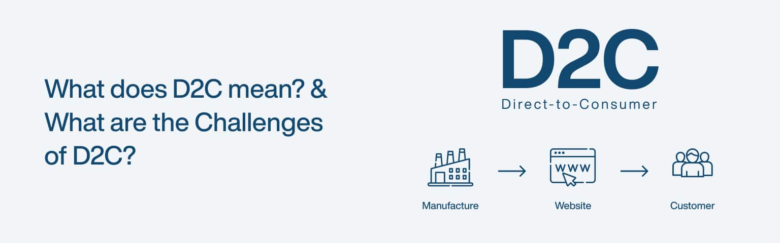
D2C means direct-to-consumer: a business model where a brand sells its products straight to customers through its own channels, cutting out wholesalers and retailers. Everything from marketing to the sale to customer support happens directly between the brand and the buyer, usually through the brand’s own website and social media. The brand owns the relationship, the data, and the experience end to end, instead of handing those off to a retail middleman.
Key Takeaways
US D2C ecommerce sales are projected to reach about $239.75 billion in 2025, roughly 19% of all US retail ecommerce (eMarketer, 2025).
D2C gives brands control, higher margins, and a direct customer relationship.
The hardest challenge is customer acquisition: without a retailer’s foot traffic, you pay to reach every buyer.
Winning at D2C comes down to a strong owned channel, efficient marketing, and reliable logistics.
The model isn’t new, but ecommerce and digital advertising turned it from a niche into a mainstream channel. Brands that once depended entirely on shelf space in someone else’s store can now reach buyers directly, and the numbers show how big that shift has become, though growth has matured rather than exploded: D2C’s share of US ecommerce has plateaued at just under 20% (eMarketer, 2025). This guide explains the model, its benefits, the genuine challenges, and how to handle them, and it pairs well with our guide to launching a profitable online store.
D2C or DTC? A quick note on the terminology
D2C and DTC mean exactly the same thing, direct-to-consumer, and the two abbreviations are used interchangeably. “D2C” uses the numeral “2” as shorthand for “to” (the same convention as B2B or B2C), while “DTC” spells the initials out. There’s no difference in meaning; which one a company uses is just style preference, and you’ll see both across the industry, sometimes in the same article. If you’re searching or optimising content, it’s worth including both forms, since customers and partners use each. Throughout this guide we use D2C, but everything applies equally to anything labelled DTC.
How does the D2C model work, and who uses it?
The D2C model works by collapsing the supply chain so the brand handles production, marketing, sales, and fulfilment itself, reaching the customer through its own store rather than a retailer. That direct line is the whole point: it gives the brand control over branding and pricing, and it captures customer data that would otherwise sit with the retailer.
Three traits define a D2C brand. It sells without intermediaries, shipping directly to the buyer. It builds its presence online first, through its website, social media, and digital advertising. And it uses the direct relationship to personalise the experience, tailoring recommendations and marketing to what it learns about each customer.
The brands that pioneered this are now household names, and their trajectories show how far the model has come.
Brand
Category
Status today
Warby Parker
Eyewear
Publicly listed (NYSE: WRBY) since 2021
Dollar Shave Club
Grooming
Sold by Unilever to Nexus Capital in 2023
Glossier
Beauty
Private; now also sells via Sephora
Lenskart
Eyewear
Publicly listed in India (2025)
Mamaearth
Personal care
Parent Honasa Consumer is publicly listed (2023)
The pattern is telling: several of the brands that proved the D2C model have since gone public or expanded into wholesale and retail. Pure direct selling got them started; scale often meant adding channels, not replacing the direct one.
What are the benefits of going direct-to-consumer?
The benefits of D2C are control, higher margins, a direct customer relationship, and the flexibility to move fast. Each comes from owning the channel instead of renting space in someone else’s.
Control comes first: you decide how your brand looks, how products are presented, and what the buying experience feels like, with consistency across every touchpoint. Margins improve because cutting out wholesalers and retailers means more of each sale stays with you, money you can reinvest in product or growth. The direct relationship may be the most valuable benefit of all, because you collect first-party data on what customers actually want and can act on it, which is increasingly important as third-party tracking disappears. And flexibility follows: without a retailer’s calendar and constraints, you can launch, test, reprice, and pivot on your own schedule.
These advantages are why so many brands build their own store rather than relying only on marketplaces. A well-built site is the foundation that makes the rest possible, which is where our guide to ecommerce website design comes in.
What are the biggest challenges of the D2C model?
The biggest challenge of D2C is customer acquisition: without a retailer’s built-in foot traffic, you pay to reach every single buyer, and those costs keep rising. The same directness that gives you control also means you carry every job a retailer used to do, and acquisition is the hardest of them.
Five challenges recur across D2C brands:
Marketing and customer acquisition. You have to find and convince every customer yourself, mostly through paid digital channels whose costs trend upward. This is the defining D2C challenge, and the one that sinks brands whose unit economics can’t absorb it.
Logistics and supply chain. You own fulfilment, shipping, returns, and inventory, which is operationally heavy and unforgiving of mistakes.
Customer service. Support sits with you directly, and buyers expect fast, helpful answers, which gets harder as you grow.
Scalability. Growing while keeping quality and experience consistent takes planning and investment, not just more orders.
Competition. The space is crowded, so standing out demands a genuinely distinct product or story, not just a nice website.
None of these is a reason to avoid D2C; they’re the work the model asks of you in exchange for its advantages. The brands that struggle are usually the ones that underestimated acquisition cost.
How do you overcome D2C challenges?
You overcome D2C challenges by making your owned channels efficient, diversifying how you acquire customers, and investing in the operations behind the sale. The goal is to lower the cost and friction of each part of the model that a retailer used to handle for you.
On acquisition, don’t rely on a single paid channel. Combine content and SEO for durable organic traffic, social and influencer marketing for reach, and paid ads for speed, so you’re not fully exposed to rising ad prices; our SEO services approach exists to build that lower-cost organic foundation.
On the operational side, use reliable fulfilment partners and inventory software early, before manual processes break under volume, and set clear support policies with a CRM so every interaction is informed and consistent. Plan growth in stages and automate repetitive work so quality holds as you scale. And on competition, lead with what makes you genuinely different, the product, the values, or the story, rather than competing on price alone. For inspiration on how strong direct brands present themselves, our roundup of the best ecommerce store examples is a useful reference.
What technology does a D2C brand need?
A D2C brand runs on a stack of tools, and because you own the whole customer journey, you own the technology behind it too. The good news is that modern platforms make most of it accessible without a large engineering team.
The core pieces are:
An ecommerce platform. The hub of the business, a hosted platform like Shopify or BigCommerce for most brands, or a headless/custom build for those needing deep customisation at scale. The store, checkout, and product data live here, and our guide to ecommerce website design covers getting it right.
Payments and checkout. A reliable payment processor and a frictionless, mobile-first checkout, the single biggest place D2C sales are won or lost.
Customer data and CRM. Because the direct relationship and its first-party data are D2C’s biggest advantage, a CRM and analytics to capture and act on customer behaviour are central, not optional.
Email and marketing automation. An owned channel (email, increasingly SMS) to turn one-time buyers into repeat customers, plus the ad and analytics tools to acquire them efficiently.
Logistics and inventory. Inventory management and fulfilment software, and as you grow a third-party logistics (3PL) partner, to handle the operational load the model puts on you.
The aim is an integrated stack where these tools talk to each other, so customer data flows from the store into your marketing and back. Start with a solid platform and add tools as real needs appear, rather than over-buying software before you have the orders to justify it.
What’s the future of D2C?
The future of D2C is steadier and more omni-channel than its early hype suggested: growth has matured, with the model settling at just under 20% of US ecommerce rather than racing past it (eMarketer, 2025). The opportunity is still large, but the easy land-grab phase is over, and the winners are brands that run the model efficiently.
Two shifts shape what comes next. First, AI and better data analytics make personalisation and demand forecasting sharper, which helps with both acquisition efficiency and inventory. Second, the most successful direct brands increasingly add channels, wholesale, marketplaces, and physical retail, rather than staying purely direct, using D2C as the core of a wider mix. For new brands, that means treating your own store as the hub of the relationship while staying open to the channels that extend your reach.
Frequently asked questions
B2C (business-to-consumer) describes any business selling to individual consumers, including through retailers and marketplaces. D2C (direct-to-consumer) is a subset of B2C where the brand sells straight to the customer with no intermediary. So all D2C is B2C, but not all B2C is D2C: a cereal brand sold in supermarkets is B2C; the same brand selling through its own website is operating D2C. The distinction matters because the direct model changes who owns the customer relationship and the data.
No. While digitally native brands popularised D2C, established and legacy brands now run major direct channels too, often selling alongside their retail and wholesale presence. The model is a way of reaching customers, not a type of company. Large traditional manufacturers have built direct stores to capture margin and data, and many of the original D2C startups have since added wholesale, so the line between “D2C brand” and “brand with a D2C channel” has blurred.
It varies widely with the product and ambition, from a few thousand for a simple store and small inventory to far more for a product needing development, manufacturing, and stock. The recurring cost that surprises founders most isn’t the store, it’s customer acquisition: paid advertising to reach buyers, repeated for every sale. Budget realistically for marketing, not just for the website and product, and validate demand before committing to large inventory.
Because a retailer’s store comes with built-in foot traffic, and your website doesn’t. When you sell through a shop, the retailer’s location and reputation bring shoppers past your product. Direct, you start with no audience and pay, mostly through digital ads whose costs keep climbing, to reach each one. That makes your customer acquisition cost the number that decides whether the model works, which is why efficient organic channels like SEO and content matter so much for D2C margins.
Final thoughts
D2C means selling directly to your customers, and its appeal is real: control over your brand, better margins, and a direct relationship with the people who buy from you. But the model hands you every job a retailer used to do, and the hardest of those is acquiring customers in a crowded market where ad costs keep rising. That’s the trade at the heart of going direct.
Treat your own store as the centre of the relationship, build efficient organic channels so you’re not fully dependent on paid ads, and invest in the logistics and service behind the sale. Do that, and the direct model’s advantages start to outweigh its costs. To build the foundation it all rests on, see our guides to ecommerce website design and launching a profitable online store.
Affiliate marketing is a performance-based model where you earn a commission for promoting another company’s products: you share a unique tracking link, and when someone buys or signs up through it, you get paid. You sit between the buyer and the seller, getting rewarded for sending qualified customers their way. The merchant gains a sale they might not have made; you earn a cut for making the introduction. No inventory, no fulfilment, no customer service, just promotion that’s tracked back to you.
Key Takeaways
US affiliate marketing spending is projected to top $12 billion in 2025, up from $10.72 billion in 2024 (EMARKETER, 2025).
On Cyber Monday 2024, affiliates and partners drove 20.3% of US online revenue (Adobe Analytics, 2024).
Pick a niche you know, join reputable programs, and create genuinely useful content around them.
US law requires you to clearly disclose affiliate links (FTC).
Affiliate marketing has become a core part of how products get sold online, and the spend behind it keeps growing. For beginners it’s one of the lowest-cost ways to start earning online, because the merchant carries the product and you only need an audience and useful content. This guide covers how it works, how to choose programs, how to build a strategy that converts, and how to stay on the right side of disclosure rules.
How does affiliate marketing work?
Affiliate marketing works through tracked links and a defined commission structure: you join a program, get a unique link for the products you promote, and earn whenever someone takes the agreed action through that link. The program uses cookies or other tracking to attribute the sale to you, then pays out on its own schedule, usually monthly once you clear a minimum threshold.
There are four parties in the model:
Merchants create or sell the product and run the program. They gain sales and exposure without paying upfront for marketing.
Affiliates (you) promote the products and earn commission on results.
Customers buy through the affiliate’s link, usually without paying any more than they otherwise would.
Networks connect merchants and affiliates, handling tracking, payments, and reporting.
Commissions come in three main shapes. Pay-per-sale pays a percentage of each purchase and is the most common. Pay-per-lead pays a fixed amount for an action like a signup or free-trial start. Pay-per-click, now rare, pays for traffic regardless of whether it converts. Most beginner-friendly programs are pay-per-sale, so your earnings track directly to the purchases you drive. The model rewards relevance and trust: affiliates whose audiences convert well, like influencers, can outperform broad social promotion by a wide margin (Adobe Analytics, 2024).
How do you choose the right affiliate program?
You choose an affiliate program by matching it to your audience and checking three things: commission terms, reputation, and product relevance. A high commission on a product your audience won’t buy earns nothing, so relevance comes first, then the economics, then the program’s reliability.
Programs come in two types. In-house programs are run directly by a brand (Shopify, Bluehost, and many SaaS companies offer their own). Networks aggregate many merchants under one roof, so you apply once and access many programs. The big networks have shifted recently, so make sure your information is current: CJ Affiliate (formerly Commission Junction), Awin, Impact, and ClickBank are the major players, and ShareASale has now merged into Awin, with its standalone platform closed in October 2025. Amazon Associates remains the easiest starting point for physical products, though its category commission rates are modest.
When comparing programs, weigh:
Factor
What to check
Why it matters
Commission terms
Rate, cookie window, payout threshold
Decides what you actually earn
Reputation
Reviews from other affiliates, payment history
Confirms you’ll get paid on time
Relevance
Fit with your niche and audience
Drives whether anyone converts
Recurring vs one-off
Subscription products pay repeatedly
Recurring commissions compound
Rates vary widely by category: physical products often pay in the low single digits to around 10%, while digital products, courses, and SaaS frequently pay 20% to 50% or more, sometimes recurring. Anchor your expectations on the program’s published schedule rather than aggregated blog estimates.
What commission rates can you expect by niche?
Commission rates vary widely by niche, and knowing the rough ranges helps you set realistic expectations and choose where to focus. These are typical ranges, not guarantees, every program sets its own rate, so always check the published terms, but the pattern across categories is consistent.
Digital products, software, and SaaS: the highest, often 20–50% and frequently recurring (you keep earning while the customer stays subscribed), because the marginal cost of a digital sale is low.
Finance and insurance: often large flat payouts per qualified lead or signup, since customer lifetime value is high, though approval and compliance requirements are stricter.
Health, wellness, and beauty: typically mid-range, often around 10–30% depending on the brand and whether it’s a subscription.
Fashion and apparel: usually lower, often in the 3–15% range, reflecting thinner retail margins, though volume and frequent repeat purchases can offset the rate.
Physical goods via large marketplaces (e.g. Amazon Associates): generally the lowest, low single digits to around 10% by category, but easy to start and broad in selection.
The takeaway isn’t to chase the highest rate, it’s to weigh rate against how well the product fits your audience and how often they’ll buy. A 5% commission on something your audience buys repeatedly can beat a 40% commission on something they never click, and recurring commissions (common in SaaS) compound, so prioritise them where they fit your niche.
How do you build an affiliate marketing strategy?
You build an affiliate strategy by picking a focused niche, creating content that genuinely helps your audience, and optimising it so people can find it. The order matters: niche first, because it determines who you’re talking to and which products fit; content second, because it’s what earns trust and clicks; and SEO third, because it’s what brings a steady audience without paying for every visit.
Choose a niche you know or care about, narrow enough to build authority but broad enough to have buyers and programs to promote. Use keyword research and tools like Google Trends to confirm there’s real demand and manageable competition, and check that decent affiliate programs exist in the space before committing.
Then create content that earns the click. The formats that convert in affiliate marketing are the ones that help someone decide: honest reviews, how-to guides, comparison articles (“X vs Y”), and tutorials that show a product solving a real problem. Place your links naturally inside genuinely useful content, not bolted onto thin posts. Be transparent about what you recommend and why, because credibility is the asset that makes affiliate income durable. To bring a steady audience to that content without paying for every visitor, lean on search: optimise titles and headings for the terms buyers actually search, keep pages fast and mobile-friendly, and build authority over time, which is exactly what our SEO services approach is built around.
How do you promote affiliate products and track results?
You promote affiliate products through content, social media, and email, then track clicks, conversions, and earnings to see what’s working. The channels reinforce each other: content gives you something worth sharing, social and email distribute it, and tracking tells you where to focus next.
On distribution, a blog with reviews and guides is the durable core, because it keeps earning from search long after you publish. Video (demonstrations, unboxings, tutorials) converts well because it shows the product in use. Social media extends reach, and an email list is the channel you actually own, ideal for sharing recommendations directly with people who asked to hear from you. Match the channel to where your audience already is rather than trying to be everywhere.
On measurement, watch four numbers: click-through rate (are people clicking your links?), conversion rate (are clicks turning into sales?), earnings per click (how profitable is each click?), and return on investment (is your effort or ad spend paying off?). These tell you which content, products, and channels deserve more attention and which to drop. Treat affiliate marketing as a loop: promote, measure, double down on what converts, and cut what doesn’t.
Which platform should you promote on (blog, YouTube, Instagram, email)?
The best platform for affiliate promotion is the one where your audience already is and where your content can show a product helping, and each major channel has a distinct strength. Most successful affiliates anchor on one and use the others to feed it.
Blog or website: the durable core, because search traffic keeps finding your reviews and guides long after you publish, and you own the channel. Best for in-depth reviews, comparisons, and how-to content, and the least exposed to algorithm changes. It pairs directly with the SEO services approach that brings steady free traffic.
YouTube: the strongest for converting considered purchases, because video shows the product in use, demonstrations, unboxings, and tutorials build trust that text can’t, with links in the description.
Instagram (and TikTok): best for discovery and visual or lifestyle products, through Stories, Reels, and link stickers. Reach is high but links are limited, so it works best driving people to a blog or a link hub.
Email: the highest-converting channel you fully own, ideal for sending recommendations to people who asked to hear from you. Build the list from your blog or video audience, then nurture it.
Match the channel to your content strengths and your niche, then cross-feed: a blog review embedded in a YouTube video and shared to an email list reaches the same buyer three ways. Whatever you choose, the FTC disclosure rule applies on every channel, so disclose clearly wherever the link appears.
Frequently asked questions
Realistically, very little at first and then it compounds. Early on you’re building an audience and content, so income is small or zero for months. As your traffic and trust grow, earnings can scale meaningfully, especially with recurring-commission products. The honest framing is that affiliate marketing rewards patience: the affiliates earning real money built an audience first. Treat it as a long-term asset you grow, not a quick payout, and reinvest early effort into content and SEO that keep working for you.
Yes. In the US the FTC requires you to disclose any material connection, including affiliate commissions, clearly and conspicuously, placed right with the recommendation (FTC). A vague label like “affiliate link” tucked away isn’t enough; plain wording such as “I earn a commission from purchases made through links in this post” is the safe approach. Beyond the legal requirement, clear disclosure builds the trust that makes your recommendations convert, so it helps you as well as protecting you.
No, but it helps a lot. You can promote through social media, video, or email without one, and many affiliates start that way. A website gives you something you own and control, ranks in search to bring steady free traffic, and hosts the reviews and guides that convert best, so most serious affiliates build one. If you start on social or video, treat a simple content site as the next step once you know your niche works, since it’s the channel least exposed to algorithm changes.
Usually months, not days. You need an audience before commissions follow, and building one through content and SEO takes time, commonly several months before meaningful income, then growth accelerates as your library of content compounds. Programs that pay recurring commissions speed this up, because each sale keeps paying. Anyone promising fast affiliate riches is selling something; the durable version is a slow build that turns into a real income stream once your content and audience reach critical mass.
Final thoughts
Affiliate marketing is one of the most accessible ways to earn online, because the merchant carries the product and you focus on what you’re good at: building an audience and creating content that helps them decide. The spend flowing through the channel keeps growing, and affiliates with relevant, trusted audiences capture a real share of online sales.
Start narrow: pick a niche you understand, join reputable programs, create genuinely useful reviews and guides, and bring traffic through search rather than paying for every visit. Disclose your links clearly, measure what converts, and give it the months it needs to compound. For the organic-traffic foundation that makes affiliate content pay off, see our SEO services approach.
Instagram vs. Facebook: which is better for marketing?
Neither platform is universally better; the right choice depends on your audience’s age and your content. Instagram wins for younger, visually driven audiences and brand building, while Facebook wins for broader reach across older age groups and sophisticated ad targeting. Both run on Meta’s shared advertising system, so the real question isn’t which is stronger, it’s which one your customers actually use and which suits what you have to post.
Key Takeaways
Facebook reaches about 2.39 billion users with ads each month; Instagram reaches about 1.99 billion (DataReportal, 2026).
Instagram skews young: 80% of US 18-29s use it, versus 19% of those 65+; Facebook peaks among 30-49s (Pew Research, 2025).
Marketers rate Facebook highest for ROI (54%), with Instagram second (43%) (Statista via Sprout Social, 2025).
For most businesses a combined approach beats choosing just one.
Both platforms are enormous and both belong to Meta, so you’re not choosing between rival companies, you’re allocating effort between two channels with different strengths. This guide compares them on audience, reach, engagement, content, and advertising, then helps you decide, complementing our wider work on getting found online through SEO services.
The table below summarises how they differ.
Factor
Instagram
Facebook
Core audience
18-34, visually driven
Broad, skews 30+
Monthly ad reach
~1.99 billion
~2.39 billion
Content strength
Photos, Reels, Stories
Text, video, links, Groups
Engagement
Higher per post
Lower, but huge scale
Best for
Brand building, younger reach
Broad reach, ad targeting, community
How do the audiences differ?
The audiences differ most by age: Instagram skews young while Facebook reaches a broader, older spread, which is the single biggest factor in choosing between them. If your customers are teenagers and young adults, Instagram is where they are; if you need to reach people across all age groups, including 40s and up, Facebook’s spread is hard to match.
The data is clear. Among US adults, 80% of 18-29 year-olds use Instagram, falling to just 19% of those 65 and older, while Facebook usage peaks among 30-49 year-olds at 80% (Pew Research, 2025). Overall US adult reach is higher for Facebook (71%) than Instagram (50%), but Facebook is notably weaker with teenagers, who have largely moved to Instagram, TikTok, and YouTube. Instagram also skews slightly female among US adults.
Both platforms are massive in absolute terms. Meta’s family of apps reaches 3.54 billion daily active people on average (Meta, 2025), so neither is short of audience. The decision is about which slice of that audience matches your customers, not which is bigger overall.
Which platform gets more reach and engagement?
Facebook delivers more raw reach, while Instagram delivers higher engagement per post, so the better metric depends on your goal. Facebook’s larger ad audience (about 2.39 billion monthly, versus Instagram’s 1.99 billion) means more potential eyeballs (DataReportal, 2026), but Instagram users interact more actively with the content they see.
On organic reach, both have declined as algorithms prioritise content from friends over brands, and Facebook’s brand reach in particular is now low without paid support. Instagram holds up better for genuinely engaging visual content, though its engagement has softened too: the median Instagram post sees about 0.48% engagement, with carousels (0.55%) and Reels (0.52%) outperforming static images (0.37%) (Socialinsider, 2025). The practical reading is that format matters: video and multi-image posts pull ahead of single photos.
For most brands, organic reach alone won’t carry results on either platform anymore. Both increasingly reward paid promotion, which is where Facebook’s targeting and Instagram’s visual formats each earn their place.
What content works best on each platform?
Instagram rewards polished visual content (high-quality images, Reels, and Stories), while Facebook rewards variety (text, links, video, and community discussion). Matching your content to the platform’s strength is what separates accounts that grow from ones that stall.
On Instagram, lead with strong visuals and short video. Reels drive a large share of time on the platform and reach beyond your followers, Stories keep your regular audience engaged with timely or behind-the-scenes content, and carousels are the highest-engagement feed format. A consistent visual identity and well-chosen hashtags help discovery. If your business is visual, fashion, food, design, travel, fitness, Instagram plays to that directly.
On Facebook, the strength is range and community. It handles text posts, links, long-form video, and external articles in a way Instagram doesn’t, and Facebook Groups remain one of the most effective tools on either platform for building an engaged community around your brand. Live video and Events add real-time and promotional formats. If your strategy depends on sharing links, sparking discussion, or reaching a broad age range with mixed content, Facebook’s flexibility is the advantage.
Which platform offers better advertising and ROI?
Facebook generally offers better advertising value for broad, targeted campaigns, while Instagram delivers strong returns for visually driven brand campaigns, and both run through the same Meta Ads system. Marketers rate Facebook highest for ROI (54%), with Instagram close behind at 43% (Statista via Sprout Social, 2025), which reflects their complementary strengths rather than a clear winner.
Because both platforms share Meta’s targeting and Ads Manager, you can run a single campaign across both and let the system optimise placement. Facebook’s edge is its broad reach and the depth of its targeting and ad formats (Carousel, Video, Lead Ads), which make it cost-effective for reaching defined audiences at scale. Instagram’s edge is immersive visual placements, Story Ads, Feed Ads, and Shoppable Posts, that suit brands whose products sell on how they look, and a large share of Instagram ads now run on Reels. Instagram clicks can cost more, but visual brands often see that repaid in stronger engagement and brand lift.
The practical takeaway: you don’t have to choose your ad platform up front. Run across both through Meta Ads, watch which placements perform for your specific goal, and shift budget toward what works.
How do Facebook and Instagram ad costs compare?
Facebook and Instagram share the same auction and Ads Manager, so their costs move together, but Instagram placements often carry a slightly higher CPM (cost per 1,000 impressions) while Facebook frequently delivers a lower cost per click and cost per result, especially for link-driven campaigns. The reason is competition and intent: Instagram’s visual, younger inventory is in high demand and built for awareness, while Facebook’s broader inventory and link formats convert clicks more cheaply.
Two caveats matter more than any headline number. First, absolute costs vary enormously by industry, audience, country, season, and ad quality, the same campaign can cost very differently in fashion versus B2B, or in Q4 versus January, so any published “average CPM” is only a loose guide. Second, cheaper impressions aren’t the goal; cost per result is. Instagram’s higher CPM is often repaid for visual brands through stronger engagement and brand lift, while Facebook’s cheaper clicks suit direct response and lead generation. Because both run through one auction, the practical approach is to run across both with Advantage+ placements, then read your own cost-per-result by placement and shift budget to whichever delivers, rather than deciding on generic benchmarks.
Where does TikTok fit for under-25 audiences?
If your audience skews under 25, the honest answer is that the Instagram-versus-Facebook question is increasingly a three-way one, because TikTok now competes hard for that age group’s attention. Facebook barely registers with teens, and even Instagram shares its youngest users with TikTok, which has become a primary discovery and short-video platform for under-25s.
For a brand targeting that demographic, the practical reading is: Facebook is rarely the priority, Instagram (especially Reels) remains essential for reaching young adults and for shoppable visual content, and TikTok is worth testing as the discovery engine where younger audiences first find brands. The three aren’t mutually exclusive, short vertical video made for one often works on the others, so many brands repurpose a single clip across Reels, TikTok, and YouTube Shorts. This guide focuses on the two Meta platforms because they share an ad system and are the usual starting decision, but if your customers are Gen Z, treat TikTok as a serious third channel rather than an afterthought.
Which platform suits your business type?
The quickest way to decide is to match the platform to your business type and audience rather than weighing every feature. The table below gives a starting recommendation; treat it as a default to test, not a rule.
Your business
Lead with
Why
Visual product, young audience (fashion, beauty, food, fitness)
Instagram (+ TikTok)
Visual formats and the younger, highly engaged audience
Local service or trade (broad/older audience)
Facebook
Broad local reach, Groups, Events, reviews
B2B / professional services
Facebook (+ LinkedIn off-Meta)
Targeting depth and older decision-makers; Instagram is weak for B2B
Community-driven brand
Facebook (Groups)
Groups are the strongest community tool on either platform
Ecommerce / D2C
Both
Instagram for discovery and shopping, Facebook for retargeting and reach
Content or link publisher
Facebook
Handles links and long-form far better than Instagram
Whatever the starting point, the principle from the rest of this guide holds: confirm with your own audience data, and because both run on Meta Ads, you can run across both and let results refine the split.
Should you use both Instagram and Facebook?
For most businesses, yes: using both lets you reach a wider age range and run more complete campaigns, since they share an ad system and complement each other’s strengths. Rather than an either/or decision, treat them as two channels in one strategy, with content suited to each.
A combined approach works because the platforms cover different audiences and formats from a single Meta account. Use Instagram for visual brand building and reaching younger customers; use Facebook for broad reach, community through Groups, and link-driven content for older audiences. Cross-promote between them, run ads across both through Meta Ads Manager, and use the insights from each to sharpen the other. The main reason to focus on just one is limited time or a sharply defined audience, for example a youth-focused brand that should put its energy into Instagram, or a community organisation whose members live in Facebook Groups. If you can sustain both well, doing so almost always beats picking one.
Frequently asked questions
It depends on your customers and your content, not your size. A visual small business reaching younger buyers (a boutique, a cafe, a fitness studio) will usually do best starting on Instagram. A local service or community-focused business reaching a broad or older audience often gets more from Facebook, especially its Groups and Events. If you’re time-limited, pick the one where your customers clearly are and do it well, rather than spreading thin across both. You can always add the second platform once the first is working.
Yes. Both are owned by Meta, which is why they share an advertising system (Meta Ads Manager), cross-posting tools, and overlapping features. This is an advantage for marketers: you can manage ads for both from one place, run unified campaigns, and let Meta optimise placement across them. It also means audience and ad-targeting data flow between them. So while they’re separate apps with different cultures and strengths, behind the scenes they’re one platform, which makes using both together straightforward.
It’s worth it, but it rarely carries results alone anymore. Both platforms’ algorithms favour content from friends and family over brands, so organic brand reach has declined, more sharply on Facebook than Instagram. Engaging visual content, especially Reels and carousels on Instagram, still earns meaningful organic reach, and Facebook Groups remain strong for organic community engagement. The realistic approach is to build an organic presence for trust and community while using paid promotion to reach beyond your existing followers.
Check your own data and your customers’ demographics. Instagram Insights and Facebook Page Insights both show your followers’ age, location, and active times; Google Analytics shows which social platforms send traffic to your site. Combine that with what you know about your customers: if they’re mostly under 35 and visually engaged, Instagram; if they span a broad or older age range, Facebook. Looking at where similar businesses get the most engagement also helps. Let the data, not assumptions, decide where you focus.
Final thoughts
Instagram versus Facebook isn’t a contest with one winner; it’s a question of fit. Instagram is your platform for younger, visually engaged audiences and brand building, while Facebook gives you broader reach across age groups, deeper community tools, and ad targeting at scale. Both run on Meta’s shared system, so they’re more partners than rivals.
For most businesses the strongest move is to use both, with content matched to each platform’s strengths, while letting your audience data decide where to concentrate. Start where your customers clearly are, measure what converts, and expand from there. To pair your social presence with durable traffic from search, see our approach to SEO services.
What is unused JavaScript, and why does reducing it matter?
Unused JavaScript is code your browser downloads and parses but never actually runs on a given page, and reducing it makes your site load faster, respond quicker, and rank better. Most of that dead weight comes from third-party scripts, large libraries where you use one small feature, and plugins that load their code on every page whether it’s needed or not. The browser still has to fetch, parse, and compile all of it before it can get on with showing your page, so every unused kilobyte is pure cost with no benefit.
Key Takeaways
The median web page ships 558 KB of JavaScript on mobile, and about 206 KB of it (44%) goes unused during load (HTTP Archive Web Almanac, 2024).
Unused JavaScript hurts the most where it counts: it delays interactivity (INP) and slows your largest content paint (LCP).
Removing it improves Core Web Vitals, SEO, bandwidth costs, mobile experience, and security at once.
You find it with Chrome’s Coverage panel and fix it with code splitting, deferral, and removing scripts you don’t use.
About half of the JavaScript on a typical page is doing nothing for the user. That’s not a rounding error, it’s the single biggest, most ignored chunk of waste in front-end performance. This guide explains the concrete benefits of trimming it, then shows you how to find and remove it, building on our wider guide to improving Core Web Vitals.
The table below maps each benefit to why it happens.
Benefit
What changes
Why it happens
Faster loading
Lower LCP
Fewer, smaller files to fetch and parse
Better responsiveness
Lower INP
Less script tying up the main thread
Improved SEO
Stronger Core Web Vitals
Google assesses page experience on field data
Lower bandwidth
Smaller payloads
Fewer bytes transferred per visit
Better mobile performance
Faster on weak devices
Less to download and execute on slow CPUs
Tighter security
Smaller attack surface
Fewer third-party scripts to exploit
How does reducing unused JavaScript speed up loading?
Reducing unused JavaScript speeds up loading because the browser spends less time downloading, parsing, and compiling code before it can render your page. JavaScript is one of the most expensive resources on the web, byte for byte, because unlike an image it has to be parsed and executed, not just decoded. The median mobile page already ships 558 KB of it, and that figure rose 14% in a single year (HTTP Archive Web Almanac, 2024).
The metric most affected is Largest Contentful Paint (LCP), which measures how long until the largest visible element appears, and good is 2.5 seconds or less at the 75th percentile (web.dev). Render-blocking and long-parsing scripts push LCP out because the browser is busy with JavaScript instead of painting content. Cutting the unused portion directly shortens that critical path. If render-blocking is your specific problem, our guide to eliminating render-blocking resources covers the deferral techniques in detail.
Speed isn’t a vanity metric, it’s tied to whether people stay. As mobile page load goes from one second to ten, the probability of a visitor bouncing rises 123% (Think with Google, 2018). Less JavaScript to process is one of the most direct ways to keep that number down.
How does it improve responsiveness and INP?
Reducing unused JavaScript improves responsiveness because less code competes for the browser’s main thread, the single thread that handles both running scripts and reacting to taps and clicks. When that thread is busy evaluating JavaScript, interactions queue up and the page feels laggy. This is measured by Interaction to Next Paint (INP), where good is 200 milliseconds or less; INP replaced the older First Input Delay metric as a Core Web Vital on 12 March 2024 (web.dev).
The mechanism is “long tasks.” Any task that occupies the main thread for more than 50 milliseconds is a long task, and while one runs, the interface can’t respond (web.dev). Interactions during page load are especially vulnerable, because the browser is busy evaluating scripts exactly when a user might first try to tap something. Most unused JavaScript still gets parsed and compiled during load, so it inflates those long tasks even though its functions never fire.
Removing it shortens and breaks up the work, so the main thread is free more often to answer the user. A page can have a perfect LCP and still feel broken if INP is poor, which is why trimming script is one of the highest-impact things you can do for perceived speed.
Does reducing unused JavaScript help SEO?
Yes. Reducing unused JavaScript helps SEO because Google uses Core Web Vitals as a page-experience ranking signal, and the metrics it grades, LCP and INP, are exactly the ones unused script degrades. A faster, more responsive page is more likely to pass the thresholds Google measures on real-user field data, not just lab tests.
There are three connected gains. First, faster pages clear the Core Web Vitals bar, which feeds into rankings. Second, a quick, responsive site keeps visitors engaged, and engagement signals reinforce that your page satisfied the query. Third, lighter pages are cheaper for search bots to crawl and render, so your important content gets indexed more reliably. None of these is a magic ranking lever on its own, but together they remove a real handicap. If you want to measure where you stand before changing anything, our guide to reading your site’s speed with Core Web Vitals walks through the tools.
What are the other benefits: bandwidth, mobile, and security?
Beyond speed and SEO, reducing unused JavaScript lowers bandwidth costs, improves mobile performance, and shrinks your security attack surface. These follow from the same root cause: less code shipped means less to transfer, less to execute, and fewer places for things to go wrong.
On bandwidth, every visit transfers smaller files, which matters at scale for your hosting bills and for visitors on metered mobile data. On mobile performance specifically, the gains are amplified because phones have slower CPUs and less stable connections than desktops, so the parse-and-execute cost of JavaScript hits hardest there, precisely where most of your traffic now is. On security, much unused JavaScript arrives via third-party scripts and dependencies, each of which is a potential entry point; removing what you don’t use cuts the number of moving parts an attacker could exploit and the number of packages you have to keep patched. Cleaner dependencies also mean simpler maintenance, fewer bugs to chase, and faster updates.
How do you find and remove unused JavaScript?
You find unused JavaScript with Chrome DevTools’ Coverage panel and remove it through code splitting, deferral, and cutting scripts you don’t need. The workflow is measure, then act, then re-measure, so you’re fixing real waste rather than guessing.
To find it, open Chrome DevTools, run the Coverage tool, and reload the page. It reports each script’s unused bytes as a red-and-green bar, showing exactly which files ship code the page never runs. Lighthouse and PageSpeed Insights also flag “Reduce unused JavaScript” with the specific files and estimated savings.
To remove it, work through these in order:
Audit your plugins and third-party tags. On most sites the biggest culprits are analytics, chat widgets, and plugins that load their scripts site-wide. Remove what you don’t use and load the rest only on pages that need them.
Use code splitting. Break large bundles so each page loads only the code it actually uses, instead of one giant file for the whole site. Modern build tools (Webpack, Vite, and most frameworks) support this directly.
Defer and lazy-load. Add defer or async to non-critical scripts, and load below-the-fold or interaction-triggered code only when it’s needed, not during the initial render.
Tree-shake your dependencies. Tree shaking removes unused exports from libraries at build time. Importing one helper from a large utility library shouldn’t ship the whole thing.
Re-measure in the field. After each change, confirm the lab improvement in PageSpeed Insights, then watch your field data over the following weeks to confirm it for real users.
Done in this order, you get the largest wins first (usually the plugin and third-party audit) before spending effort on build-tooling refinements.
How do you audit unused JavaScript on WordPress, Shopify, and WooCommerce?
The biggest sources of unused JavaScript are usually platform-specific, so where you look depends on what you run. The method is the same everywhere, use Chrome’s Coverage panel to see which scripts go unused, then trace each back to its source, but the usual culprits differ.
WordPress: plugins are the prime offender. Many load their CSS and JS on every page, even ones that don’t use them (a contact-form or slider script running site-wide). Audit your active plugins, remove what you don’t need, and use a performance plugin (or an asset-manager like Asset CleanUp or Perfmatters) to stop plugin scripts loading where they aren’t used.
Shopify: the weight comes from the theme and installed apps. Each app often injects its own script into every page through the theme; remove apps you no longer use (uninstalling doesn’t always strip leftover code, so check the theme for orphaned snippets), and prefer apps that load only on the pages they serve.
WooCommerce: it loads cart, checkout, and WooCommerce scripts on all pages by default, even your blog. Restrict those scripts to the store pages that actually need them, and audit extensions the same way as WordPress plugins.
The common thread is conditional loading: ship each script only where it’s used. Because so much of this dead weight arrives via third-party tools, pair this with the tactics below and our guide to minimising third-party impact.
How do you manage third-party scripts (tag managers, chat widgets)?
Third-party scripts, analytics, tag managers, chat widgets, and ad pixels, are often the largest chunk of unused JavaScript, because they load on every page and you don’t control how efficiently they’re written. Managing them deliberately is usually the single biggest win.
A few habits keep them in check. Audit your tag manager (Google Tag Manager and similar) and remove tags for campaigns, pixels, and tests that are no longer live, since containers accumulate dead tags over time. Load heavy widgets only when needed: a chat widget or video embed can use a lightweight “facade”, a placeholder that loads the real script only when the user clicks it, so it costs nothing on first load. Defer non-essential third-party scripts so they run after the page is interactive, and scope each tag to fire only on the pages where it’s needed rather than site-wide. Anything stable you can safely self-host removes an external connection too. Our dedicated guide to minimising third-party impact covers the auditing, facades, and performance-budget approach in full.
Frequently asked questions
A lot, unfortunately. At the median, mobile pages ship 558 KB of JavaScript and around 206 KB of that, about 44%, goes unused during load (HTTP Archive Web Almanac, 2024). So roughly half being unused is typical, not exceptional. That’s why it’s worth auditing: most sites have a meaningful amount to cut, and the heaviest pages carry far more. Treat anything PageSpeed Insights flags under “Reduce unused JavaScript” as a starting list rather than an edge case.
It can if you remove code that’s used on some pages but not the one you tested, so change carefully. Unused on one page doesn’t mean unused everywhere. The safe approach is to load scripts only where they’re needed rather than deleting them outright, test interactive features after each change, and lean on code splitting and conditional loading instead of blanket removal. Deferring non-critical scripts is lower-risk than deleting, and gives most of the speed benefit.
Unused JavaScript is code that downloads but never runs; render-blocking JavaScript is code that stops the browser from displaying the page until it has loaded and executed. They overlap but aren’t the same: a script can run (so it’s “used”) yet still block rendering, and unused code adds parse cost even when it isn’t render-blocking. You handle unused code by removing or splitting it, and render-blocking code by deferring it, as our guide to eliminating render-blocking resources explains.
Chrome DevTools’ Coverage panel is the most direct: it shows unused bytes per file as you load and interact with a page. Lighthouse and Google PageSpeed Insights both run a “Reduce unused JavaScript” audit that lists the offending files with estimated savings, and PageSpeed Insights adds real-user field data so you can see whether a fix improved things for actual visitors. Start with PageSpeed Insights for the headline issues, then use Coverage to pinpoint exactly which code to cut.
Final thoughts
Reducing unused JavaScript is one of the highest-impact, lowest-glamour performance wins available, because about half the script on a typical page is doing nothing while still costing you load time, responsiveness, bandwidth, and security exposure. The benefits all trace back to one idea: ship less code, and the browser has less to download, parse, and run before it can serve your visitor.
Start by measuring, audit your plugins and third-party scripts first since they’re usually the biggest offenders, then split, defer, and tree-shake what remains, confirming each change in the field. For the full performance picture and the metric-by-metric fixes, pair this with our guide to improving Core Web Vitals.
WebP is a Google-developed image format that produces files roughly 26% smaller than PNG at the same quality, with full transparency support and 96.39% browser coverage in 2026 (Can I Use, 2026). Use WebP as your default web image format. Keep PNG only when you need pixel-perfect screenshots, you’re serving very old browsers, or you’re inside a design tool that doesn’t export WebP yet. For new builds in 2026, also consider AVIF, which now has 95-98% browser support and beats WebP by another 20-30% on file size for the same visual quality.
Key Takeaways
WebP lossless images are about 26% smaller than PNG at equivalent quality (Google for Developers, 2025).
WebP browser support reached 96.39% globally in 2026, including 99%+ on mobile (Can I Use, 2026).
WebP now accounts for roughly 35-40% of all image bytes served on the web; AVIF takes another 8-10% and JPG is sliding toward 40% (HTTP Archive Web Almanac, 2025).
PNG still wins for screenshots with sharp text, design files needing pixel-perfect fidelity, and the small set of users on browsers older than IE11.
What is WebP and why did Google build it?
WebP is an image format Google launched in 2010 to reduce the file size of web images without giving up visual quality. It supports both lossless compression (about 26% smaller than PNG at the same quality) and lossy compression (up to 3x smaller than PNG for the same visual quality), plus alpha transparency and animation (Google for Developers, 2025). The format was designed for the web from day one, which is why it now dominates production image pipelines on most modern CMS platforms.
The practical implication is bandwidth. A WordPress site with 200 product images at 500KB each in PNG ships ~100MB to every visitor who hits a category page. The same images in WebP ship ~25MB. That’s a 75MB difference on every page view, which compounds across Core Web Vitals (faster Largest Contentful Paint), bounce rate, and SEO ranking.
What is PNG and where does it still win?
PNG (Portable Network Graphics) is a lossless raster format that’s been the web’s go-to for transparent and screenshot images since 1996. According to the PNG Wikipedia entry, it was designed as an open replacement for GIF and has been supported by every major browser since 2001.
PNG still beats WebP in three specific situations:
Screenshots and UI mockups with sharp text. PNG’s lossless compression preserves anti-aliased edges perfectly. WebP lossless does too, but design tools (Figma, Sketch) and screenshot utilities (CleanShot, ShareX) still default to PNG and often offer better PNG export pipelines.
Pixel-perfect design handoff. Brand assets, icon libraries, and design system tokens almost always live as PNG because the format is universally supported by every image editor, every QA tool, and every legacy workflow on a designer’s machine.
Sub-1% legacy browsers. A handful of enterprise and government workflows still use IE11 or older. If your traffic includes a meaningful share of those (rare in 2026), PNG is the safe default. For everyone else, a <picture> element with WebP first and PNG fallback covers the gap with zero downside.
WebP vs PNG: side-by-side comparison
The table below maps the differences that actually affect day-to-day decisions. Numbers come from Google’s WebP compression study, HTTP Archive’s 2025 Web Almanac, and Can I Use’s browser support tracker.
The headline number to remember: WebP is 26% smaller than PNG at the same lossless quality, and it’s supported by 96%+ of browsers. For greenfield builds in 2026, there’s almost no reason not to default to it.
When should you use WebP, and when does PNG still make sense?
Use WebP for almost every image on a public website. Use PNG only when a specific constraint forces it.
Use WebP when
You’re shipping photography, product images, hero banners, or thumbnails on a site where page speed affects revenue. The 26%-to-3x file-size saving translates directly to faster Largest Contentful Paint and lower bounce rates.
You’re optimising for mobile traffic, which is now 60%+ of all web traffic globally. Mobile bandwidth is the bottleneck WebP was built to solve.
Your CMS (WordPress, Shopify, Ghost, Squarespace) supports WebP natively. All major platforms have since 2021.
You want a single format that handles transparency, animation, and both lossy/lossless modes without juggling PNG, JPEG, and GIF separately.
Use PNG when
The image is a screenshot or UI mockup where pixel-perfect text rendering matters. PNG’s lossless mode and design-tool tooling are still better here.
You’re delivering brand assets, logos, or design system files to a third party (an agency, a printer, a legacy CMS) where WebP support isn’t guaranteed downstream.
You need genuine universality across every browser ever shipped. For internal tools serving regulated industries, IE11 and older clients still matter occasionally.
You’re storing source-of-truth files for design handoff. PNG is the safer archival format because every image editor opens it without conversion.
The framework: WebP for end users, PNG for designers and edge cases.
How do you convert PNG to WebP without losing quality?
The fastest path depends on whether you’re converting once or building a pipeline.
One-off conversion (1-50 images)
Squoosh (squoosh.app) is Google’s browser-based image optimiser. Drag a PNG in, pick WebP, set quality to 80-90 for lossy or use lossless mode, download. Free and no upload required.
TinyPNG (tinypng.com) handles both PNG optimisation and WebP conversion. Better as a PNG optimiser than a WebP converter, but solid for batch work.
ImageOptim (imageoptim.com) is a free Mac utility that batch-converts and optimises images locally.
Pipeline conversion (100+ images or automated)
cwebp command line. Google’s reference encoder. Install via brew install webp on Mac. Convert with cwebp -q 80 input.png -o output.webp. Use -lossless for pixel-perfect output, -near_lossless 60 for a good compromise.
Sharp (Node.js). Production-grade image processing library used by Next.js, Nuxt, Astro, and many CDNs internally. sharp(input).webp({ quality: 80 }).toFile(output).
WordPress + ShortPixel / Smush / EWWW. Plugin-based conversion that runs on upload. ShortPixel and Imagify are the two most reliable for high-volume sites in 2026.
Cloudflare Images, Cloudinary, Imgix. SaaS image CDNs that handle WebP delivery, AVIF fallback, and responsive sizing automatically. Right choice for sites with thousands of images.
For most WordPress sites, a single plugin (ShortPixel or Imagify) plus the WebP Express plugin for <picture> fallback covers the entire pipeline in an afternoon.
What about AVIF? Should you skip WebP entirely?
AVIF is the next-generation image format that beats WebP by another 20-30% on file size at the same quality, with HDR and wide-gamut colour support that neither WebP nor PNG can match. AVIF browser support reached roughly 95-98% globally in 2026, depending on the country and device mix (Can I Use, 2026).
Format
File size vs PNG
Browser support 2026
Best for
PNG
Baseline
99.9%
Screenshots, design files
WebP
~26% smaller (lossless), up to 3x (lossy)
96.39%
Web default in 2026
AVIF
~50% smaller than WebP at equal quality
95-98%
Photography, hero images, sites where the saving matters
The practical 2026 pattern: serve AVIF as the primary, WebP as the first fallback, PNG or JPG as the universal fallback. Most production CDNs (Cloudflare Images, Cloudinary, Bunny.net) handle this automatically. The <picture> element makes it trivial to do by hand:
“`html
“`
Should you skip WebP entirely and go straight to AVIF? Not yet for most sites. WebP encodes 5-10x faster than AVIF, has slightly broader browser support, handles animation more reliably, and is supported by every major CMS plugin. For a 2026 build that prizes simplicity, WebP-only is still the pragmatic default. For a 2026 build that prizes the best possible performance, AVIF-with-WebP-fallback is the optimal stack.
What does WebP do to SEO and Core Web Vitals?
Image weight is one of the two biggest contributors to Largest Contentful Paint (LCP), Google’s primary Core Web Vitals metric for loading performance. According to Google’s PageSpeed Insights documentation, LCP should land under 2.5 seconds for a “good” rating, and images are the LCP element on roughly 70-80% of web pages.
Switching the hero image and above-the-fold images from PNG to WebP typically:
Reduces LCP by 0.5-1.5 seconds on mobile, depending on connection speed and image weight
Cuts total page weight by 30-60% on photo-heavy templates
Improves bounce rate by 5-15% on mobile (the magnitude varies by category)
These are direct ranking inputs in Google’s algorithm. Faster pages rank higher for competitive queries, all else equal. For pages where image weight is the LCP bottleneck (most e-commerce category pages, most blog posts with hero images), the switch from PNG to WebP is a single-day project with measurable SEO impact.
Yes for 96%+ of users in 2026 (Can I Use, 2026). The remaining 4% is mostly old enterprise browsers (IE11 and older Edge versions). A single <picture> element with WebP primary and PNG fallback covers 100% of users at no extra page weight (the browser only downloads one format).
Yes. WordPress added native WebP support in version 5.8 (July 2021). The Media Library accepts WebP uploads directly, and themes display WebP images without changes. For automatic on-upload conversion from PNG/JPG to WebP, use ShortPixel, Imagify, or EWWW Image Optimizer.
No. WebP is a web format. For print or any high-resolution archival use, stick with PNG (for graphics with transparency) or TIFF/PSD (for photography). The web/print distinction is the most common confusion, but the formats serve genuinely different purposes.
Not directly. Google penalises slow pages, and PNG-heavy pages are usually slow. The penalty for not using WebP is the LCP delay it causes; switch to WebP and the symptom disappears. There’s no specific “non-WebP penalty.”
No. Keep PNG originals as source files in your design system or CMS Media Library, and serve WebP to users via the conversion plugin or CDN. The WebP version is a delivery format; the PNG (or layered PSD/AI) is the source of truth.
What this means in practice
For any public-facing website in 2026, WebP is the default image format. PNG belongs in three places: design source files, screenshots with sharp text, and the small set of pages that genuinely need IE11 compatibility. The conversion path is well-trodden: install a CMS plugin (ShortPixel, Imagify, EWWW), enable on-upload conversion, and use <picture> for the rare PNG fallback. Total work is a single afternoon for most WordPress sites, and the page-speed payoff shows up in Search Console within 30 days.
For new builds in 2026, the conversation has already moved on. AVIF is the next stop, with WebP as the safer fallback during the toolchain catch-up. The teams who switched from PNG to WebP in 2022-2024 are now layering AVIF on top, not reconsidering the decision.
You convert WebP to PNG in one of three ways: an online converter, your computer’s built-in image apps, or a command-line tool, depending on how many files you have and how often you do it. WebP and PNG are both common web image formats, but PNG has broader support in older software and tools (MDN). The quickest option for a single file is an online converter or your operating system’s built-in image viewer; for many files at once, the command line is fastest.
Key Takeaways
You can convert WebP to PNG online, with built-in apps like Preview (Mac) or Paint (Windows), or via the command line.
WebP is a Google format that’s often 25 to 34% smaller than JPEG, which is why sites use it (Google).
PNG is a lossless format with universal support and transparency, making it ideal for editing and compatibility (MDN).
Converting WebP to PNG usually increases the file size, because PNG is lossless and less compressed.
For many files, a command-line tool like ImageMagick converts them in one batch (ImageMagick).
This guide walks through each conversion method step by step, then explains what to watch out for and when each format is the right choice. It’s a companion to our wider guide on choosing the right image file type.
What is WebP?
WebP is an image format developed by Google that supports both lossy and lossless compression, transparency, and animation, designed to make web images smaller without losing visible quality (Google). Google’s own figures put lossy WebP at roughly 25 to 34% smaller than comparable JPEG files, and lossless WebP around 26% smaller than PNG.
That size advantage is why WebP became common across the web: smaller images load faster, which improves performance and Core Web Vitals. WebP is now supported in all major browsers, including Chrome, Firefox, Edge, and Safari (MDN). The catch is outside the browser: some older desktop software, editing tools, and systems still don’t open WebP files, which is the usual reason people need to convert one to PNG.
What is PNG?
PNG (Portable Network Graphics) is a lossless raster image format that supports transparency and is universally supported across browsers, operating systems, and editing software (MDN). Being lossless means it preserves every pixel exactly, with no compression artefacts, which makes it the standard for graphics, logos, screenshots, and any image you’ll edit repeatedly.
The trade-off is file size. Because PNG doesn’t discard data the way lossy formats do, PNG files are typically larger than the equivalent WebP or JPEG. That’s a fair price for images where quality and compatibility matter more than download size, which is exactly the situation when you’re converting a WebP for editing or sharing. PNG’s combination of lossless quality, alpha transparency, and support everywhere is why it remains the safe, universal choice.
What’s the difference between WebP and PNG?
The core difference is that WebP is built for small file sizes on the web, while PNG is built for lossless quality and universal compatibility (Google). They overlap in features, both support transparency, but they’re optimised for opposite priorities, which is why each suits different situations.
WebP offers both lossy and lossless modes, supports transparency and animation, and produces noticeably smaller files, around 25 to 34% smaller than JPEG in Google’s figures. That makes it ideal for serving images on a live website where load speed matters. PNG, by contrast, is always lossless, supports transparency through a reliable alpha channel, and opens in essentially every program and platform ever made, but its files are larger. WebP’s weakness is support outside the browser: some desktop software and older systems still can’t open it. PNG’s weakness is size: it’s heavier to download. Put simply, WebP wins on efficiency and PNG wins on compatibility and editing, which is exactly why converting between them is so common. You pick the format that matches the job rather than treating one as universally better.
Why would you convert WebP to PNG?
You’d convert WebP to PNG mainly for compatibility: many editing tools, older systems, and some platforms still don’t fully support WebP, while PNG works almost everywhere (MDN). If you’ve downloaded a WebP image and your software won’t open it, conversion is the fix.
The common reasons are practical:
Software compatibility. Some image editors and design tools don’t open WebP, but all of them handle PNG.
Editing. PNG is lossless, so it’s better suited to images you’ll edit and re-save repeatedly without accumulating compression damage.
Transparency you can rely on. PNG’s alpha transparency is universally supported, which matters for logos and graphics.
Sharing and uploading. Some older platforms or systems reject WebP uploads but accept PNG.
Printing and archiving. PNG’s lossless quality and broad support make it a safer choice for long-term storage and print.
In short, you convert when you need compatibility or lossless editing rather than the smallest possible file. For the web itself, WebP is usually the better format to keep.
What are the best tools to convert WebP to PNG?
The best tool depends on volume: online converters and built-in apps suit one or a few files, while command-line tools handle batches (ImageMagick). You almost certainly already have at least one option available without installing anything. The table below summarises the main routes.
Method
Tools
Best for
Online converter
Squoosh, CloudConvert
A single file, no install
Built-in app (Mac)
Preview
Quick conversion on macOS
Built-in app (Windows)
Paint, Photos
Quick conversion on Windows
Image editor
GIMP, Photoshop
When you’re already editing the image
Command line
ImageMagick, dwebp
Many files at once (batch)
Each has its place. Online tools are the fastest for a one-off when you don’t want to install anything, though you should avoid uploading sensitive images to third-party sites. Built-in apps keep the file on your machine and need no setup. Image editors make sense when you’re working on the image anyway. And the command line is unbeatable for converting dozens or hundreds of files in a single step. The sections below cover each method in detail.
How do you convert WebP to PNG online?
To convert WebP to PNG online, upload the file to a browser-based converter such as Squoosh or CloudConvert, choose PNG as the output, and download the result (Google). It’s the quickest route for a single image when you don’t want to install software.
The steps are the same across most online tools:
Open the converter in your browser.
Upload or drag in your WebP file.
Select PNG as the output format.
Start the conversion.
Download the resulting PNG.
A couple of cautions apply. First, don’t upload confidential or sensitive images to a third-party website, since you’re handing the file to an external service; use a local method for anything private. Second, free online converters sometimes limit file size or the number of conversions, so for many files a built-in or command-line method is more practical. For a quick, one-off public image, though, an online converter is hard to beat for convenience.
How do you convert WebP to PNG on your computer?
You can convert WebP to PNG without any extra software using your operating system’s built-in apps: Preview on macOS or Paint and Photos on Windows (MDN). This keeps the file on your machine, which is the safer choice for anything private.
On macOS, open the WebP file in Preview, choose File then Export, select PNG from the format menu, and save. Preview handles WebP natively on recent macOS versions. On Windows, open the file in Paint, choose File then Save as, and pick PNG; the Photos app offers a similar option. If you use an image editor like GIMP (free) or Photoshop, the process is the same: open the WebP, then export or save as PNG. These methods are ideal when you have one or a few files and want to keep everything local. They’re slower than the command line for large numbers of files, but for everyday conversions they’re more than enough and require nothing extra to install.
How do you convert WebP to PNG with the command line?
For converting many files at once, the command line is fastest, and ImageMagick is the standard tool for the job (ImageMagick). Once installed, a single command converts one file, and a short loop converts an entire folder.
To convert a single file with ImageMagick:
magick input.webp output.png
To convert every WebP file in the current folder to PNG, use a simple loop (this example is for macOS or Linux shells):
for f in *.webp; do magick "$f" "${f%.webp}.png"; done
Google also provides a dedicated WebP decoder called dwebp, which converts a WebP straight to PNG:
dwebp input.webp -o output.png
The command line has a learning curve, but for batch work it’s transformative: converting a hundred images takes the same single command as converting one. It’s also scriptable, so you can build it into an automated workflow. If you regularly handle large numbers of images, learning this one command pays for itself quickly. For occasional single files, though, the built-in apps above are simpler.
How do you convert PNG back to WebP for the web?
Since WebP is the better format for a live website, you’ll often want to go the other way too, converting PNG to WebP, and Google’s cwebp tool does exactly that (Google). The workflow of keeping lossless PNG source files and exporting WebP for the web is common, so it’s worth knowing both directions.
The cwebp command-line tool converts a PNG to WebP:
cwebp -q 80 input.png -o output.webp
The -q 80 sets quality (0 to 100); around 75 to 85 is a good balance of quality and size for most web images. ImageMagick handles it too, with the same syntax pattern as before:
magick input.png output.webp
Most modern image editors and build tools can also export or generate WebP automatically, and many content management systems now create WebP versions of uploaded images for you. The reason to bother is performance: serving WebP instead of PNG cuts the download size, which speeds up your pages and helps your Lighthouse score, as covered in our guide to improving your Lighthouse performance score. Keep PNG for your originals and editing; serve WebP to visitors.
What should you watch out for when converting?
The main thing to expect is that the PNG will usually be larger than the WebP, because PNG is lossless and less compressed (Google). That’s normal and expected, not a sign anything went wrong; you’re trading file size for compatibility and lossless quality.
A few other points are worth checking:
Transparency. If your WebP has transparent areas, make sure your conversion method preserves the alpha channel; PNG supports transparency, but some converters flatten it.
Quality. Converting from WebP to PNG won’t recover detail the WebP already lost if it was saved as lossy; PNG preserves what’s there, but it can’t restore what’s gone.
Animation. Animated WebP files don’t convert cleanly to PNG, which is a static format; you’d need APNG or a GIF for animation.
Batch consistency. When converting many files, spot-check a few outputs to confirm dimensions, transparency, and quality came through as expected.
None of these is a serious obstacle, but knowing them upfront saves confusion, especially the file-size increase, which surprises people who expect conversion to shrink the file rather than grow it.
What are common WebP-to-PNG problems and how do you fix them?
Most conversion problems come down to a few recurring causes: lost transparency, a tool that won’t open WebP, animation that doesn’t carry over, or confusion about file size (MDN). All of them have straightforward fixes once you know what’s happening.
The table below maps the common symptoms to their solutions.
Problem
Cause
Fix
Transparency turned white or black
Converter flattened the alpha channel
Use a tool that preserves transparency (Preview, GIMP, ImageMagick)
Software won’t open the WebP at all
Older app without WebP support
Convert with a built-in app or online tool first, then open the PNG
Animated WebP became a single frame
PNG is a static format
Use APNG or GIF for animation, or extract the frame you need
Output PNG looks no sharper than the WebP
The WebP was already lossy
Expected; PNG can’t restore detail the WebP discarded
Converted file is much larger
PNG is lossless and less compressed
Normal; use WebP if size matters more than compatibility
When a conversion goes wrong, the quickest diagnosis is to open the result and check transparency and dimensions first, since those are the most common casualties. If a batch conversion produced odd results, convert one file manually to confirm the settings, then re-run the batch. And remember that converting can’t improve quality, it can only preserve what’s already in the file, so if the source WebP was low quality, the PNG will match it rather than exceed it.
When should you use WebP versus PNG?
Use WebP for images on the live web where speed matters, and PNG for editing, compatibility, and graphics that need guaranteed lossless quality (web.dev). They’re not rivals so much as tools for different jobs, and most workflows use both. The table below sums up the choice.
Use case
Best format
Why
Images on a live website
WebP
Smaller files, faster loading
Editing and re-saving
PNG
Lossless, no compounding compression
Logos and graphics with transparency
PNG
Universal, reliable transparency
Maximum compatibility
PNG
Opens everywhere
Performance and Core Web Vitals
WebP
Smaller payload improves load time
The practical pattern is to keep your working and source files as PNG (or another lossless format) for editing, then export to WebP for the live site to get the speed benefit. That smaller payload directly helps page performance, which is why image format is part of the wider work in our guide to improving Core Web Vitals and to picking the right format in image file types explained.
How does AVIF compare to WebP and PNG?
AVIF (AV1 Image File Format) is a newer image format that often compresses smaller than WebP at similar quality, making it the current cutting edge for web images, though its tooling and software support still lag WebP’s slightly (web.dev). If WebP replaced JPEG and PNG for many web images, AVIF is the format increasingly doing the same to WebP.
The practical picture is this. AVIF supports both lossy and lossless compression, transparency, and wide colour and HDR, and it typically produces smaller files than WebP for comparable quality, which is its main draw for performance. It is now supported in all major browsers, including Chrome, Firefox, and Safari (MDN). The trade-offs are that AVIF encoding can be slower, and desktop and editing-software support still trails WebP and PNG, so you would convert an AVIF to PNG for the same compatibility reasons covered above. For the live web, the common pattern now is to serve AVIF with a WebP fallback and a PNG or JPEG fallback beneath that, using the HTML <picture> element so each browser gets the best format it supports. For editing and guaranteed compatibility, PNG remains the safe choice.
How do WordPress and other CMSs generate WebP automatically?
Many modern content management systems can create and serve WebP versions of your images automatically, so you upload a PNG or JPEG and the platform handles the conversion, removing the manual step entirely. WordPress added support for uploading and serving WebP images in version 5.8 (WordPress), while automatic conversion of every upload into WebP is provided by performance plugins rather than turned on in core by default.
In practice that gives a WordPress site two routes. You can upload WebP files directly and use them like any other image, or, more conveniently, install a plugin, such as the official Performance Lab plugin’s Modern Image Formats feature, or popular options like EWWW, Imagify, or ShortPixel, that automatically generates WebP (and increasingly AVIF) versions of everything you upload and serves them to supporting browsers (WordPress). Other platforms work similarly, and many hosts and CDNs convert and serve modern formats on the fly. The upshot for most site owners is that you rarely need to convert images by hand for the web at all, the system keeps a compatible original and serves the optimised format automatically. Manual conversion, the focus of this guide, is mainly for the reverse case: getting a WebP file out of the system and into a tool that needs PNG.
Frequently asked questions
Because PNG is lossless and less aggressively compressed than WebP, so it stores more data (Google). WebP was designed to make web images small, often 25 to 34% smaller than JPEG, while PNG prioritises preserving every pixel exactly. A larger PNG after conversion is normal and expected; you’re gaining compatibility and lossless quality in exchange for size.
No, the conversion itself doesn’t lose quality, because PNG is lossless and preserves whatever the WebP contained (MDN). However, if the original WebP was saved as lossy, that detail was already discarded and converting to PNG can’t bring it back. PNG keeps exactly what’s in the file at the point of conversion; it doesn’t add or restore anything.
Yes. You can use your operating system’s built-in apps, Preview on macOS or Paint and Photos on Windows, or a browser-based online converter, none of which need an install (MDN). Built-in apps are the safer choice for private images since the file stays on your machine, while online tools are convenient for a quick, non-sensitive one-off.
Use a command-line tool like ImageMagick, which can convert an entire folder with a single loop command (ImageMagick). This is far faster than converting files one by one through an app, and it’s scriptable so you can automate it. For a handful of files, a built-in app is simpler; for dozens or hundreds, the command line is the clear choice.
For most images on a live website, WebP is the better choice because its smaller file size speeds up loading and helps Core Web Vitals (web.dev). Reserve PNG for graphics that need guaranteed lossless quality or where a tool requires it. A common approach is to keep PNG source files for editing and serve WebP versions to visitors.
Final thoughts
Converting WebP to PNG is straightforward once you match the method to the job: an online converter or built-in app for a single file, and a command-line tool like ImageMagick for batches. The key thing to expect is that the PNG will be larger, since you’re trading WebP’s compression for PNG’s lossless quality and universal compatibility. That trade is exactly why you convert: for editing, for tools that don’t support WebP, and for reliable transparency. For the live web, though, keep using WebP where you can, because its smaller files load faster. To go deeper on choosing formats and on image performance, see our guides to image file types and improving Core Web Vitals. Match the format to the task, lossless PNG for editing and compatibility, compact WebP for the live web, and conversion becomes a routine step rather than a headache.