The Essential Elements of eCommerce Web Design
A successful eCommerce business takes more than great products. The way your store looks — and the way it actually works on every device — decides whether visitors stay and buy, or bounce to a competitor. This guide walks through the ten design elements that make the biggest difference: user-friendly layout, intuitive navigation, high-quality images […]


Table of Contents 
More Growth? > More leads...
We are ready to work with your business and generate some real results…
Let's TalkA successful eCommerce business takes more than great products. The way your store looks — and the way it actually works on every device — decides whether visitors stay and buy, or bounce to a competitor. This guide walks through the ten design elements that make the biggest difference: user-friendly layout, intuitive navigation, high-quality images and descriptions, SEO, fast checkout, consistent branding, clear calls to action, robust security, and multiple payment options.

Each section below covers what the element is, why it affects conversions, and the specific decisions worth getting right when you build or refresh an online store.
User-friendly design
A user-friendly design is what keeps customers engaged and converts visits into orders. Just like a physical store, an online shop needs to feel organised, scannable, and easy to move through.
A clean interface beats a clever one
Online shoppers want what physical shoppers want: clear sections, predictable layouts, and no friction. A cluttered or over-stylised interface forces visitors to think — and shoppers who have to think usually leave.
Cross-device compatibility
Visitors arrive from desktops, tablets, and phones in roughly that order — with mobile taking the largest share in most consumer categories. Your layout, text size, image dimensions, and tap targets all need to adapt cleanly to each screen. Responsive design is not optional.
Why mobile responsiveness matters
Mobile is where a growing share of online buying happens, and Google ranks mobile-friendly sites higher in mobile search results. A mobile-responsive site:
- Serves the largest share of your traffic well. Smartphones and tablets generate a large and growing share of eCommerce sessions in most regions.
- Improves user experience. Layouts, images, and forms adapt so visitors do not have to zoom or scroll horizontally.
- Improves search rankings. Google’s mobile-first indexing means mobile experience drives ranking.
- Lowers bounce rate. Visitors who can read and tap easily stay longer and convert more.
- Differentiates you from competitors who have not done the work.
Easy navigation
Navigating an eCommerce site should feel like walking through a well-organised store: predictable, quick, and frustration-free. How easily visitors find what they want is the single biggest predictor of whether they buy.
Build an intuitive navigation system
- Logical structure. Group similar items together and use familiar labels. For clothing: “Men”, “Women”, “Kids”, “Sale”.
- Search functionality. A prominent, fast search bar serves visitors who already know what they want.
- Breadcrumbs. Keep visitors oriented and help them step back without losing their place.
- Limit top-level menu items. Use subcategories rather than long horizontal menus.
- Responsive navigation. Menus that work on desktop usually need a different pattern (hamburger, drawer) for mobile.
Menus that read clearly
Menus are the map of your store. Make them:
- Clear — use plain, descriptive labels, not industry jargon.
- Visible — place them where visitors expect: across the top, or down the left.
- Consistent — keep the same style and location on every page.
- Hierarchical — main categories obvious, subcategories logically nested underneath.
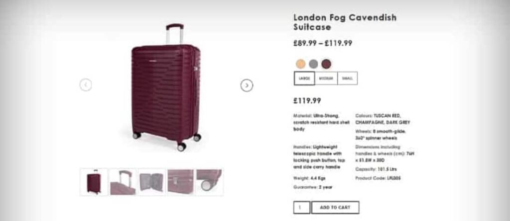
High-quality product images and videos
In a digital store, customers cannot touch the product. Images and video do that work for you — and the better they are, the more confident the buyer feels.

Why image quality matters
- Trust. Clear, detailed images show what the buyer is actually getting — reducing returns and hesitation.
- Engagement. Sharp, well-lit visuals capture attention in a crowded category listing.
- Comprehension. A good image conveys material, scale, and finish faster than any caption.
Image practices that pay off
- Multiple angles — front, back, side, top. The buyer should feel like they have walked around the product.
- Zoom. Let visitors inspect detail — texture, stitching, finish, label.
- Consistent lighting and background. Uniform styling makes a category feel professional and lets the product itself do the talking.
- Contextual shots. Show the product in use. A coffee mug filled with coffee on a breakfast table sells better than the same mug on white.
- 360-degree views and short videos where the product genuinely benefits from movement — clothing, jewellery, electronics, anything with moving parts.
Compelling product descriptions
In a physical store, the product itself does most of the talking. Online, the product description does that job. A good description informs, builds trust, and answers objections before they form.
What an effective description does
- Leads with key features. What makes the product different? What does it actually do?
- Translates features into benefits. Features describe the product; benefits describe the customer’s life with the product.
- Matches your brand voice. Playful, technical, premium — pick one and stick to it.
- Stays SEO-aware without being SEO-led. Use the natural language buyers use; do not stuff keywords.
Techniques that keep descriptions sharp
- Bullet points for scannable feature lists.
- Plain language. Skip jargon unless your audience uses it.
- A short story where appropriate — origin, materials, why this product exists.
- Social proof. Pull a short customer quote or rating into the description block when the page supports it.
- Edit ruthlessly. Cut every word that does not earn its place.
Search engine optimisation (SEO)
Visibility decides whether visitors arrive at all. SEO is not bolted on after the design is finished — it is woven into the design from day one.

Why SEO has to be part of the design
- Visibility. Higher rankings mean more relevant traffic, every day, for free.
- User experience overlap. Fast pages, mobile responsiveness, clear navigation — the things SEO rewards are the same things shoppers want.
- Cost-effectiveness. Organic traffic compounds. Paid traffic stops the moment you stop paying.
What actually moves the needle
- Keyword optimisation. Map every category and product page to the searches your buyers actually run.
- Quality content. Buying guides, comparisons, and how-tos bring visitors to your site before they are ready to buy from a competitor.
- Site structure. Clear hierarchy helps search engines crawl effectively and helps visitors navigate.
- Mobile optimisation. Google ranks the mobile version of your site; design for that first.
- Backlink building. Links from credible sites still tell Google you are credible.
Streamlined checkout process
Checkout is the most expensive part of your site to get wrong. Every extra step, every required field, every confusing message costs orders.
Why simplicity wins
- Reduced friction. Each removed obstacle keeps more buyers moving toward “place order”.
- Better experience. A short, predictable checkout respects the buyer’s time and earns repeat visits.
- Higher conversion. Simplifying checkout often produces a larger conversion lift than any acquisition campaign.
Features that make checkout work
- Guest checkout — let first-time buyers complete a purchase without creating an account.
- Clear progress indicators — Shipping → Payment → Confirmation, so the buyer always knows what is next.
- Multiple payment options — cards, PayPal, Apple Pay, Google Pay, regional methods where they matter.
- Auto-fill for returning customers — pull saved details without forcing re-entry.
- Inline error handling — flag mistakes (invalid card, wrong postcode) right at the field, with clear guidance.
- Order summary — show the buyer exactly what they are buying and what they will be charged, before they confirm.
Consistent branding
A consistent brand makes your store recognisable on every page and every channel. Inconsistency makes visitors wonder whether they are still on the same site, and weakens the digital marketing work you do everywhere else.
What “consistent” actually means on the site
- Visual elements. Logo, colours, typography, button styles — applied the same way everywhere.
- Voice and tone. The same brand personality on the homepage, product pages, checkout, and emails.
- Story and values. Your About page, mission statement, and product copy should all reflect the same underlying brand.
- Imagery. Photography style, illustration choices, and content tone should pull in the same direction.
Consistency beyond the site
- Social media. Same profile imagery, same voice, same visual style across platforms.
- Email. Marketing and transactional emails should look like the rest of your brand, not a system-generated afterthought.
- Digital ads. Display, search, and social ads should be unmistakably yours.
- Customer service. Chat replies and support emails should sound like your brand, not a different company.
Clear call to action (CTA)
A CTA is the bridge between intent and action. Get it right and visitors do what you want; get it wrong and they hesitate.
Designing CTAs that actually convert
- Visibility. Use contrast. The CTA should be the easiest thing to see on the page.
- Placement. Put CTAs where buyers naturally reach a decision — near product details, after a benefit, at the end of a comparison.
- Plain language. “Buy now”, “Add to cart”, “Sign up”, “Get started”. No clever phrasing.
- Urgency or incentive when honest — limited stock, free shipping over a threshold, returning-customer discount.
- Test and iterate. Try wording, colour, placement variations. Measure the conversion lift before locking in a winner.
The conversion impact
CTAs convert because they:
- Direct the buyer to the next step, removing ambiguity.
- Improve experience by making decisions easier.
- Increase engagement when used outside checkout too — for newsletters, guides, demos.
- Generate measurable data. Every CTA click tells you what the buyer cared about.
Security features
Online shoppers will not buy from a site they do not trust. Security is both a customer-protection measure and a conversion lever.
What to put in place
- Encryption of sensitive data, including card information and personal details.
- SSL certificates so every page is served over HTTPS — non-negotiable in 2025 onwards.
- Regular security audits to catch outdated plugins, weak passwords, and misconfigured permissions.
- PCI DSS compliance if you handle card details. This is a legal floor, not a stretch goal.
- User education. Encourage strong, unique passwords; offer hints for safer account practice.
Three security layers worth singling out
- SSL certificates — encrypt the connection. Free options are widely available; no excuse for not having one.
- Multi-factor authentication (MFA) — protects customer accounts even if a password is leaked elsewhere.
- Regular updates — every CMS, plugin, and theme. Most successful eCommerce breaches start with outdated software.
Multiple payment options
Offering a range of payment methods is about matching the way buyers want to pay, in their region and on their preferred device.
- Range of methods. Credit and debit cards, PayPal, Apple Pay, Google Pay, buy-now-pay-later providers (Klarna, Clearpay) where appropriate, and regional methods (iDEAL in the Netherlands, Bancontact in Belgium, UPI in India).
- Payment-gateway security. Use providers with built-in fraud protection and tokenisation (Stripe, Adyen, Braintree).
- Easy checkout flow. A complicated payment screen is one of the largest single drivers of abandonment.
- Localised options. International customers convert dramatically better when offered the methods they already use at home.
Frequently asked questions
How much should I spend on eCommerce web design?
Costs vary widely based on platform, catalogue size, custom functionality, and design complexity. A simple Shopify or WooCommerce build can run a few thousand pounds; a custom store with bespoke integrations easily runs to tens of thousands. The right number is whatever pays back the fastest in conversions and operational savings. A useful sanity check: estimate the lifetime value of one extra customer and compare it to the design investment.
Which eCommerce platform is best for design flexibility?
Shopify is fastest to launch with strong templates and a clean checkout. WooCommerce on WordPress gives the most design freedom because you control everything. BigCommerce and Magento (Adobe Commerce) sit in between for larger catalogues. The right platform depends less on raw flexibility and more on the team’s comfort with the technical stack behind it.
How important is mobile design for eCommerce in 2026?
Critical. Mobile is the primary device for browsing in most consumer categories and a majority of purchases in many. Sites that do not work cleanly on mobile lose ranking, lose visitors, and lose orders. If your audit shows red on Core Web Vitals for mobile, that is the first thing to fix.
How do I reduce cart abandonment?
The biggest single levers are: a guest checkout option, fewer required fields, a clear order summary before payment, transparent shipping costs shown before checkout starts, multiple payment methods, and abandoned-cart email follow-up. Many stores recover a meaningful share of abandoned carts with a single well-written follow-up email.
Do I need a developer to build an eCommerce store?
For small catalogues on Shopify or WooCommerce, no — owner-built stores can ship quickly with a strong theme. For anything custom (integrations, complex product configurations, B2B pricing, custom checkout, headless commerce, multi-region setups), bring in eCommerce web design specialists. The cost of a bad build usually exceeds the cost of a good one within months.
A well-designed eCommerce site combines all of the above — usability, navigation, imagery, copy, SEO, fast checkout, brand consistency, clear CTAs, robust security, and flexible payments — into a single coherent experience. Get one element wrong and the others compensate; get several wrong and the store loses orders steadily and quietly. The best stores are the ones built with each of these decisions made deliberately, then revisited as the business grows.
More Growth? > More leads...
We are ready to work with your business and generate some real results…
Let's TalkJoin Our Community: Subscribe for Updates
Get notified of the best deals on our WordPress themes.
Continue reading

Screen Sizes for Web Design: What to Build For in 2026 (Real Data, Not Guesses)

The Ecommerce Sales Funnel Blueprint: Convert More, Grow Faster