Screen Sizes for Web Design: What to Build For in 2026 (Real Data, Not Guesses)
53.65% of global traffic is mobile (StatCounter, 2026). Here are the screen sizes you should actually design for, with current viewport data.


Table of Contents 
Need More Growth & Leads?
We are ready to work with your business and generate some real results…
Let's TalkJoin Our Community: Subscribe for Updates
Get notified of the best deals on our WordPress themes.
The screen sizes that matter for web design in 2026 are 414×896, 360×800, and 390×844 on mobile and 1920×1080, 1536×864, and 1366×768 on desktop, which together cover roughly 53% of global traffic (StatCounter GlobalStats, April 2026).
Key Takeaways
- Mobile accounts for 53.65% of global web traffic in April 2026 (StatCounter, 2026), so design mobile-first or risk losing the majority of visitors.
- 414×896 is the single most common mobile resolution worldwide at 12.7% share; 1920×1080 leads desktop at 19.2% (StatCounter, 2026).
- Only 48% of mobile pages pass Core Web Vitals (Web Almanac, 2025), so screen-size handling alone isn’t enough, performance matters too.
Why does screen size matter for web design?
Mobile passed desktop in global web traffic share back in 2016 and now sits at 53.65% as of April 2026 (StatCounter, 2026). If your site renders cleanly on a 1920×1080 desktop monitor but breaks on a 360×800 Android phone, you’re degrading the experience for the majority of your audience. Google made this worse for laggards in July 2024 by completing the move to mobile-first indexing for every site, which means the mobile rendering is now what Google ranks (Google Search Central, 2023).
There’s a second pressure. Page experience signals (Core Web Vitals) factor into rankings, and they’re harder to pass on mobile than desktop. The 2025 Web Almanac reports only 48% of origins pass all three CWV metrics on mobile, compared with 56% on desktop (HTTP Archive, 2025). A site that doesn’t account for narrow viewports, slow networks, and touch targets is competing with one hand tied behind its back.
The commercial cost is real too. Google’s own analysis found that as page load time on mobile goes from 1 second to 3 seconds, the probability of bounce jumps by 32%, and stretches to a 123% increase at 10 seconds (Think with Google, 2017). That figure is from 2017 and still gets cited as the canonical benchmark because nobody at Google has published a more recent replacement.
What are the most common screen sizes in 2026?
The actual top resolutions, drawn from StatCounter’s monthly global traffic measurements for April 2026, are below. These are CSS pixel resolutions as reported by browsers, which is what your media queries respond to.
Mobile (53.65% of global traffic)
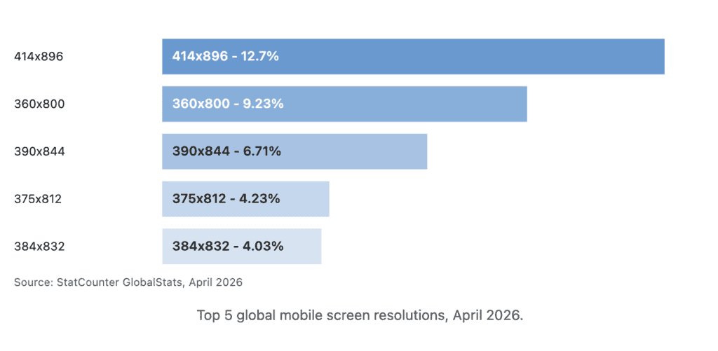
The five resolutions above add up to 36.9% of global mobile traffic. The long tail is real: there are dozens of resolutions below 4%, which is why fixed-pixel layouts fall apart and fluid layouts win.
Desktop (46.35% of global traffic)
| Resolution | Share | Common devices |
|---|---|---|
| 1920×1080 | 19.2% | Full HD monitors, most laptops |
| 1536×864 | 8.54% | 13″-14″ laptops at 1.25x scaling |
| 1280×1200 | 7.49% | Vertical/square monitors |
| 1366×768 | 6.65% | Budget laptops, older hardware |
Data: StatCounter, April 2026. (StatCounter also reports 800×600 at 4.04%, which is almost certainly headless/bot traffic and shouldn’t drive design decisions.)
Tablet
| Resolution | Share | Common device |
|---|---|---|
| 768×1024 | 9.21% | iPad portrait |
| 800×1280 | 7.74% | Android tablets portrait |
| 1280×800 | 7.14% | Android tablets landscape |
| 810×1080 | 6.19% | iPad 10th gen portrait |
| 820×1180 | 5.49% | iPad Air portrait |
Data: StatCounter, April 2026.
Current iPhone viewport widths (May 2026)
If you’re still designing against “iPhone 14 Pro” specs you’ve fallen three generations behind. Here’s the current lineup:
| Model | CSS viewport (px) |
|---|---|
| iPhone 15 / 15 Pro / 16 | 393×852 |
| iPhone 15 Plus / 15 Pro Max / 16 Plus | 430×932 |
| iPhone 16 Pro / 17 / 17 Pro | 402×874 |
| iPhone 16 Pro Max / 17 Pro Max | 440×956 |
| iPhone 17 Air | 420×912 |
Source: YesViz, 2026. All models have a device pixel ratio of 3.0, which means a 1px CSS border renders across 3 hardware pixels.
How is mobile-first indexing changing what you should design for?
Mobile-first indexing means Googlebot Smartphone, not Googlebot Desktop, is the crawler whose view of your page determines your ranking. Google completed the rollout to every site by July 2024 and said as much in their official announcement (Google Search Central, 2023). If a piece of content is desktop-only (hidden behind a media query that doesn’t fire on mobile, or loaded by JavaScript that mobile bots don’t execute), Google effectively can’t see it.
The practical fallout: anything that hurts mobile rendering hurts your rankings everywhere. Render-blocking JS, oversized images served to phones, broken touch targets, and layouts that overflow at 360px wide all show up in Core Web Vitals data. The 2025 Web Almanac’s CWV breakdown reports good LCP on 62% of mobile pages, good CLS on 81%, and good INP on 77% (HTTP Archive, 2025). LCP is the weak link, almost always tied to images and fonts that weren’t optimized for mobile.
A common pattern in responsive-design audits: the CSS itself works fine, but image weights don’t drop for narrow viewports and the LCP element is an oversized desktop hero being served to phones. The layout looks responsive; the bytes aren’t.
Responsive design vs. adaptive design: which should you use?
Responsive design uses fluid grids, relative units (rem, %, vw), and media queries to let one layout flex across every viewport. Adaptive design uses fixed breakpoints with separate layouts for each. For most sites, responsive wins: it’s simpler to maintain, it scales to new devices automatically, and Google explicitly recommends it as the preferred mobile configuration (Google Search Central, 2024).
Adaptive is still useful when device classes differ meaningfully (consumer marketing site that wants a fundamentally different layout on TV-sized screens, for instance), but the days of building distinct mobile and desktop CSS files are over for almost everyone.
| Approach | How it works | When it fits |
|---|---|---|
| Responsive | Fluid layout, media queries, one codebase | Default choice for marketing sites, blogs, ecommerce |
| Adaptive | Discrete fixed layouts per breakpoint | When device classes need genuinely different UI |
| Mobile-only / desktop-only | Separate sites (m.example.com) | Almost never in 2026; Google has deprecated this |
What CSS breakpoints should you actually set?
The breakpoints your framework gives you are a reasonable starting point. The three most-used CSS frameworks publish the following defaults:
| Framework | sm | md | lg | xl | 2xl/xxl |
|---|---|---|---|---|---|
| Bootstrap 5.3 | ≥576px | ≥768px | ≥992px | ≥1200px | ≥1400px |
| Tailwind CSS | ≥640px | ≥768px | ≥1024px | ≥1280px | ≥1536px |
| Bulma | up to 768px (mobile) | 769px+ (tablet) | 1024px+ (desktop) | 1216px+ (widescreen) | 1408px+ (fullhd) |
Sources: Bootstrap, Tailwind, Bulma.
If you’re rolling your own, the breakpoints that align with actual device distribution today look like this:
/* Small phones: catches 360x800, 375x812, 384x832 */
@media (min-width: 360px) { ... }

/* Standard phones / phablets: catches 390x844, 414x896, 430x932 */
@media (min-width: 390px) { ... }

/* Tablet portrait: catches 768x1024 (iPad) and similar */
@media (min-width: 768px) { ... }

/* Laptop / small desktop: catches 1280, 1366, 1440 */
@media (min-width: 1280px) { ... }

/* Full HD and up */
@media (min-width: 1920px) { ... }
Don’t design pixel-perfect to any single resolution. Design for the band. A layout that works at 360px and 414px will almost certainly work at every mobile width in between, because those represent ~24% of the entire global mobile market on their own.
How do you test designs across screen sizes?
Chrome DevTools Device Mode and Firefox Responsive Design Mode are free and built into the browsers your users already have. They simulate viewport dimensions, touch input, and pixel density, and they’re enough for 80% of testing. The remaining 20% is where things break.
Real-device testing matters for three reasons: simulator viewports don’t perfectly mimic mobile Safari quirks, iOS keyboard behavior, or actual touch-target ergonomics. BrowserStack and LambdaTest both let you remote into real iPhones and Android devices from a browser. Responsively App is open-source and shows multiple device frames side by side, which is faster for QA than reloading Chrome DevTools at three different widths.
Whatever tool you use, test the four widths that matter most: a small Android (360×800), a mid-range iPhone (393×852), an iPad portrait (768×1024), and a Full HD desktop (1920×1080). Those four cover roughly 32% of global traffic between them and surface most layout failures.
The single most common bug on responsive sites is a horizontal scrollbar at 360px wide caused by a single fixed-width element: a video embed, a table, or an image with an explicit width attribute. Fix that one class of bug and you’ll catch most “broken on mobile” complaints.
A real-world example: Walmart Canada’s responsive redesign
The most-cited responsive redesign case study with real, verifiable numbers is Walmart Canada’s 2016 rebuild. After moving from separate mobile and desktop sites to a single responsive site, they reported a 20% lift in conversions across all devices and a 98% jump in mobile orders (High Scalability, 2016). The figures are nearly a decade old now, but the dynamic still holds: when you stop maintaining two diverging codebases, you stop shipping a worse experience to half your visitors.
We don’t have a more recent, equally-verifiable D2C case study to point to, which is more about how rarely brands publish their numbers than about the principle changing.
Frequently asked questions
Three to five. A typical setup covers small mobile (≤480px), large mobile/phablet (481-767px), tablet (768-1023px), laptop (1024-1439px), and large desktop (≥1440px). Adding more breakpoints rarely improves the design and definitely complicates the CSS.
What this means in practice
The screen sizes you need to design for in 2026 are dominated by a handful of mobile widths between 360px and 414px and a smaller cluster of desktop widths between 1366px and 1920px. Build mobile-first with fluid layouts, lean on your framework’s standard breakpoints, and test on real devices for the last 20% of polish you can’t get from simulators.
If you’re auditing an existing site, the highest-value check is the 360px mobile width: most layout bugs surface there first. Fix what breaks at 360px and the rest of the breakpoints tend to fall in line.
For more on the related performance work, see our guide to Core Web Vitals optimization.
Continue reading

WooCommerce vs Shopify: Which Is Right for Your Store (2026)

Web Design and Development: The 2026 Business Guide

The Ecommerce Sales Funnel Blueprint: Convert More, Grow Faster