Web Design Trends 2025
Web design is constantly evolving, shaped by new technologies and changing user preferences. As we step into 2025, staying updated with the latest trends is crucial for creating engaging and user-friendly websites. This year, the focus is on simplicity, speed, and personalization. Designers are finding creative ways to blend aesthetics with functionality, ensuring every website delivers a seamless experience.


Table of Contents 
Need More Growth & Leads?
We are ready to work with your business and generate some real results…
Let's TalkJoin Our Community: Subscribe for Updates
Get notified of the best deals on our WordPress themes.
Web design is constantly evolving, shaped by new technologies and changing user preferences. As we step into 2025, staying updated with the latest trends is crucial for creating engaging and user-friendly websites. This year, the focus is on simplicity, speed, and personalization. Designers are finding creative ways to blend aesthetics with functionality, ensuring every website delivers a seamless experience. Let’s explore the key web design trends that will define 2025 and help your website stand out.
Let’s explore the web design trends for 2025 below, highlighting innovative and user-focused designs.
Immersive 3D Elements
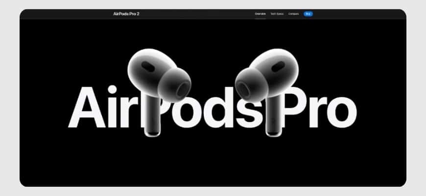
Source: AirPods Pro 2 – Apple
Immersive 3D elements involve incorporating three-dimensional visuals and interactive graphics into web design. These features create a lifelike experience, allowing users to engage with content in ways that feel more dynamic and realistic.
Why It Matters?
- Enhanced User Engagement: 3D visuals capture attention faster than flat designs. They invite users to interact with the website, keeping them engaged longer.
- Memorable Experiences: The uniqueness of 3D elements makes websites stand out, leaving a lasting impression on users. This can be a game-changer for branding.
- Improved Storytelling: Websites can use 3D designs to visually narrate their stories, products, or services, offering more immersive and detailed explanations.
- Technological Advancements: With advancements in browser capabilities and faster internet speeds, 3D elements now load quickly and run smoothly, making them more accessible.
Examples of 3D Elements in Use
- Interactive 3D Models: Websites like Apple showcase their products in interactive 3D. For instance, users can rotate an iPhone to view it from different angles, offering a more comprehensive product experience.
- Isometric Designs: Many tech websites use isometric illustrations for creating engaging visuals. These designs combine a 3D effect with clean and structured layouts.
- Floating 3D Elements:Websites like Stripe use subtle floating 3D graphics to add depth to their design without overwhelming the content.
How to Use 3D Elements Effectively
- Prioritize Performance: Ensure 3D visuals are optimized to load quickly and work on various devices.
- Keep It Relevant: Use 3D graphics that align with your brand’s identity and purpose.
- Focus on Interaction: Allow users to interact with the 3D elements for an engaging experience.
Challenges and Considerations
While 3D elements enhance design, they can increase page load times if not optimized properly. Test thoroughly to maintain speed and performance.
Dark Mode
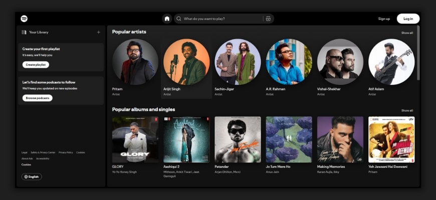
Source: Spotify
Dark mode goes beyond the basic black backgrounds. It incorporates contrasting neon highlights and adaptive color schemes that adjust based on the time of day or user preferences. These enhancements make dark mode designs more vibrant and user-friendly.
Why It Matters?
- Reduces Eye Strain: Dark mode helps users browse comfortably, especially in low-light environments. The softer tones are easier on the eyes during long screen sessions.
- Boosts Aesthetic Appeal: Combining dark backgrounds with bright neon accents creates a sleek, modern look. It makes content visually striking while maintaining readability.
- Increases User Preference: Many users now prefer dark mode for its calming effect and stylish design. Offering this option enhances user satisfaction.
- Improves Battery Life: On OLED and AMOLED screens, dark mode saves battery by using less power to display darker colors.
Examples of Websites Using Dark Mode
- Spotify: Features dark mode with clean highlights for navigation, making it visually appealing and functional.
- Slack: Offers adaptive themes, allowing users to switch between dark and light modes seamlessly.
How to Use Dark Mode Effectively
- Focus on Contrast: Ensure text and icons are clear against the dark background.
- Add Neon Highlights: Use subtle pops of color for buttons or interactive elements to draw attention.
- Offer Customization: Let users choose between dark and light modes to match their preferences.
Challenges and Considerations
- Test designs on various devices to ensure readability.
- Avoid overusing neon colors, as they can become overwhelming if not balanced.
Minimalist Maximalism
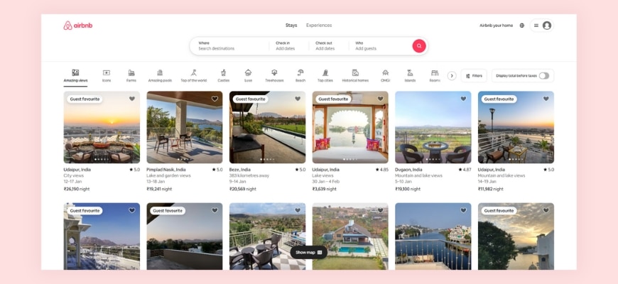
Source: airbnb
Minimalist maximalism blends clean and simple layouts with bold, eye-catching design elements. It uses vibrant colors, dramatic typography, and oversized visuals to create a striking yet balanced look.
Why It’s Effective
- Balanced Design: It keeps the layout uncluttered while using bold elements to grab attention, creating a unique mix of simplicity and creativity.
- Memorable Impact: The dramatic use of oversized visuals and vibrant colors leaves a lasting impression on users.
- Improved Readability: Clean layouts ensure easy navigation, while bold typography highlights the most important information.
- Brand Personality: This design style allows brands to express creativity without losing a polished, professional appearance.
Examples of Minimalist Maximalism
- Airbnb: Combines simple layouts with bold, oversized typography for a modern feel.
- Canva: Uses vibrant colors and dramatic design elements while keeping the interface clean and user-friendly.
How to Use It Effectively
- Keep It Simple: Maintain white space to avoid clutter.
- Focus on Key Elements: Use oversized visuals or typography sparingly to highlight important messages.
- Play with Colors: Add vibrant hues to create contrast and draw attention to specific areas.
Challenges and Considerations
- Avoid overloading the design with too many bold elements.
- Ensure the design aligns with your brand’s tone and purpose.
Scrollytelling
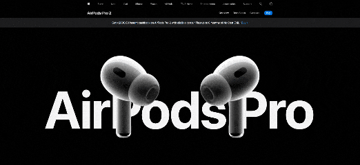
Source: Apple
Scrollytelling uses storytelling techniques in web design, where the narrative unfolds as users scroll. It combines visuals, text, and animations to create an interactive and engaging experience.
Why It’s Effective
- Engages Users:Scrolling through a story keeps users interested and encourages them to explore more.
- Improves Understanding:By combining visuals and animations, complex ideas or products are explained in an easy-to-follow format.
- Makes Content Memorable:The storytelling approach connects with users emotionally, making the content more impactful.
Best Use Cases
- Product Showcases: Highlight features and benefits step by step as users scroll.
- Portfolio Sites: Display creative work dynamically, keeping visitors intrigued.
- Brand Storytelling: Share the journey and mission of your brand in an engaging, visual way.
Examples of Scrollytelling
- Apple’s Product Pages: Uses animations and visuals to explain product features interactively.
- The New York Times’ Special Stories: Combines text, images, and scrolling animations for immersive storytelling.
How to Use Scrollytelling Effectively
- Focus on Flow: Ensure the story progresses naturally without overwhelming the user.
- Optimize Performance: Use lightweight animations and visuals to maintain fast loading speeds.
- Test for Usability: Make sure scrolling works smoothly on all devices and browsers.
Glassmorphism
Source: Dribbble
Glassmorphism uses frosted glass effects combined with bold colors and gradients. It creates a transparent, layered look that adds depth and elegance to web designs.
Why It’s Trending
- Modern Aesthetic: The sleek and futuristic style makes websites look polished and visually appealing.
- Adds Depth: Layering elements with a frosted glass effect creates a sense of dimension, making designs feel dynamic.
- Improves Focus: By blurring the background, it highlights the content in the foreground, guiding the user’s attention.
Examples of Glassmorphism in Use
- Apple Music: Features frosted effects to enhance its modern interface.
- Dribbble Designs: Many UI concepts showcase glassmorphism for card designs and menus.
How to Use Glassmorphism Effectively
- Balance the Design: Pair glass effects with simple layouts to avoid visual clutter.
- Use Subtle Gradients: Complement the frosted glass with soft gradients for a cohesive look.
- Test for Readability: Ensure text and icons remain clear against the frosted background.
Challenges of Glassmorphism
- Performance Issues: Frosted glass effects can slow down websites if not optimized, especially on older devices.
- Readability Risks: Poor contrast between text and background can make content hard to read.
- Overuse of Effects: Excessive glass layers can clutter the design and reduce usability.
Bold Typography
Source – Nike
Bold typography uses large, expressive fonts that dominate the design. These oversized text elements grab attention and communicate key messages effectively.
Why It’s Trending
- Captures Attention:Big, bold fonts instantly draw the user’s eye to important content.
- Enhances Readability:Clear and impactful typography ensures users can quickly understand the message.
- Builds Strong Branding:Expressive fonts reflect the brand’s personality and make it memorable.
Best Uses
- Headlines: Use bold typography to emphasize key messages or announcements.
- Hero Sections: Make a strong first impression with striking fonts that dominate the page.
- Branding Elements: Incorporate unique typography to align with your brand identity.
Examples of Bold Typography in Use
- Nike: Uses bold fonts in its hero sections to emphasize power and energy.
- Spotify Wrapped: Features oversized typography to create excitement and highlight key stats.
How to Use Bold Typography Effectively
- Keep It Simple: Use minimal text to let the typography shine without overcrowding.
- Pair with Clean Layouts: Bold fonts work best with simple, uncluttered designs.
- Maintain Contrast: Choose colors that ensure the text stands out against the background.
Challenges of Bold Typography
- Overwhelming Design: Overusing bold fonts can make the design feel heavy and distract from the message.
- Responsiveness: Large typography can look awkward on smaller screens if not scaled properly.
- Font Selection: Using overly decorative fonts can hurt readability and clash with the design.
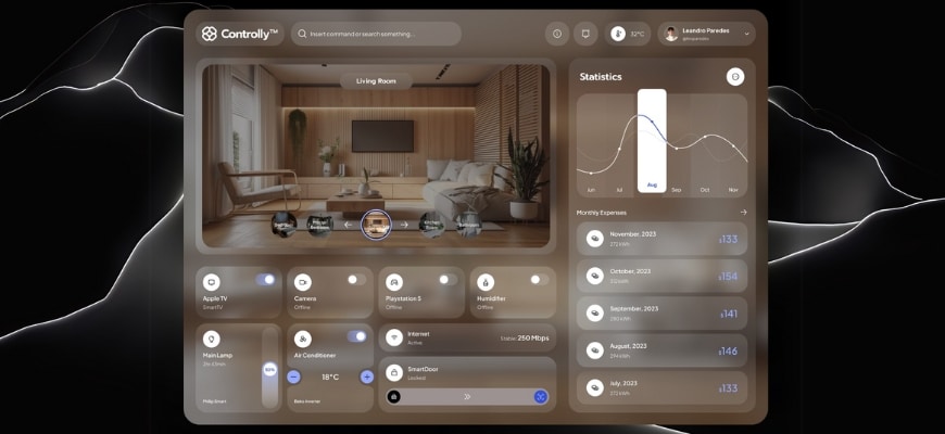
Micro-Interactions
Micro-interactions are small, subtle animations or effects that happen when users interact with a website. Examples include button hover effects, progress indicators, and feedback animations when an action is completed.
Why It’s Important
- Enhances User Engagement: These small details make interactions feel more dynamic and enjoyable, keeping users interested.
- Provides Feedback: Micro-interactions confirm user actions, like a subtle animation showing that a form submission was successful.
- Improves Navigation: Hover effects and transitions guide users intuitively, making it easier to explore the site.
Examples of Micro-Interactions in Use
- LinkedIn: Displays a loading indicator when uploading a file, keeping users informed.
- E-commerce Sites: Add to cart buttons often feature animations to confirm the action visually.
How to Use Micro-Interactions Effectively
- Keep It Subtle: Avoid overwhelming users with overly flashy animations.
- Focus on Functionality: Ensure animations have a purpose, like providing feedback or enhancing navigation.
- Optimize for Performance: Test animations to make sure they run smoothly without slowing the site.
Challenges of Micro-Interactions
- Overuse: Too many animations can clutter the design and distract users.
- Performance Issues: Poorly optimized effects can affect website speed and user experience.
- Consistency: Inconsistent interactions across pages may confuse users and break the flow.
Adaptive Color Schemes
Adaptive color schemes change based on factors like the time of day, user preferences, or device settings. For example, a website might shift to dark mode in the evening or align with a user’s chosen theme.
Why It’s Popular
- Personalized Experience: Adaptive color schemes cater to user preferences, making browsing feel more tailored.
- Improved Comfort: Adjusting colors based on the time of day reduces eye strain and creates a pleasant viewing experience.
- Device Compatibility: These schemes sync with device settings like dark or light mode, ensuring consistency across platforms.
Examples of Adaptive Color Schemes in Use
- YouTube: Automatically switches between light and dark modes based on device settings.
- Twitter: Lets users choose themes or follow system preferences for a consistent experience.
How to Use Adaptive Color Schemes Effectively
- Offer Customization: Allow users to switch modes manually if they prefer.
- Test Readability: Ensure text and elements are visible and clear in all color variations.
- Optimize Transitions: Smoothly transition between schemes to avoid jarring effects.
Challenges of Adaptive Color Schemes
- Design Complexity: Maintaining consistent branding across multiple schemes requires extra effort.
- Performance Impact: Switching schemes dynamically can slow down poorly optimized websites.
- Accessibility: Some color combinations may not be accessible to users with visual impairments.
AR-Enhanced Design
AR-enhanced design integrates augmented reality (AR) features into websites. These elements allow users to interact with digital objects in real-world settings through their devices. Examples include virtual try-ons for shopping or interactive AR games.
Why It’s Trending
- Improves User Engagement: AR makes the browsing experience more interactive and exciting.
- Enhances Decision-Making: Features like virtual try-ons help users visualize products, leading to more confident purchases.
- Adds a Wow Factor: AR elements stand out and create a memorable user experience.
Examples of AR-Enhanced Design in Use
- IKEA Place App: Lets users visualize furniture in their space through AR.
- Warby Parker: Offers virtual try-ons for glasses directly on their website.
How to Use AR-Enhanced Design Effectively
- Focus on Value: Use AR to solve a problem or enhance the user’s experience, like helping them try products virtually.
- Ensure Accessibility: Make AR features easy to use on different devices and browsers.
- Optimize Performance: Keep AR elements lightweight to avoid slowing down the website.
Challenges of AR-Enhanced Design
- Technical Requirements: Users need compatible devices and browsers to access AR features.
- Development Complexity: Integrating AR requires specialized skills and tools, increasing development time and cost.
- User Adoption: Some users may be unfamiliar with AR or hesitant to use it.
Overlapping Layers
Overlapping layers use elements like images, text, and graphics that stack and intersect to create depth and movement in a design. This approach gives websites a more dynamic and engaging look.
Why It Works
- Adds Depth: Overlapping layers create a sense of three-dimensional space, making the design feel richer and more immersive.
- Boosts Visual Interest: The interplay of layers draws the user’s eye and keeps them engaged.
- Encourages Creativity: Designers can experiment with different combinations to create unique layouts that stand out.
Examples of Overlapping Layers in Use
- Creative Agencies: Often use layered text and images in hero sections to showcase bold, artistic designs.
- Portfolio Sites: Combine overlapping elements to present work dynamically and visually.
How to Use Overlapping Layers Effectively
- Maintain Balance: Avoid overcrowding the layout; use white space to give elements room to breathe.
- Ensure Clarity: Test the readability of text and visibility of key graphics in layered designs.
- Keep It Responsive: Make sure layers adapt well to different screen sizes without looking cluttered.
Challenges of Overlapping Layers
- Overcrowded Design: Too many layers can confuse users and reduce the impact of the design.
- Performance Issues: Complex layering can slow down page loading if not optimized.
- Device Compatibility: Designs may not look the same across all devices and browsers.
Motion UI
Source: Savoir Faire
Motion UI involves using smooth animations and transitions to guide users through a website. These movements make interactions more engaging and intuitive, like animated menus, hover effects, or subtle loading screens.
Why It’s Trending
- Improves Navigation: Animations provide visual cues, helping users understand how to move through the interface.
- Enhances Engagement: Motion adds life to static designs, making the experience more dynamic and enjoyable.
- Provides Feedback: Transitions and effects confirm user actions, like a subtle animation when clicking a button.
Best Use Cases
- Loading Screens: Use animations to keep users entertained while pages load.
- Menu Animations: Highlight transitions between menus or sections for a polished look.
- Hover Effects: Add motion to buttons or links to encourage interaction.
Examples of Motion UI in Use
- Dropbox: Uses smooth transitions and animations to explain features and guide users.
- Asana: Adds subtle hover effects and animations to enhance usability.
How to Use Motion UI Effectively
- Keep It Simple: Avoid overly complex animations that might distract users.
- Focus on Speed: Ensure animations are quick and don’t delay user actions.
- Maintain Consistency: Use motion effects consistently across the site for a cohesive experience.
Challenges of Motion UI
- Performance Impact: Heavy animations can slow down websites if not optimized properly.
- Device Compatibility: Some animations may not work smoothly on older devices or browsers.
- Accessibility: Excessive motion might overwhelm users with sensory sensitivities.
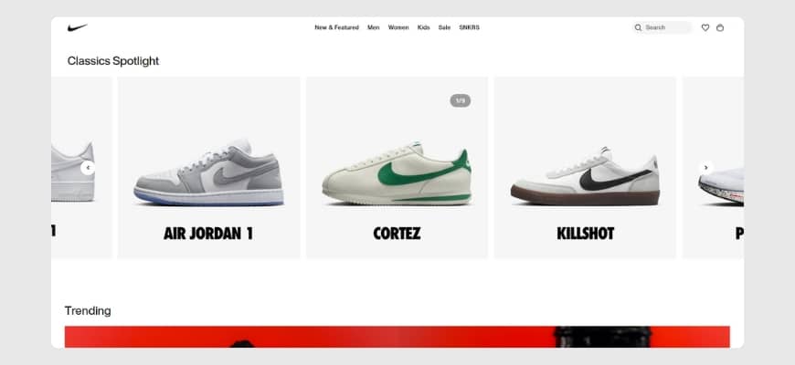
Split-Screen Layouts
Split-screen layouts divide the screen into two or more sections, allowing multiple pieces of content to be displayed side by side. This design helps balance visuals and text or compare different ideas effectively.
Why It’s Useful
- Showcases Comparisons: Perfect for highlighting differences or similarities, like product features or before-and-after visuals.
- Enhances Storytelling: Split layouts can guide users through a narrative by pairing images and text in an engaging way.
- Improves Clarity: By separating content into distinct sections, the design feels clean and organized.
Examples of Split-Screen Layouts in Use
- Nike: Uses split screens to display product features alongside visuals, creating a dynamic look.
- Portfolio Sites: Many designers showcase projects on one side and descriptions on the other for a balanced presentation.
How to Use Split-Screen Layouts Effectively
- Keep It Balanced: Ensure each section gets equal attention and doesn’t overpower the other.
- Use Contrast: Apply contrasting colors or visuals to distinguish sections clearly.
- Optimize for Mobile: Adapt the layout for smaller screens to ensure readability and usability.
Challenges of Split-Screen Layouts
- Mobile Responsiveness: Split designs can become cluttered on small screens if not optimized well.
- Visual Overload: Displaying too much content in one view may overwhelm users.
- Consistency: Maintaining balance and alignment across sections can be challenging.
Circular Design Elements
Circular design elements focus on rounded shapes and patterns in user interfaces. These include circular buttons, icons, and layouts that create a smooth and cohesive look.
Why It’s Trending
- Soft Aesthetic: Rounded shapes feel approachable and friendly, making websites more inviting.
- Modern Appeal: Circles and curves give designs a clean, modern feel that stands out.
- Focus and Balance: Circular elements naturally draw the eye and create harmony in layouts.
Examples of Circular Design Elements in Use
- Google Workspace: Uses circular icons and buttons to maintain a simple and user-friendly design.
- Fitness Apps: Often feature circular progress bars to track goals visually.
How to Use Circular Design Elements Effectively
- Keep It Simple: Avoid overcrowding the layout with too many rounded shapes.
- Highlight Key Features: Use circular designs to draw attention to important buttons or icons.
- Blend with Other Shapes: Pair circles with clean lines and rectangles for balance.
Challenges of Circular Design Elements
- Limited Space: Circles can restrict the amount of content or text displayed inside them.
- Overuse: Too many rounded elements can make the design feel repetitive or overly soft.
- Responsive Design: Ensuring circular elements scale well on smaller screens can be tricky.
Gradient Overlays
Gradient overlays use soft color transitions as backgrounds or layered effects on images and text. These gradients range from subtle tonal shifts to vibrant multi-color blends, adding a polished look to web designs.
Why It’s Popular
- Adds Depth: Gradients create a sense of dimension, making flat designs more dynamic.
- Enhances Visual Appeal: Smooth color transitions bring vibrancy without overpowering other design elements.
- Modern Touch: Gradients offer a fresh, contemporary aesthetic that appeals to users.
Examples of Gradient Overlays in Use
- Spotify: Uses bold gradients in its backgrounds and promotional banners for a dynamic look.
- Instagram: Features its iconic gradient as a central part of its branding and interface.
How to Use Gradient Overlays Effectively
- Stay Subtle: Use gradients that complement, rather than overpower, the content.
- Match the Brand: Choose gradient colors that align with your brand’s identity.
- Test for Contrast: Ensure text and visuals remain clear and readable over the gradient.
Challenges of Gradient Overlays
- Overuse: Too many gradients can make the design feel busy or distracting.
- Consistency: Creating gradients that look good across devices and screens requires careful testing.
- Performance: Large gradient images can affect loading times if not optimized.
Inclusive Design
Inclusive design ensures websites are accessible to everyone, including users with different abilities. It features customizable interfaces, accessible navigation, and support for tools like screen readers.
Why It’s Crucial
- Expands Reach: Inclusive websites cater to a wider audience, making them usable for all, including people with disabilities.
- Enhances Usability: Features like adjustable text sizes, clear navigation, and color contrast improve the experience for every user.
- Supports Legal Compliance: Many regions require websites to meet accessibility standards, such as WCAG guidelines.
Examples of Inclusive Design in Use
- BBC: Offers keyboard-friendly navigation and supports screen readers to accommodate all users.
- Apple: Includes features like VoiceOver and adjustable settings for accessibility across devices.
How to Use Inclusive Design Effectively
- Ensure Text Readability: Use clear fonts, adjustable sizes, and high contrast for visibility.
- Optimize Navigation: Include keyboard-friendly controls and clear labels for links and buttons.
- Test Accessibility: Use tools like WAVE or Lighthouse to identify and fix accessibility issues.
Challenges of Inclusive Design
- Increased Complexity: Designing for diverse needs requires extra time and resources.
- Testing Across Devices: Ensuring accessibility on various devices and browsers can be challenging.
- Ongoing Updates: Accessibility needs evolve, requiring continuous monitoring and improvements.
Dynamic Cursor Effects
Dynamic cursor effects make the cursor interactive, changing its shape, color, or behavior based on user actions. For instance, the cursor might expand when hovering over links or morph into a different icon when interacting with content.
Why It’s Trending
- Engages Users: Interactive cursors add a playful and unique touch, keeping users interested.
- Provides Visual Cues: Cursor changes help users understand interactive elements, improving navigation.
- Enhances Personalization: Custom cursors create a distinct brand experience, making the website more memorable.
Examples of Dynamic Cursor Effects in Use
- Creative Portfolios: Many designers use dynamic cursors to highlight links or emphasize interaction.
- Gaming Websites: Incorporate unique cursors that align with the theme of the site.
How to Use Dynamic Cursor Effects Effectively
- Keep It Subtle: Avoid overly complex effects that might distract users.
- Focus on Functionality: Use changes to guide users, like indicating clickable areas.
- Test Responsiveness: Ensure cursors perform well across different devices and browsers.
Challenges of Dynamic Cursor Effects
- Overuse: Too many animations can overwhelm users and slow down performance.
- Accessibility Issues: Some cursor effects may not work well for users relying on assistive technologies.
- Compatibility: Unique cursors might not render correctly on all devices or operating systems.
Textured Backgrounds
Textured backgrounds use subtle patterns or designs to give a website depth and character. These can range from soft gradients to fine grain effects, making the design more engaging and visually appealing.
Why It’s Trending
- Adds Depth: Textured backgrounds break away from flat, plain designs, creating a more dynamic feel.
- Enhances Sophistication: The tactile quality of textures adds a polished and professional look.
- Improves Visual Interest: Patterns and textures draw attention without overpowering the main content.
Examples of Textured Backgrounds in Use
- Luxury Brand Sites: Often use fine grain or subtle fabric textures to create a premium feel.
- Creative Portfolios: Incorporate watercolor effects or abstract patterns for artistic appeal.
How to Use Textured Backgrounds Effectively
- Stay Subtle: Choose textures that complement the content instead of distracting from it.
- Match the Brand: Select patterns or effects that align with your brand’s style and tone.
- Optimize for Performance: Use lightweight texture files to maintain fast loading speeds.
Challenges of Textured Backgrounds
- Overwhelming Designs: Bold or busy textures can overshadow text and visuals, reducing readability.
- Consistency: Ensuring textures look good across various devices and screen sizes can be challenging.
- Accessibility Concerns: Some textures may make text harder to read for users with visual impairments.
Web design trends for 2025 showcase the perfect blend of creativity, functionality, and inclusivity. From immersive visuals to user-first designs like adaptive color schemes and inclusive layouts, staying updated with these trends can elevate your website’s experience and make it stand out. Whether you’re looking to revamp your site or create a new one, embracing these innovations ensures you stay ahead in the competitive digital landscape.
Ready to implement these trends on your website? At Chetaru, we specialize in crafting stunning, trend-focused websites tailored to your brand’s needs. Let’s work together to build a site that captivates your audience and drives results. Contact us today to get started!
Continue reading
Best Web Development Companies for UK Businesses (2026)

How Much Does a WordPress Website Cost in 2026?

WooCommerce vs Shopify: Which Is Right for Your Store (2026)